I never really thought about it before, but your wallpaper actually affects way more than you'd expect - your battery life, how easy it is to find apps, even how professional you look when someone glances at your phone.
I used to have this super busy wallpaper with bright colors everywhere - looked cool in the app store, but I was constantly squinting to find my apps. Finally switched to a simple marble pattern and honestly? Game changer. Way easier on the eyes, and I wasn't embarrassed when colleagues saw my screen during meetings anymore.
Your phone wallpaper isn't just decoration - it's literally the backdrop to thousands of daily interactions. And trust me, the right choice makes a bigger difference than you'd think.
Table of Contents
Essential Considerations for Choosing Elegant Phone Wallpapers
-
25 Elegant Phone Wallpapers Across 6 Categories
Minimalist Geometric Designs
Natural Textures and Landscapes
Artistic and Creative Expressions
Architectural and Urban Elements
Luxury and Metallic Themes
Seasonal and Time-Based Elegance
Deep Dive Analysis of Complex Wallpaper Options
What Actually Matters When Choosing
Protecting Your Elegant Display with Rokform
Final Thoughts
TL;DR
Match your phone's resolution or it'll look pixelated and cheap (learned this the hard way)
Darker wallpapers can add 3-4 hours of battery life on newer phones - seriously
Pretty wallpapers are useless if you can't find your apps - test icon visibility first
Stick with subtle designs for professional settings, save the artistic stuff for personal use
Geometric patterns work on any phone size and never look dated
Natural textures need high-quality sources or they look muddy and fake
Seasonal wallpapers look great but you'll forget to update them (I always do)
Essential Considerations for Choosing Elegant Phone Wallpapers
Here's something that took me way too long to figure out - if your wallpaper resolution doesn't match your phone, it's gonna look pixelated and cheap. I've seen gorgeous wallpapers completely ruined by this.
When you're picking elegant phone wallpapers, think about how they'll look with your phone case too. I once had this beautiful minimalist wallpaper that looked terrible with my bright blue case - totally killed the sophisticated vibe I was going for.
Look, I'm not gonna bore you with a bunch of specs, but basically - newer iPhones and Samsung phones want those tall, narrow wallpapers (they're like 19.5:9 ratio if you're curious). Most wallpaper sites let you filter by phone model, which saves a ton of headache.
Device Type |
What You Need |
Key Thing to Remember |
|---|---|---|
iPhone 15 Pro |
2556 x 1179 |
Works around that Dynamic Island thing |
Samsung Galaxy S24 |
2340 x 1080 |
Dark wallpapers = better battery |
Google Pixel 8 |
2400 x 1080 |
Matches your phone's color theme automatically |
Most Android phones |
2340 x 1080 |
Pretty universal these days |
Color psychology is real, by the way. Cool blues and grays make you feel calmer and look more professional. Warm colors are friendlier but might not work in stuffy office environments. Since you're looking at your phone hundreds of times a day, this stuff actually affects your mood.

Can you see your apps? This seems obvious but I can't tell you how many times I've picked a stunning wallpaper only to realize I can't find my messaging app when I need it. White icons on light backgrounds = disaster.
My friend Sarah had this gorgeous watercolor wallpaper, but she was always struggling to find her calendar app during calls. Looked pretty, but totally impractical. She switched to a darker marble texture and suddenly everything was readable again.
Your phone shows up in meetings, social situations, professional settings - pick something that matches the image you want to project, not something that undermines it.
Battery impact is real, especially on newer phones with OLED screens. Darker backgrounds genuinely help - I gained like 3-4 hours switching from a bright desert scene to dark mountains. Bright or animated wallpapers will drain your battery faster.
25 Elegant Phone Wallpapers Across 6 Categories
Okay, so I've been collecting wallpapers for way too long (probably have like 200 saved), and I've narrowed it down to these 25 that actually work in real life. Not just pretty to look at, but stuff you can actually live with day-to-day.
Minimalist Geometric Designs
Honestly? These are my go-to. They look professional without trying too hard, and you'll never get sick of them. Plus geometric stuff looks good on any phone size.
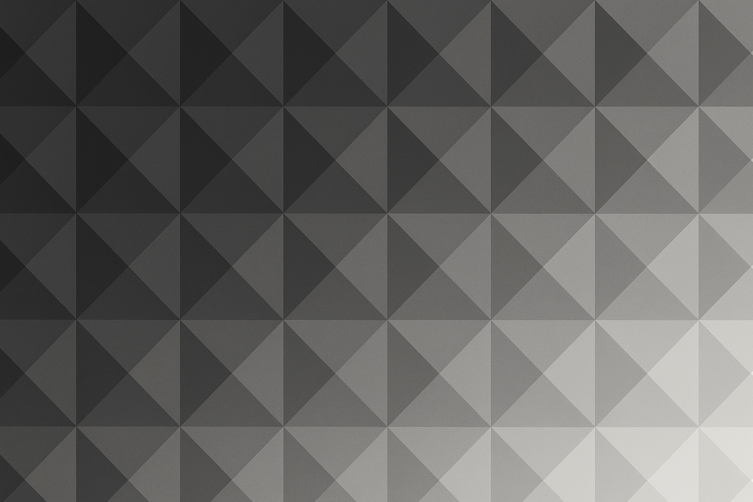
1. Subtle Gradient Triangles
This one's basically charcoal triangles that fade to light gray. Sounds boring, but it's actually really satisfying to look at. Plus your apps sit perfectly in the different sections - it's like your phone organized itself.
2. Monochromatic Line Art
Super simple circles and squares, all in one color. Perfect if you work somewhere stuffy where a colorful wallpaper might raise eyebrows.
3. Abstract Hexagonal Patterns
These honeycomb-looking patterns are weirdly addictive. I keep finding myself staring at them during boring meetings. The shadow effects give it just enough depth without being distracting.
4. Minimalist Wave Forms
Gentle waves but geometric - like if a math person designed ocean waves. Less "beach vacation" and more "I have my life together."
Natural Textures and Landscapes
This is where things get tricky. Nature wallpapers can look amazing or absolutely terrible depending on your phone's screen quality. They usually help with battery life though, especially the darker mountain scenes.
Natural landscape phone wallpapers work great if you're into outdoor stuff or just want something calming that doesn't look too corporate.
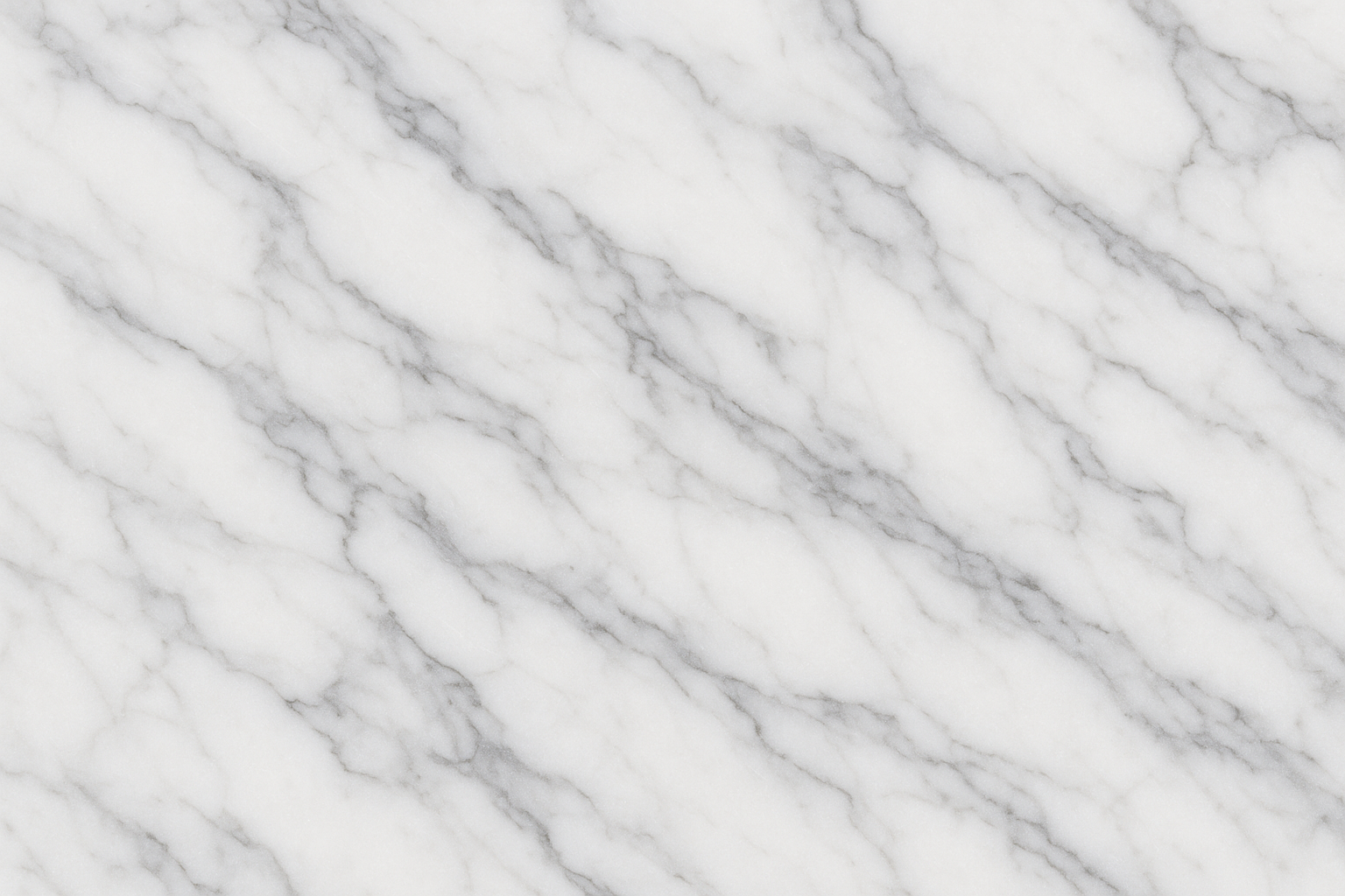
5. Marble Veining Patterns
Yeah, marble is everywhere now, but there's a reason - it just works. That classic white-gray Carrara marble never looks dated. Though I'll admit, I'm getting a little tired of seeing it on everyone's phone.
The dramatic black marble with gold veining looks incredible if you want something bolder, but make sure your screen resolution is good enough to show the details properly.
6. Misty Mountain Silhouettes
These layered mountain things in blue-gray? Chef's kiss. Super calming and your battery will thank you for all that dark space. The way the mountains fade into the distance creates this nice depth effect.
7. Ocean Wave Abstracts
Not actual photos of waves, but artistic versions. Way better than those cheesy beach photos that scream "I wish I was on vacation." The deep blue gradients with white foam details add just enough movement without being busy.
8. Wood Grain Textures
Rich, dark wood can look really sophisticated, but please - and I cannot stress this enough - make sure it's high resolution. Pixelated wood grain looks like cheap contact paper. The natural grain patterns are warm and organic if done right.
9. Stone and Rock Formations
River stones, cliff faces - basically anything that looks like it belongs in an expensive spa. The natural color variations keep it interesting without being overwhelming.
10. Desert Sand Dunes
These flowing sand patterns in gold and beige are gorgeous, but heads up - they're pretty bright, so your battery might suffer. The sculptural quality of wind-carved dunes is really unique though.
My friend who's a landscape architect picked one of those misty mountain wallpapers and it perfectly matched his whole outdoor professional thing. Clients always commented on how it reinforced his environmental focus during presentations.
Artistic and Creative Expressions
This is where I get myself in trouble. They look so pretty in the preview, but half the time you can't read your app names. Great for creative types or personal phones, but test the contrast first.
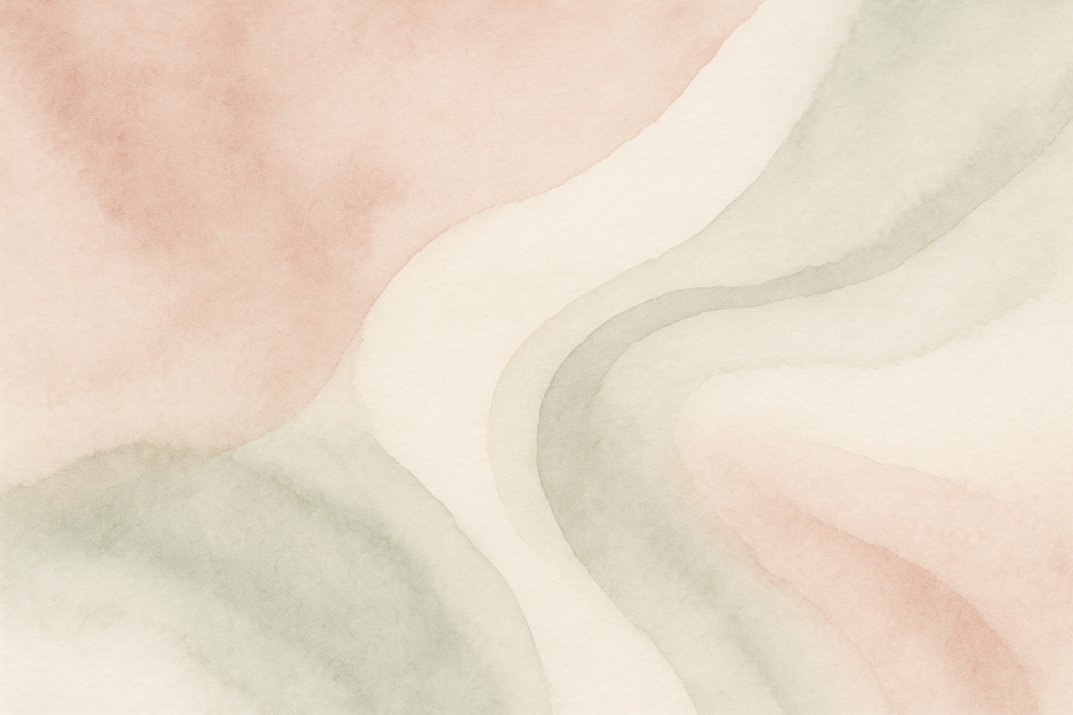
11. Watercolor Washes
Soft, dreamy colors bleeding into each other. Beautiful, but test it with your apps first - I've made this mistake too many times. The painterly quality is gorgeous when it works.
12. Ink Blot Abstractions
Like sophisticated Rorschach tests. Great conversation starters, though people might think you're weird for having psychology test patterns on your phone. The organic shapes in monochrome look surprisingly elegant.
13. Brush Stroke Textures
Bold paint strokes, usually with some metallic colors. Very "I went to art school" vibes. The directional movement adds energy while darker backgrounds help your battery.
14. Paper Texture Overlays
That subtle paper grain texture in cream or off-white. Looks expensive but might be too light for some people's taste. The natural fibers and imperfections give it a crafted feel.
15. Vintage Map Fragments
Old maps with that aged paper look. Perfect if you're into travel or history, but might confuse people who glance at your screen. The muted colors and historical details are pretty cool though.
Architectural and Urban Elements
These are money in professional settings. Makes you look like you appreciate good design and modern thinking. Usually great for icon visibility too because of all the clean lines and contrast.
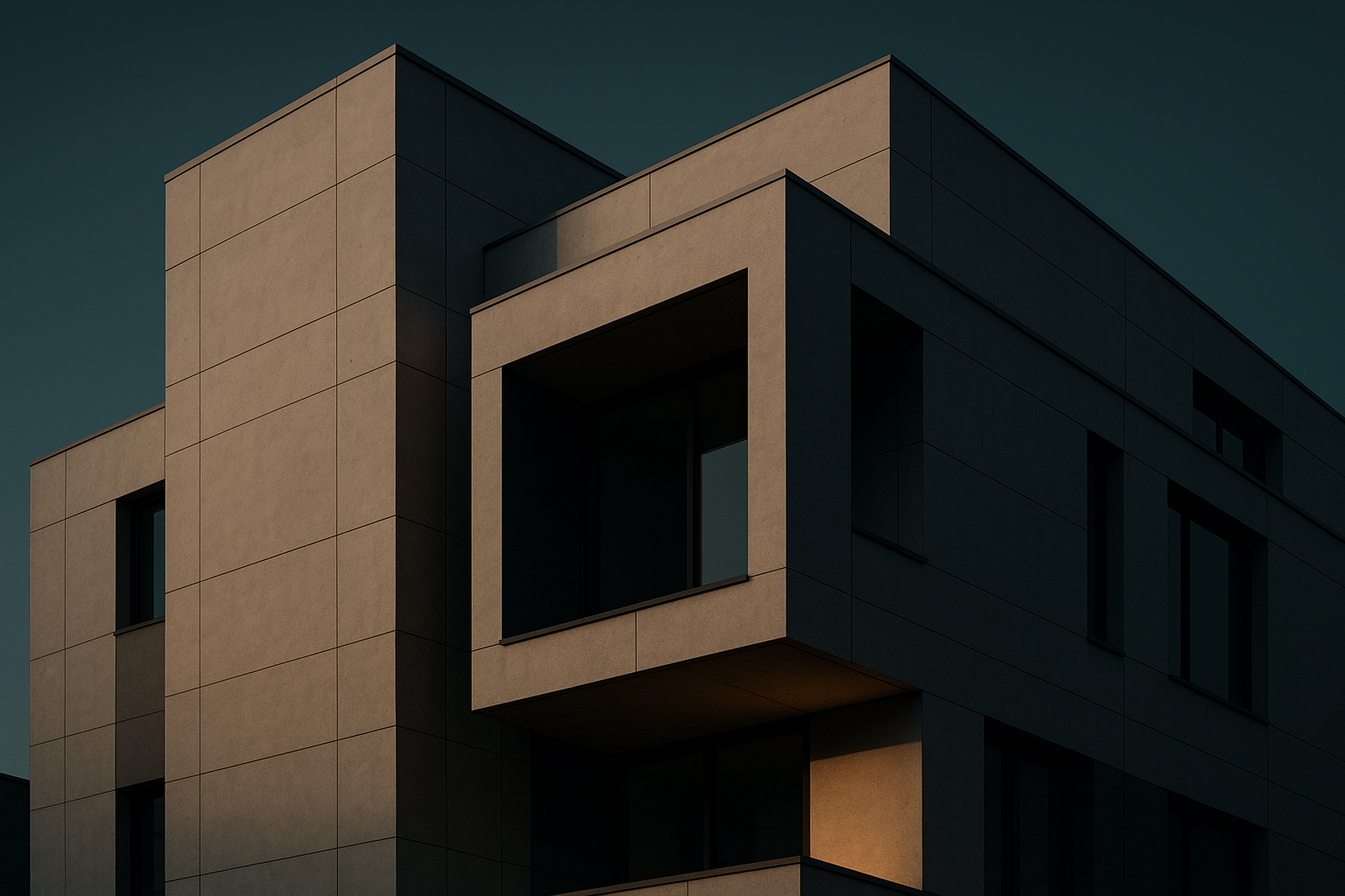
16. Modern Building Facades
Clean lines, dramatic lighting - basically architectural photography that makes you look sophisticated. Can't go wrong with these in business meetings. The repetitive patterns create nice visual rhythm.
17. Bridge Structure Details
Steel cables, geometric patterns - engineering as art. Appeals to the part of your brain that likes things organized. These showcase human achievement while giving you natural lines for organizing apps.
18. Staircase Perspectives
Spiral staircases photographed from cool angles. Looks artsy but not too artsy. The leading lines and depth work great for creating visual hierarchy on your home screen.
19. Window Grid Patterns
Repetitive windows from skyscrapers. The grid naturally matches your app layout, which is oddly satisfying. Professional sophistication without being boring.
Luxury and Metallic Themes
Fair warning - these need really good screen resolution to not look cheap. When they work, they're stunning. When they don't... yikes. Also, the bright metallic surfaces can be tough on your battery.
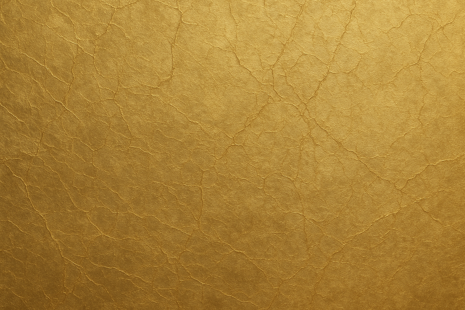
20. Gold Foil Textures
Subtle gold with natural crackling. Classy if done right, but can look gaudy if your screen isn't up to it. The warm metallic tones suggest premium quality without being too flashy.
21. Brushed Metal Surfaces
Stainless steel or aluminum with those directional brush marks. Very industrial chic, works with everything. The linear texture gives you natural organization zones for apps.
22. Crystal and Glass Refractions
Light through cut crystal creating rainbow effects. Gorgeous but can make finding apps a nightmare. The prismatic effects are sophisticated but test the visibility first.
23. Silk Fabric Draping
Luxurious fabric with natural folds. Looks expensive, feels expensive, might make your phone feel expensive too. This elegant wallpaper for phone displays works great for fashion industry people.
Seasonal and Time-Based Elegance
I love these but I'm terrible at remembering to change them. Nothing worse than having autumn leaves in March. They show attention to detail when you keep them updated though.
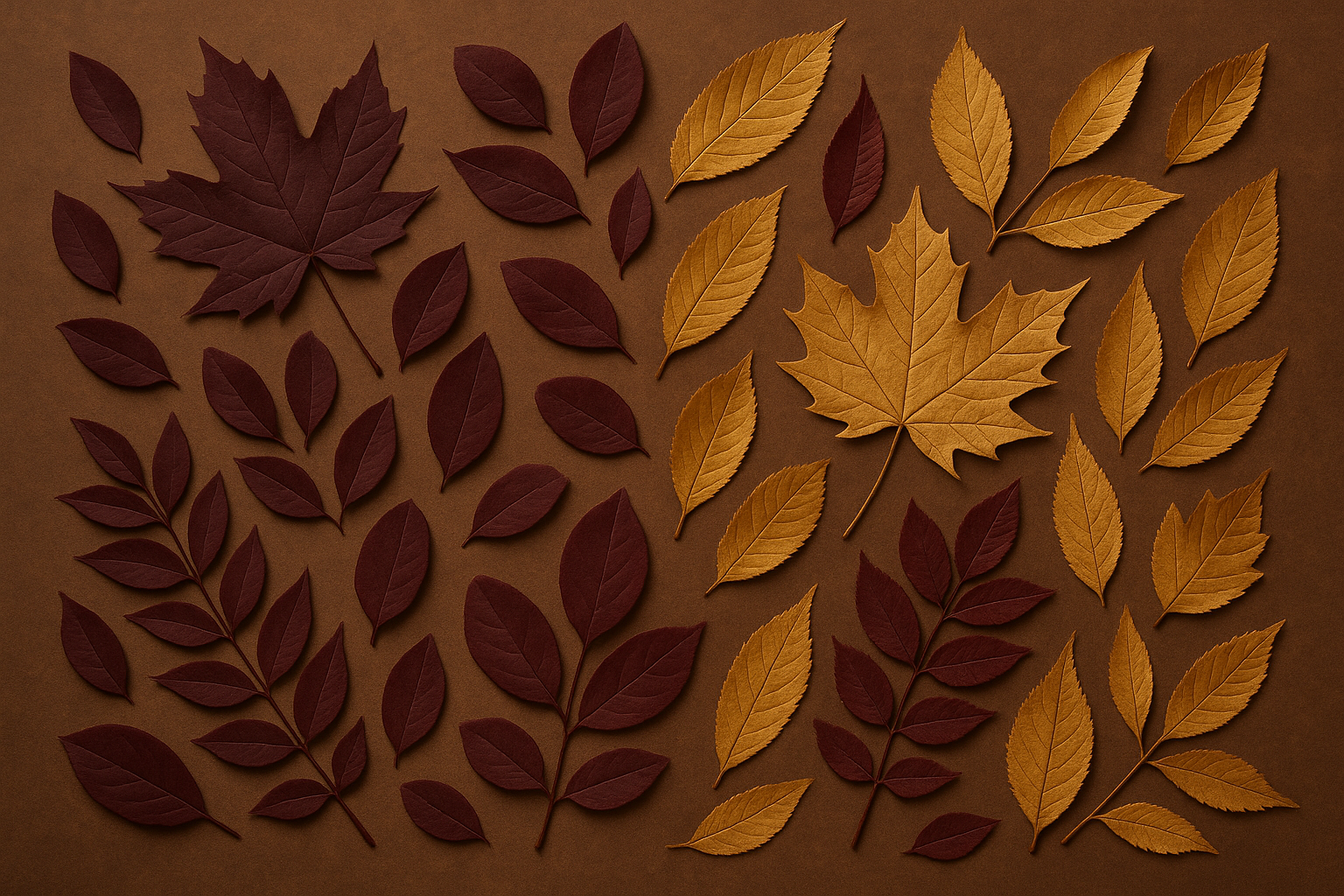
24. Autumn Leaf Arrangements
Rich burgundy and gold fallen leaves. Absolutely beautiful during fall, looks weird any other time of year. The warm colors create this inviting atmosphere and the natural arrangements work well for app organization.
25. Winter Frost Patterns
Delicate ice crystals on glass. Super pretty and calming, though maybe a bit too subtle for some people. These phone backgrounds showcase nature's mathematical precision while staying professional.
Deep Dive Analysis of Complex Wallpaper Options
Some of these wallpaper types are trickier than others. Let me break down the ones that can either look amazing or completely backfire depending on how you handle them.
Marble Veining Patterns (#5)
Okay, so marble wallpapers are everywhere, but when they're done right, they're timeless. The classic Carrara marble (white with gray veining) works with literally everything. The dramatic black marble with white veining is bold but still sophisticated.
The key is getting high-resolution versions that show the stone's natural depth. Cheap, flat marble photos look fake and destroy the whole luxury vibe you're going for.
The natural randomness keeps it interesting even after months of daily viewing. But seriously, don't cheap out on resolution here - it makes or breaks the whole effect.
Misty Mountain Silhouettes (#6)
These work by layering multiple mountain ranges at different distances - usually 3-5 layers getting progressively lighter from dark foreground to pale background. The atmospheric perspective creates this amazing depth effect.
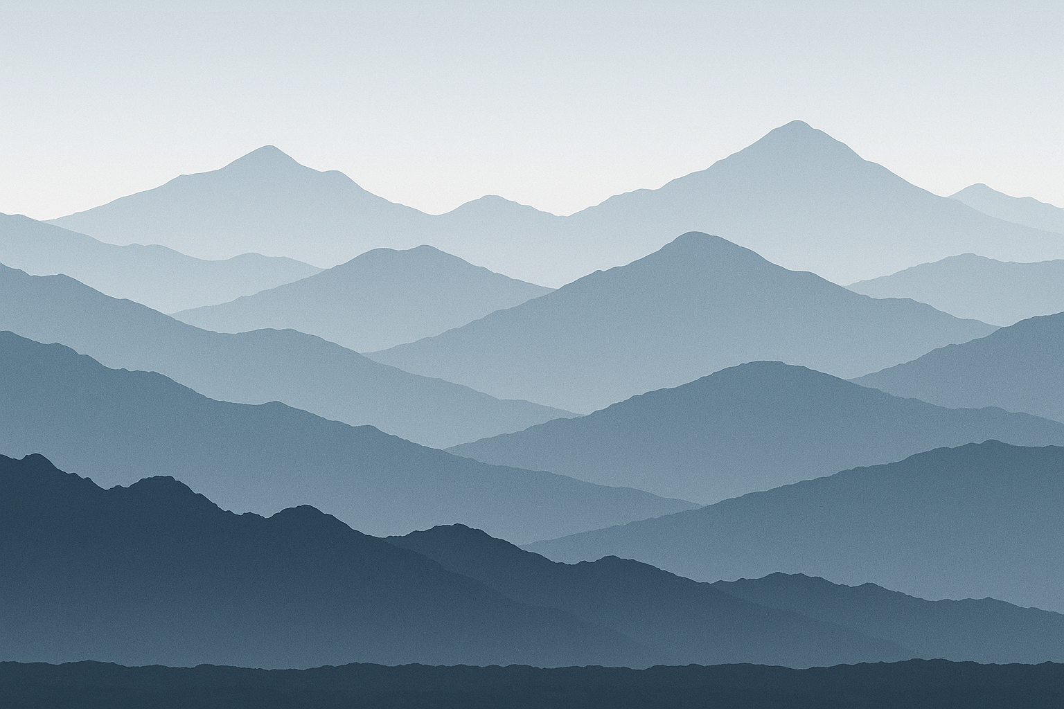
The misty effect softens everything while keeping the dramatic landscape impact. Colors are usually cool blue-gray spectrums that work with most interface themes without competing for attention.
Battery life is excellent because of all the dark colors, making these perfect for heavy phone users. The horizontal composition naturally creates zones for organizing your apps too.
Watercolor Washes (#11)
The sophisticated ones blend 2-3 colors organically - think dusty rose flowing into sage green, or deep navy transitioning to warm gray. More than 3 colors usually looks chaotic.
White space is crucial here. The best watercolor wallpapers have enough negative space so they enhance your interface instead of competing with it.
Icon visibility can be tricky depending on color intensity and where the colors blend. Always test your most-used apps before committing to a watercolor background.
Modern Building Facades (#16)
These focus on contemporary buildings' geometric beauty through dramatic lighting. Golden hour warmth or cool blue shadows work best for emphasizing the lines and textures.
Glass and steel surfaces create natural reflections and patterns, while repetitive window elements give you visual rhythm without chaos. The mathematical precision appeals to detail-oriented people while conveying professionalism.
These are perfect for business environments - they suggest structure, progress, and attention to detail without being distracting.
What Actually Matters When Choosing
Look, I could go on forever about technical specs, but here's what really matters from someone who changes wallpapers way too often:
Category |
Resolution Needs |
Can You See Apps? |
Good for Work? |
Battery Friendly? |
|---|---|---|---|---|
Geometric |
Not picky |
Excellent |
Perfect |
Yes (dark ones) |
Nature |
Needs quality |
Usually good |
Great |
Depends on colors |
Artistic |
High resolution |
Hit or miss |
Maybe not |
Medium |
Architecture |
High resolution |
Excellent |
Absolutely |
Pretty good |
Luxury/Metallic |
Super high |
Can be tricky |
Yes (if subtle) |
Not really |
Seasonal |
High resolution |
Varies |
Okay |
Varies |
Resolution stuff: Just match your phone model when downloading. Most wallpaper sites let you filter by device - use it. Don't try to force a square wallpaper onto a rectangular screen.
Can you see your apps? Seriously, test this. That gorgeous sunset might make your white app icons disappear completely. I've learned this lesson too many times.
Battery life: Darker wallpapers genuinely help, especially on newer phones with OLED screens. Mountain silhouettes and deep ocean scenes are your friends here. Bright desert scenes or sunlit textures will drain your battery faster.
Professional settings: If you're in meetings a lot, stick with geometric patterns or architecture. Save the artistic stuff for personal phones or creative industries.
Personal brand stuff: Your phone shows up more than you think - meetings, social situations, handing it to someone to show them something. Pick wallpapers that match the vibe you want to project.
Minimalist Geometric Designs Performance
These are basically foolproof. Since they're simple mathematical designs, resolution doesn't matter as much - they stay crisp on any phone. Perfect if you upgrade devices a lot or share wallpapers between phones.
You can always see your apps clearly because these designs prioritize clean space and contrast. They're also the most professional-looking option - geometric patterns suggest you're organized and pay attention to details.
Battery efficiency varies by color choice. Dark geometric patterns are excellent for battery conservation, while lighter versions might use more power but work better in bright sunlight.
Natural Textures and Landscapes Performance
These need high-quality source images or they look muddy and cheap. Marble and wood grain especially suffer from poor resolution - they lose all their tactile appeal.
Icon visibility varies a lot within this category. Mountain silhouettes and ocean abstracts usually provide great contrast, while busy textures might require strategic icon placement.
They're great for professional use, especially if you work in outdoor industries, environmental organizations, or companies that emphasize natural values.
Battery efficiency favors the darker landscapes significantly. Mountain silhouettes and deep ocean scenes help preserve battery life, while bright desert scenes or sunlit textures consume more power.
I know someone who started with a bright desert dune wallpaper that looked amazing but killed his phone battery during long workdays. After switching to a darker mountain silhouette with similar elegant curves, he kept the sophisticated look while gaining several hours of battery life.
Artistic and Creative Expressions Performance
These need high resolution to capture subtle color transitions and smooth gradients. Watercolor and ink effects benefit tremendously from quality source images to maintain their painterly quality.
Icon visibility requires careful selection. Watercolor washes with enough white space work great, while busy brush strokes might interfere with reading app names.
Professional appropriateness works best for creative industries or personal use. These might appear too artistic for conservative business environments but excel in design, marketing, or creative fields.
Battery efficiency typically favors darker artistic backgrounds. Light watercolor washes and bright artistic elements consume more battery than darker, subdued creative expressions.
Architectural and Urban Elements Performance
These demand high resolution to maintain sharp architectural lines and professional appearance. Blurry building details destroy the precision and sophistication these wallpapers are meant to convey.
Icon visibility generally excels due to strong geometric contrast and well-defined light and shadow areas. The structured nature of architectural elements naturally complements app icon arrangements.
Professional appropriateness reaches peak performance here. Architectural wallpapers suggest structure, progress, and modern thinking - ideal for business use across virtually all industries.
Battery efficiency depends on overall brightness levels. Shadowy architectural details provide better battery conservation, while bright glass and steel surfaces may consume more power.
Luxury and Metallic Themes Performance
These require maximum resolution to capture fine details and subtle light effects that define premium materials. Poor resolution instantly reveals these wallpapers as cheap imitations rather than luxury expressions.
Icon visibility presents challenges through metallic surfaces that may create glare effects interfering with text. Careful selection becomes essential to maintain usability while achieving luxury aesthetics.
Professional appropriateness works well for luxury brands, high-end services, or personal use when understated rather than flashy. These suggest quality and attention to detail without appearing ostentatious.
Battery efficiency typically suffers due to bright metallic surfaces and reflective elements. These prioritize visual impact over power conservation, making them better suited for users with reliable charging access.
Seasonal and Time-Based Elegance Performance
These need high resolution to capture natural details. Macro photography resolution becomes essential to showcase the intricate beauty that makes these wallpapers compelling.
Icon visibility varies significantly - autumn leaves generally provide good contrast through natural color variation, while delicate frost patterns may require darker variants for adequate text readability.
Professional appropriateness can demonstrate environmental awareness and attention to seasonal details. However, these require regular updating to maintain relevance and avoid appearing outdated.
Battery efficiency varies dramatically within this category. Bright autumn colors consume more power than subtle winter tones, while the natural color palettes generally provide moderate efficiency levels.
Wallpaper Type |
Best For |
Avoid If |
How Often to Change |
|---|---|---|---|
Dark Marble |
Heavy users, professionals |
You prefer bright displays |
Maybe once a year |
Mountain Silhouettes |
Battery conscious, minimalists |
You need high contrast icons |
With the seasons |
Geometric Patterns |
Business users, frequent upgraders |
You want personal expression |
Rarely |
Architectural |
Corporate environments |
You work in creative fields |
Twice a year |
Watercolor |
Creative professionals |
Conservative industries |
Monthly if you get bored |
Seasonal Elements |
Detail-oriented users |
You forget to update |
Every few months |
Protecting Your Elegant Display with Rokform
You've spent time picking the perfect elegant wallpaper that actually works for your lifestyle and looks professional. That sophisticated marble texture or clean geometric pattern deserves protection that won't mess up its visual impact through scratched screens or cheap plastic that makes colors look weird.
Rokform's crystal-clear protection keeps your wallpaper looking exactly how it's supposed to while providing serious durability. Whether you picked architectural elements for work meetings or natural textures for personal inspiration, your screen stays pristine through daily use and unexpected drops.
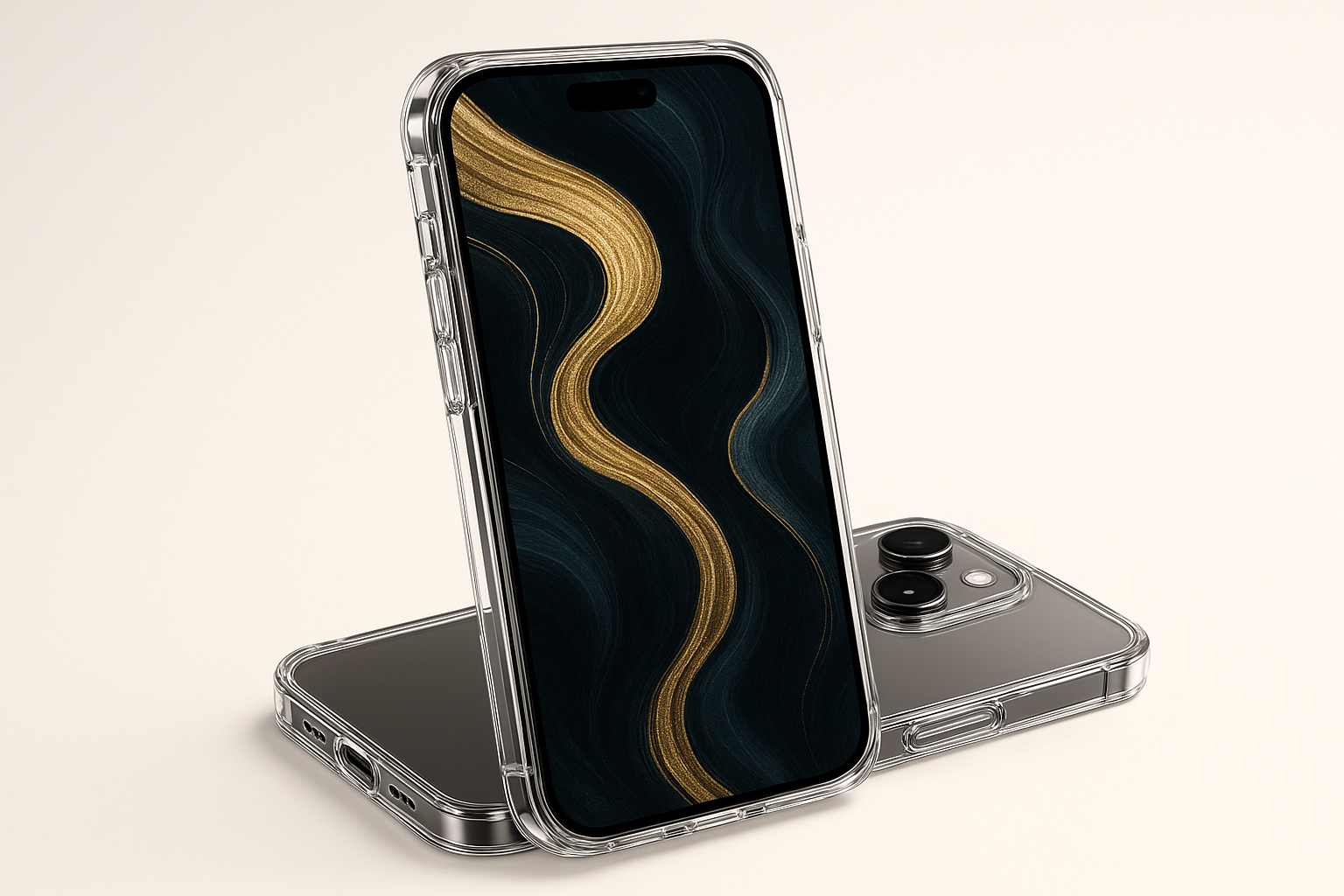
The magnetic mounting systems turn your phone into a sophisticated display piece, so people can actually appreciate your refined aesthetic choices while keeping your device secure and accessible. Your elegant mountain silhouette or luxury metallic wallpaper becomes a conversation starter when properly displayed at the perfect viewing angle.
For professionals who pick wallpapers to project success and attention to detail, Rokform's premium materials and precise manufacturing reflect those same values. The brand's commitment to durability ensures your phone's elegant appearance isn't compromised by wear, maintaining the sophisticated image your wallpaper selection was meant to convey.
Ready to protect your elegant display? Explore Rokform's collection of rugged cases designed to keep your sophisticated wallpapers looking pristine while surviving real-world adventures.
Final Thoughts
The perfect elegant wallpaper isn't necessarily the prettiest one in the gallery - it's the one that makes your daily phone experience better without creating problems. Your choice should reflect your personal style while actually working in real life and professional situations.
Think about how you use your phone throughout the day. Heavy users benefit from darker wallpapers that save battery, while professionals need options that look good in business settings. Your phone background appears in countless daily interactions, so pick something that consistently makes you happy rather than frustrated.
Remember that you can always change your wallpaper as your needs evolve. Seasonal updates, job changes, or just wanting something fresh are all perfectly valid reasons to switch things up. The key is understanding what works for your specific device, usage patterns, and aesthetic preferences.
Take time to test your chosen wallpaper in different lighting conditions and with your actual apps. What looks perfect in the preview might create visibility issues when you're actually trying to use your phone. The best elegant phone wallpapers enhance rather than compete with your phone's functionality while providing daily visual satisfaction.
These cool phone wallpapers represent just the beginning of your personalization journey. Whether you gravitate toward minimalist geometry or luxurious textures, the right phone wallpapers will transform your device into a reflection of your refined taste and practical needs.
Personally, I'm probably biased toward darker wallpapers since my battery life is terrible, but I've found that mountain silhouettes might sound boring at first, but they're actually pretty calming and work with everything. The marble thing is overdone, but there's a reason everyone uses it - it just works.
The best wallpaper is honestly the one you don't think about. If you're constantly adjusting brightness or squinting at app names, it's not working. And yeah, you can always change it - I probably switch mine monthly, which my friends think is weird, but whatever. Your phone should make you happy when you look at it, not frustrated.


