


According to Oh So Lovely Blog, there are over 55 different February wallpaper design options available for 2025, spanning everything from Valentine's Day themes to Black History Month tributes (source). I spent way too long last February switching between wallpapers because I'm indecisive like that – scrolling through dozens of options, trying to find something that captured both the romantic vibes and winter's lingering presence. Turns out, it's harder than you'd think!
February sits in this weird sweet spot where winter meets spring, love fills the air, and cultural celebrations demand recognition. Your phone wallpaper isn't just decoration; it's literally the first thing you see dozens of times daily. The right february phone wallpaper can boost your mood during those final winter weeks, celebrate the season's special moments, and actually reflect who you are instead of just looking pretty in screenshots.
I found 25 wallpapers that actually don't suck, spread across different vibes and styles. Some are romantic without being cheesy, others capture winter's beauty without being depressing, and a few celebrate the cultural significance of February in meaningful ways.
What Actually Makes a Good February Phone Wallpaper
The thing about February wallpapers is they need to actually work with your messy home screen. I learned this the hard way after falling in love with an intricate rose pattern that made finding my Uber app impossible during a rainstorm. Not fun.
Here's what actually matters when you're picking one:
Your phone needs to handle it without looking like garbage. Match your screen resolution or go higher - nobody wants pixelated romance. And if you've got one of those fancy OLED screens, darker wallpapers won't murder your battery. Trust me on this one.
Pretty is useless if you can't use your phone. I don't care how stunning that floral explosion looks - if you spend five minutes hunting for your texting app every time, you'll hate it within a week. Look for designs with enough empty space that your icons don't disappear into the background.
February is weird seasonally, and your wallpaper should get that. We're stuck between winter's last tantrum and spring's shy debut, plus there's Valentine's Day drama and Black History Month to consider. Your wallpaper choice can either embrace this chaos or ignore it entirely - both are valid.
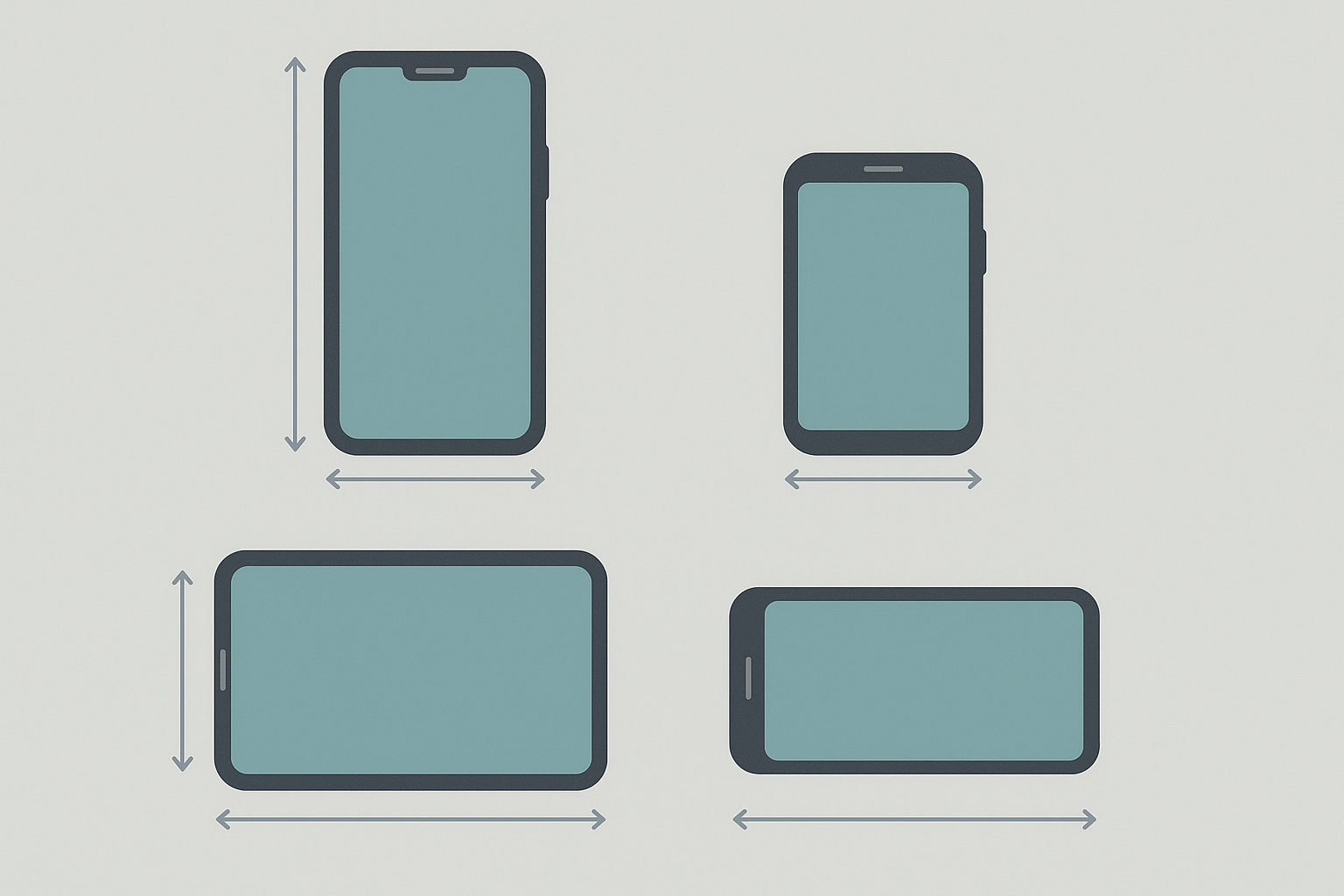
You know that feeling when your wallpaper is gorgeous but you can't find your messaging app? Yeah, been there. The busy patterns might look amazing on Pinterest, but they turn your home screen into a visual nightmare. Icon visibility trumps beauty every time, and I'm probably biased toward the minimalist stuff because I'm lazy about organizing my home screen.
The Romance Stuff (Because It's February)
Look, Valentine's Day wallpapers can go really wrong really fast. I've seen everything from aggressive red hearts that hurt your eyes to cheesy quotes that make you cringe every time you check your phone.
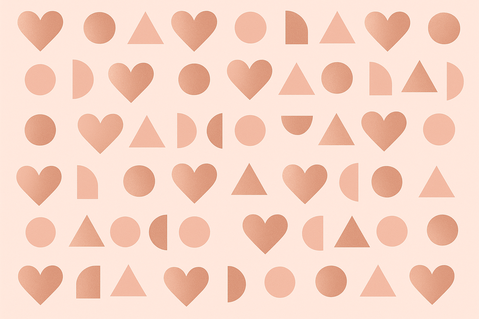
The geometric heart thing actually works. Rose gold and soft pink in clean shapes - it's romantic without being obnoxious. Your apps stay visible, and you won't get sick of it after February 15th. The subtle gradient backgrounds with metallic accents provide just enough depth without overwhelming your screen.
Vintage love letters are hit or miss. They photograph beautifully with those aged paper textures and handwritten script, but that sepia and burgundy combo can make reading notifications a nightmare. Only go here if you're committed to the aesthetic over practicality.
Neon hearts are surprisingly awesome, especially if you're into that urban vibe. Electric pink and purple against dark backgrounds create insane contrast on newer phones, and they actually save battery if you've got an OLED display. Plus they don't scream "I'm desperately single" or "I'm aggressively coupled" - they just look cool.
Skip the rose bouquet photos unless you're really organized. High-resolution red roses and pink peonies are gorgeous, don't get me wrong, but good luck finding anything on your home screen. The professional photography quality is stunning, but save them for your laptop maybe.
Abstract love waves offer a modern twist with flowing, organic shapes in warm pink and coral. The gradient transitions from deep rose to soft peach give you romance without the literal hearts everywhere. Plus there's enough negative space to actually use your phone.
Winter Stuff That Actually Looks Good
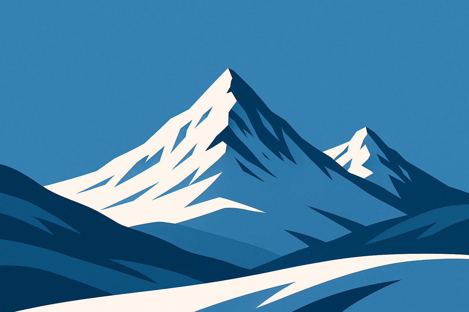
Mountain peaks are basically cheat codes for phone wallpapers. Clean lines, natural contrast in cool blue and white, and they make you look outdoorsy even if you haven't left your apartment in three days. The snow provides perfect negative space for your apps.
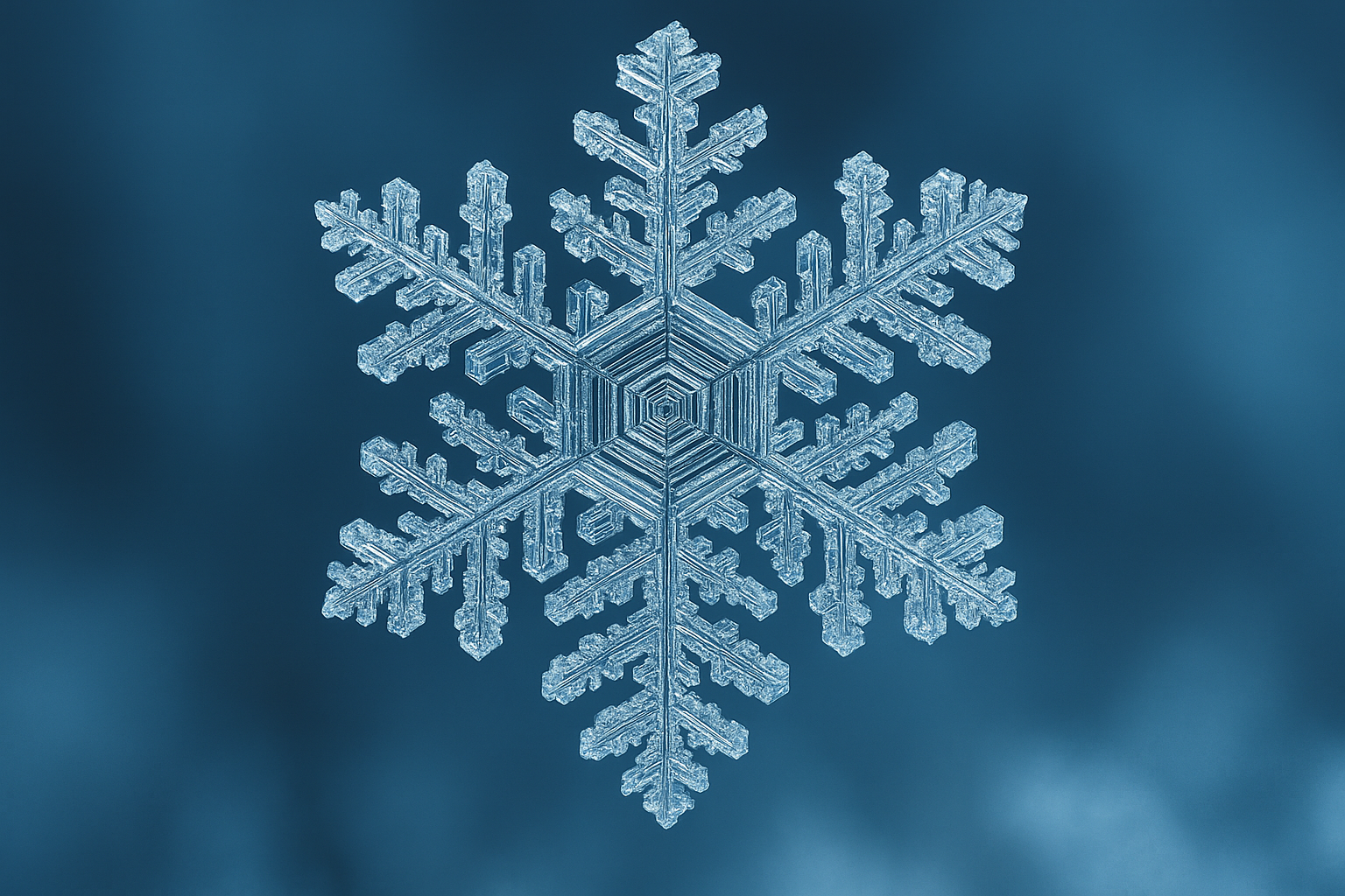
Forest ice photos are tricky. Those intricate ice crystal formations on tree branches look incredible with macro photography and shallow depth of field, but all that texture can turn your home screen into a visual nightmare. Maybe stick to your lock screen for these detailed shots.
Northern lights wallpapers are incredible if you can find authentic ones. Most of them are oversaturated nonsense, but the real deal with those green and purple aurora colors in 4K resolution? Chef's kiss. The natural aurora colors (that's oxygen green at 557.7nm and nitrogen purple at 427.8nm, if you're into the science) look absolutely stunning against star-filled night skies.
A photographer friend living in Alaska told me she uses aurora wallpapers as reference for editing her professional shots. Turns out the authentic green and purple hues help her remember the exact color combinations she witnessed during spectacular aurora events. Who knew wallpapers could be practical?
Wildlife shots work better than you'd think. Professional photography of snow owls, foxes, and deer against natural winter habitats gives you that nature vibe without the busy background problems. Plus, who doesn't want a majestic animal judging them every time they check Instagram?
Ice crystal macro shots are fascinating if you're into extreme close-ups of snowflake formations. The scientific beauty mixed with artistic composition creates incredible detail, especially on larger phone screens where you can actually see the intricate structures.
The Artsy Abstract Route
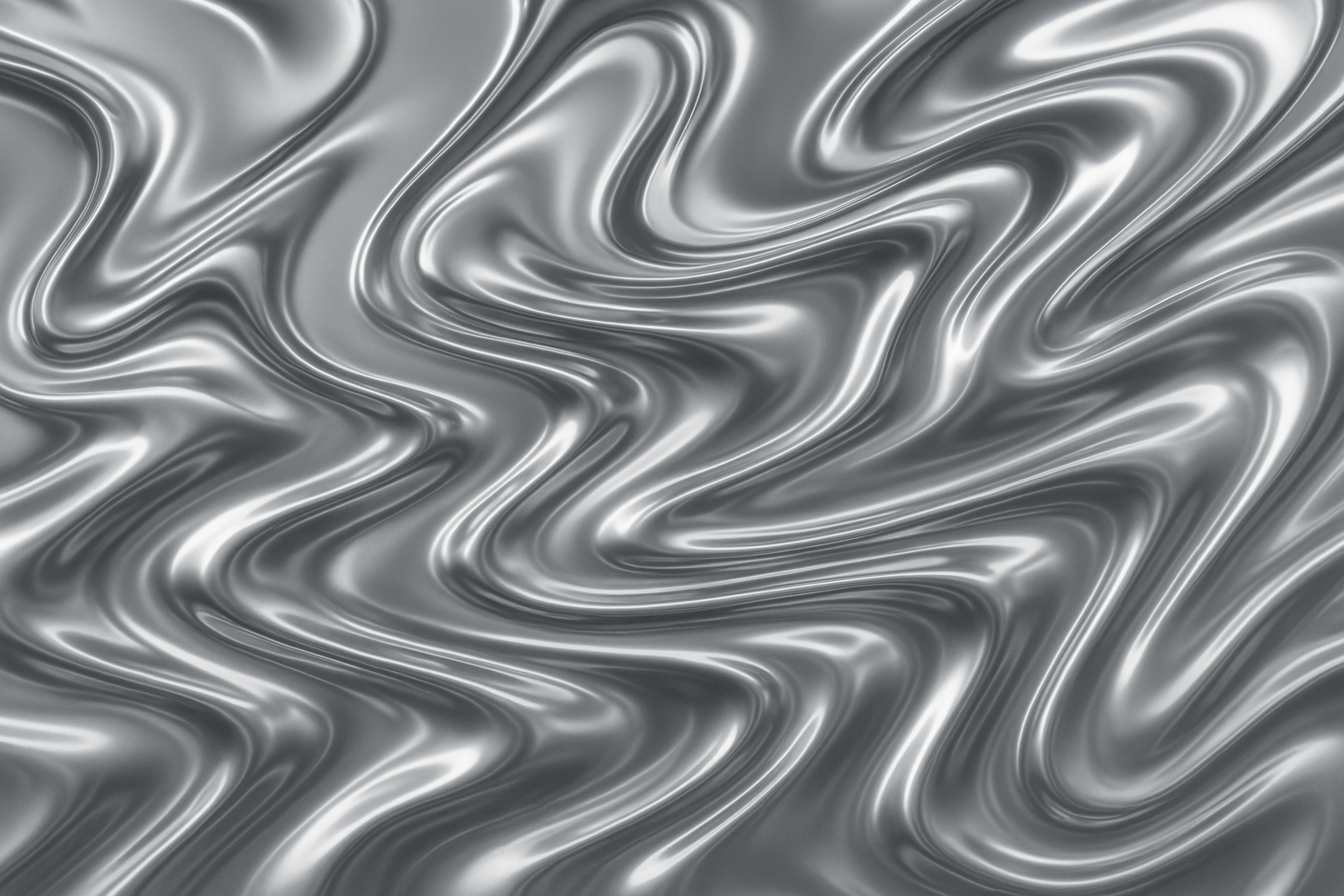
Liquid metal effects look expensive, which is either exactly what you want or completely not your vibe. Chrome and silver metallic flows with dynamic movement create premium visual appeal and make your phone look sophisticated. They photograph well for social media if that's your thing.
Watercolor washes are safe choices. Soft, bleeding colors in February-appropriate hues provide organic beauty without being too aggressive. They play nice with most app icon styles and won't annoy you after a week. Not exciting, but they won't drive you crazy either.
Geometric crystal stuff appeals to people who like their aesthetics clean and mathematical. 3D rendered crystal formations with prismatic light effects and rainbow refractions look crisp on any phone since they're vector-based. They scale perfectly without quality loss, but they might be too sterile for some tastes.
Smoke and ink abstracts offer sophisticated artistic appeal with fluid dynamics captured in high-contrast black and white. The monochromatic approach works with basically any setup while satisfying your inner art enthusiast.
Glitch art is for people who want their phone to look like it belongs in a sci-fi movie. Intentional digital distortions through pixel sorting and RGB channel displacement in cyan, magenta, and yellow create cutting-edge visual expression. Love it or hate it territory - there's no middle ground.
Motivation That Doesn't Suck
Most motivational wallpapers are aggressively cheesy, but a few actually work without making you roll your eyes every morning.
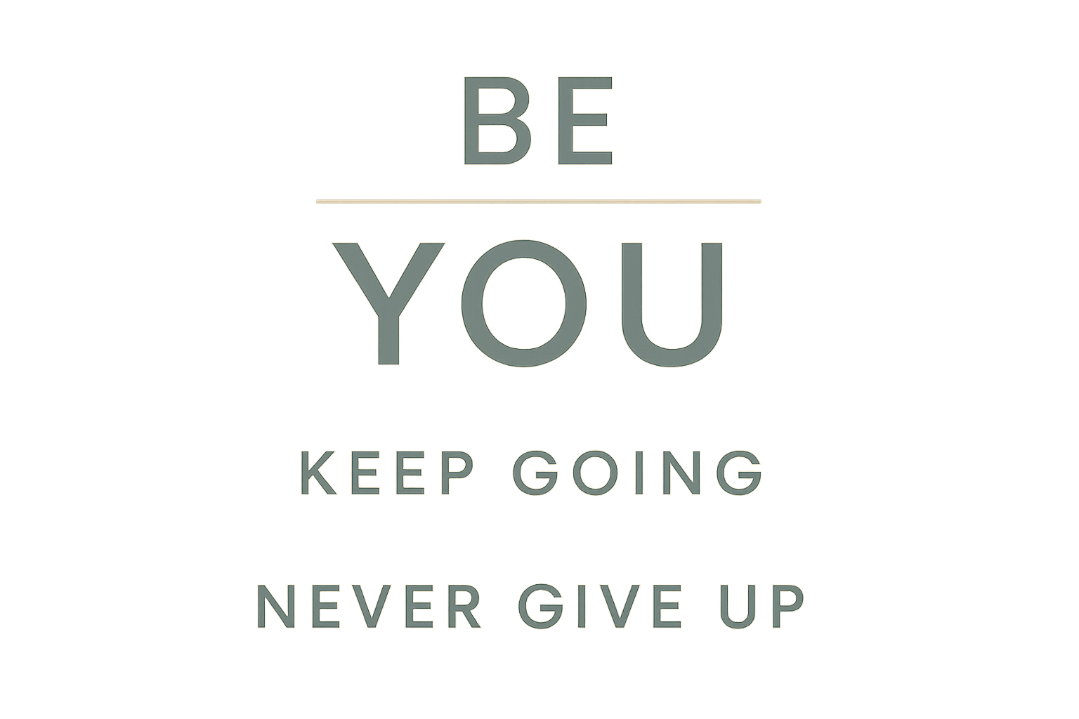
Typography done right is clean and helpful. Modern fonts with inspiring February quotes against minimalist backgrounds in calming colors provide daily motivation without being preachy. The key is finding quotes that won't make you cringe in three weeks, and these are specifically designed with UI elements in mind.
Sunrise cityscapes hit different if you're actually trying to get your life together. Urban dawn photography with warm lighting symbolizes new beginnings without being obnoxious about it. They're optimistic without being preachy, and the natural lighting usually works well with app visibility.
Mountain achievement photos work if you're into that whole "conquer your goals" mindset. Lone figures conquering snowy summits with dramatic lighting and vast landscapes inspire ambitious personalities. Just don't pick anything too dramatic unless you want to explain your wallpaper choice to people.
Growth through adversity imagery is surprisingly powerful. Plants breaking through snow and ice provide metaphorical resilience without hitting you over the head with it. The symbolic representation works well for anyone going through tough times while offering genuine hope and encouragement.
The Seasonal Transition Thing
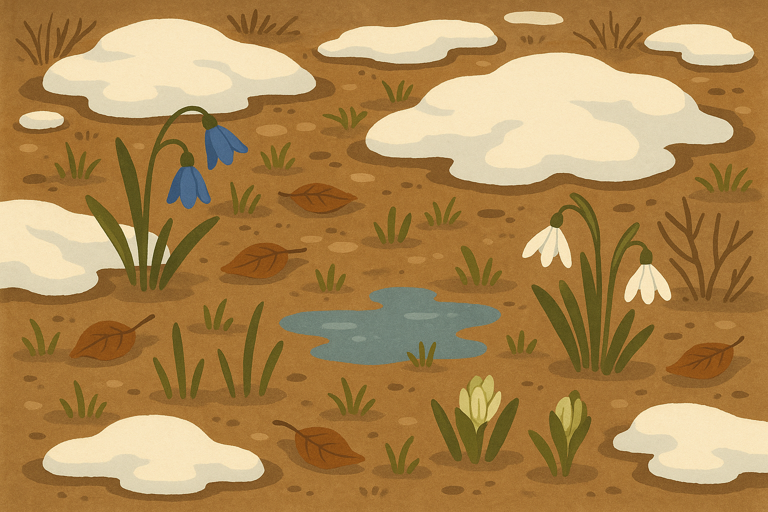
February is awkward seasonally, and some wallpapers get that. Late winter thaw images with melting snow revealing early spring elements and tiny green shoots? That's February energy right there. They acknowledge where we actually are instead of pretending it's full winter or spring.
Sky gradients in those weird February sunset colors are underrated. Authentic February sunset and sunrise colors in pastel transitions from winter to spring palettes capture the month's unique light perfectly. They're subtle, seasonally accurate, and work with pretty much any app setup.
Bare tree branches against colorful skies are minimalist gold. Natural architecture emphasizing form over foliage provides great contrast without competing with your apps for attention. The artistic approach appeals to people who appreciate nature's structural beauty.
Cultural Stuff Worth Considering
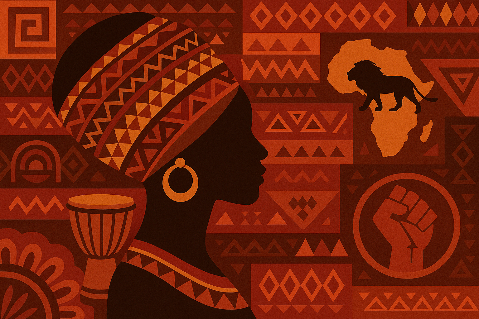
Black History Month deserves better than token gestures, so if you're going this route, find something with actual artistic merit and cultural significance. Rich, warm colors with historical importance honor February's significant cultural observance properly, and the cultural awareness aspect makes these wallpapers meaningful beyond just looking good.
Winter sports wallpapers are motivating if you're into that scene. Dynamic skiing, snowboarding, and ice hockey imagery with high-energy compositions and motion blur can actually pump you up for your day, especially if you're stuck indoors dreaming of powder days.
A snowboard instructor from Colorado told me that switching to action sports wallpapers during February significantly boosted her motivation during early morning lessons. The dynamic imagery reminded her why she loved her profession, especially on those challenging days when weather conditions were rough.
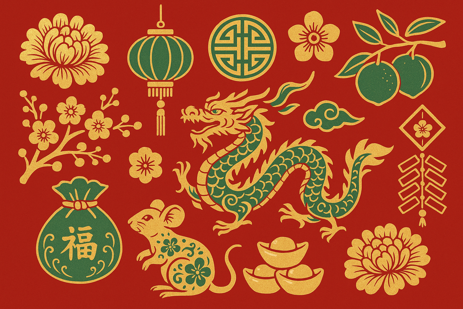
Lunar New Year elements are beautiful and often overlooked. Traditional Asian artistic motifs in red, gold, and jade color schemes celebrate multicultural traditions with stunning festive designs. They acknowledge February's Lunar New Year celebrations and provide meaningful cultural representation that doesn't get enough mainstream attention.
Okay, Let's Be Real About Which of These Actually Work
After testing way too many wallpapers (because I have no self-control), here's what I learned from actual daily use:
The aurora one is stunning but might be too much for daily use. It's like having a screensaver from 1998, but in a good way. Great for impressing people, questionable for productivity. The 4K source resolution ensures incredible detail, but those authentic aurora colors can be distracting.
Simple geometric hearts are the sweet spot for romance. Cute enough for February, functional enough for March, and they don't make you look desperate. The 15% opacity overlays ensure your apps remain accessible while still getting that romantic vibe.
Winter thaw images perfectly capture February's weird energy. They're seasonal without being too specific, and they give you hope that spring is actually coming. The authentic seasonal representation resonates with people who appreciate nature's gradual changes.
Neon stuff looks incredible on newer phones but might seem dated in a few years. The high contrast design provides excellent battery savings on OLED displays while delivering contemporary urban aesthetics. Proceed with awareness.
Typography wallpapers are great until you get sick of reading the same quote 47 times a day. Choose wisely, and make sure the design considers UI elements so your phone remains functional.
Mountain peaks consistently perform well because they provide natural contrast and clean composition that works with any app setup. Outdoor enthusiasts love them, but honestly, they make everyone look more adventurous.
Fair warning: some of these look way better on Instagram than on your actual phone. The busy patterns are pretty but you might hate them after a week of struggling to find your apps.
Protecting Your Perfect Display
Choosing the perfect february wallpaper iphone is only half the battle - you need to protect that beautiful display too. If you've spent time finding the ideal wallpaper, whether it's those vibrant neon hearts or subtle mountain peaks, you want a case that won't interfere with color reproduction or clarity.
Look for cases with crystal-clear protection that maintain true colors without adding yellow tints or reducing brightness. Military-grade protection becomes essential if you're drawn to those winter sports or outdoor adventure wallpapers - your phone needs to survive the environments these images represent.
The magnetic mounting systems work great for navigation or hands-free viewing, and they're compatible with wireless charging so you can enjoy your chosen wallpaper while keeping your device powered up. Whether you're displaying motivational quotes during workouts or showing off those geometric crystal structures, your case should enhance rather than hinder the experience.
The Bottom Line on February Wallpapers
The truth is, you'll probably change your wallpaper three times this month anyway because that's what people do. The key is picking something that won't actively annoy you while you're figuring out what you actually want.
Skip anything too busy, too bright, or too specific to one day (looking at you, Valentine's themed disasters). February is short enough without having to explain your wallpaper choices to yourself every morning.
Your february phone wallpaper should work with your actual life, not against it. Whether you go for the scientific beauty of ice crystals, the cultural significance of Black History Month tributes, or the transitional hope of late winter thaw, pick something that makes you feel good when you see it 50 times a day.
And honestly? Sometimes the best wallpaper is just something simple that makes your apps easy to find and doesn't drain your battery. Revolutionary concept, I know. But February's brief span makes it perfect for experimenting with seasonal themes that capture both winter's final moments and spring's approaching promise - just make sure you can still order your coffee without hunting through a visual maze every morning.

