


Here's something cool I discovered: minimalist wallpapers usually have darker or single-tone backgrounds, which can reduce battery consumption on OLED iPhones because black pixels use less power. I found this out the hard way when I switched from my chaotic, colorful wallpaper collection to a single, clean geometric design – my phone felt way more organized, and I actually noticed my battery lasting longer throughout the day.
Your wallpaper choice affects way more than just looks. It changes how you use your device, impacts your focus, and even determines how well your apps work together. I've put together 25 awesome minimalist phone wallpapers in 6 different styles, each tested for real-world use so you know what actually works.
Table of Contents
What Actually Makes a Minimalist Wallpaper Work
-
25 Top Minimalist Phone Wallpapers in 6 Styles
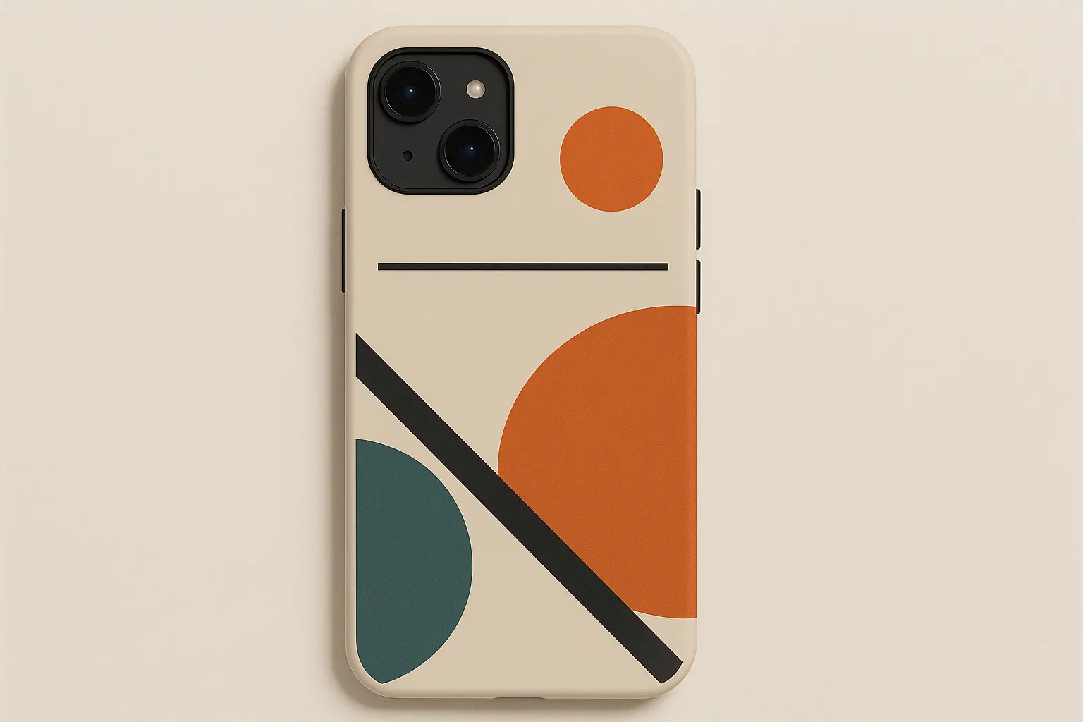
Geometric Abstractions (5 wallpapers)
Nature-Inspired Minimalism (4 wallpapers)
Monochromatic Studies (4 wallpapers)
Subtle Color Palettes (4 wallpapers)
Architectural Elements (4 wallpapers)
Digital Minimalism (4 wallpapers)
How Rokform Enhances Your Minimalist Phone Experience
Things to Think About for 2025
Final Thoughts
TL;DR
Make sure you can actually see your app icons – that's priority number one
Don't cheap out on image quality – blurry wallpapers look terrible on modern screens
Darker wallpapers save battery on OLED screens, lighter ones are better for readability
Colors actually affect your mood – cool tones help you focus, warm ones give you energy
Geometric designs work best if you want clean app organization
Nature-inspired wallpapers honestly make scrolling through your phone way more relaxing
Black and white never goes out of style
Architectural stuff is perfect if you're the type who likes everything organized
Digital minimalism themes are great for tech nerds who still want clean aesthetics
Rokform cases complement minimalist looks without adding visual clutter
What Actually Makes a Minimalist Wallpaper Work
Here's the thing – picking good minimalist phone wallpapers isn't just about finding something that looks pretty. You need to think about six things that balance looking good with actually working. Can you see your app icons clearly? Does it look crisp on your phone's screen? How do the colors make you feel throughout the day? If you want your phone to last all day, does it drain your battery? Will you still like it in six months? And does it help you organize your home screen better?
Before we dive into the actual wallpapers, you need to understand what separates wallpapers that actually work from ones that just look good in screenshots.
When you're picking the perfect wallpaper, think about how it'll work with your protective phone case to create a look that actually makes sense together.
What to Look For |
Sweet Spot |
How It Affects Daily Use |
Battery Stuff |
|---|---|---|---|
Can You See Your Icons? |
High contrast |
Less eye strain, easier to find apps |
Higher contrast usually means darker backgrounds (good for OLED) |
Color Temperature |
5000K-6500K |
Cool colors help focus, warm ones energize |
Cooler colors typically use less battery on OLED |
How Busy Is It? |
1-3 elements max |
Less distracting, better app organization |
Simple designs usually have more dark space |
Image Quality |
Match your phone's resolution |
No pixelation or stretching |
Properly sized images load faster |
Screen Brightness |
20-40% |
Comfortable viewing, less eye fatigue |
Lower brightness saves tons of battery |
Here's the Thing - Your Wallpaper Needs to Actually Work
Your wallpaper is basically the backdrop for your apps and widgets – your actual stuff is what matters. The best minimalist phone wallpapers make your interface look better instead of fighting with it. You need good contrast between light and dark areas so you can actually see your icons no matter where they are on the screen.
This goes way beyond just looking nice. Bad contrast makes you squint, hunt for apps, or constantly move things around on your home screen. That totally defeats the point of minimalist design.
My friend Sarah told me she switched from some busy floral thing to a simple gray gradient and could suddenly find her productivity apps 30% faster during crazy workdays because the clean background got rid of all the visual noise that made her hunt for the right icons.
Don't Cheap Out on Image Quality
Modern phones have insanely high-resolution screens, and your minimalist phone wallpaper should match your device's actual resolution to avoid looking pixelated or stretched. iPhone users need wallpapers made for Retina displays, while Android users should check their specific phone's screen size.
A blurry wallpaper immediately ruins the clean, professional look you're going for. Trust me, it's worth spending extra time finding properly sized images instead of settling for something that "looks close enough."
Colors Actually Affect Your Mood
Minimalist doesn't mean boring or no color at all. The colors you pick seriously impact how you interact with your phone all day. Cool tones help you stay calm and focused – perfect if you use your phone mostly for work stuff. Warm tones can give you energy and inspire creativity when you need that extra push.
Think about how the wallpaper's vibe matches your lifestyle and work habits. Are you using your phone mainly for business? Creative projects? Staying connected with people?
Battery Life Actually Matters More Than You Think
Darker minimalist phone wallpapers help your battery last longer on OLED screens because they need less power to light up the pixels. This becomes super important if you're on your phone constantly throughout the day.
But honestly, don't sacrifice functionality just to save battery. A slightly brighter wallpaper that makes your workflow better might be worth the tiny battery trade-off.
Pick Something You Won't Get Sick Of
Trendy designs get old fast, but good minimalist phone wallpapers should still look good over time. Go for designs with classic proportions and color schemes that won't feel dated in six months.
You'll know you found a keeper when you can imagine still loving it a year from now.
Make It Work With How You Actually Use Your Phone
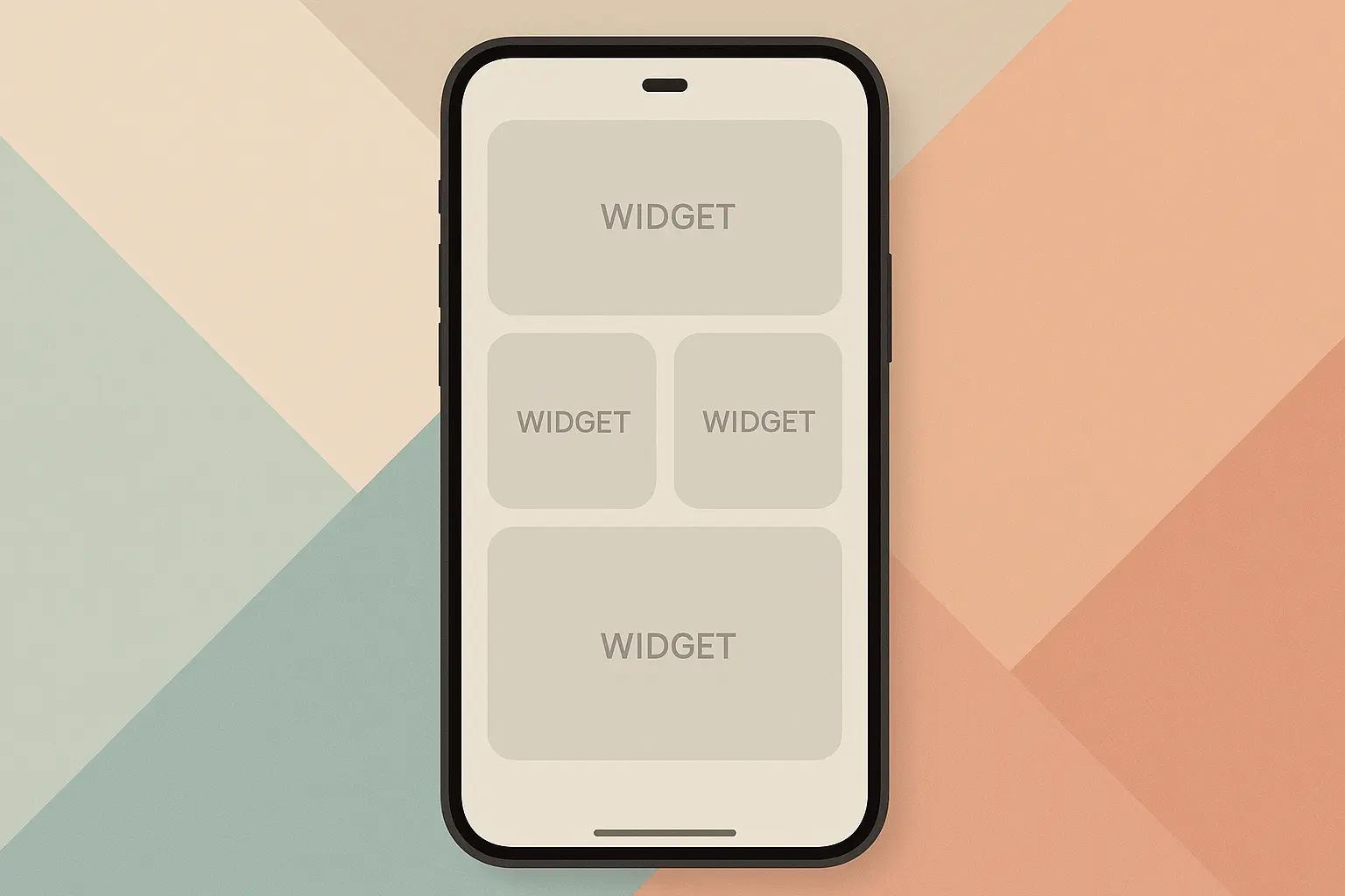
Think about how the wallpaper works with your app organization system. Some minimalist phone wallpapers have subtle guides or sections that can actually help you organize your home screen better.
The best wallpapers give you natural zones for different types of apps – work stuff in one area, entertainment in another, frequently used apps in spots that are easy to reach.
25 Top Minimalist Phone Wallpapers in 6 Styles
I've organized these 25 carefully picked minimalist phone wallpapers into six different styles, each one serving different tastes and needs. From geometric designs that give you natural app organization zones to nature-inspired ones that honestly make screen time way more relaxing, every wallpaper includes my thoughts on how well you can see icons, battery impact, workflow integration, and whether you'll still like it later.
Geometric Abstractions
Geometric designs give you the perfect mix of visual interest and functional organization through clean shapes, smart color placement, and proportions that just look right. These five wallpapers use triangles, circles, grids, and curves to create natural zones for app placement while keeping your icons super visible and looking timeless.
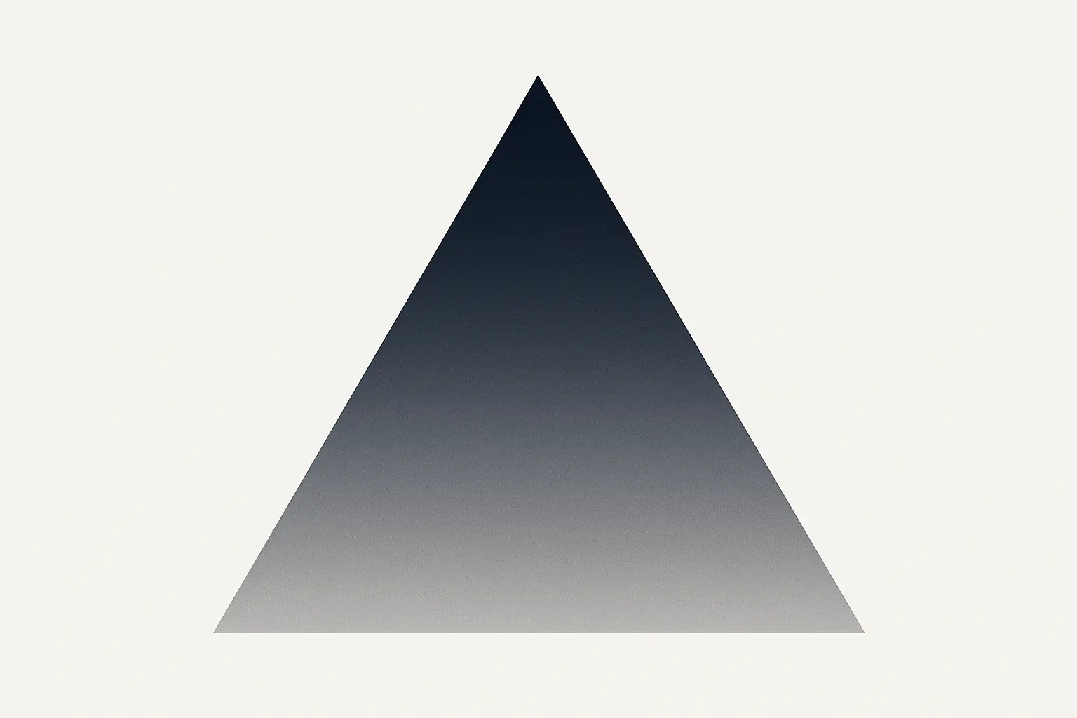
1. Gradient Triangle Composition
This one's just a simple triangle with a nice fade from dark blue to gray, positioned off-center against a white background. The triangle's angle gives you a clean spot for widgets.
The high contrast areas make sure your icons look great no matter where you put them. The gradient adds visual interest without overwhelming your interface, and it looks amazing on high-resolution displays where you can really see that smooth color transition. The cool colors help you stay focused and productive all day.
2. Overlapping Circles Study
Two big circles in muted sage green and dusty rose, overlapping to create a subtle intersection area in a complementary tone. The composition uses proportions that just naturally look pleasing.
The intersection area gives you a natural focal point for your most important apps, while the outer areas offer clean space for stuff you don't use as much. The soft colors are easy on your eyes during long phone sessions and won't go out of style. Battery-friendly on OLED displays because of the muted tones.
3. Linear Grid Pattern
Super thin lines forming a subtle grid pattern in light gray against an off-white background. The grid squares are sized to naturally fit standard icon layouts without feeling restrictive.
This one's perfect for workflow integration since the grid naturally guides how you organize your apps. High contrast means perfect icon visibility across the whole screen. The neutral colors work with any app icon color scheme and won't look dated. Minimal battery impact because it's mostly light colors.
Tech consultant Mike uses the Linear Grid Pattern wallpaper to organize his 120+ apps across four home screens. The subtle grid lines help him keep consistent spacing and create logical app groupings – work apps in the top-left, communication tools in the top-right, entertainment at the bottom. This system cut his app search time by 40%.
4. Asymmetric Color Blocks
Three rectangular blocks in different sizes: charcoal, cream, and soft terracotta, arranged asymmetrically with plenty of white space between them.
The different block sizes create natural zones for different types of apps – productivity, entertainment, and utilities. High contrast areas make sure icons stay visible no matter where you place them. The warm-cool color balance gives you visual interest while sticking to minimalist principles. This timeless color combo won't date quickly.
5. Single Curve Study
One elegant curved line in deep forest green sweeping across a light gray background, creating two distinct areas with different tones.
The curve creates natural visual flow and divides the screen into logical sections for app organization. Great contrast ensures you can see icons throughout. The organic shape softens the rigid grid of app icons, giving your eyes some relief. Battery-efficient on OLED displays with its mostly dark and neutral tones.
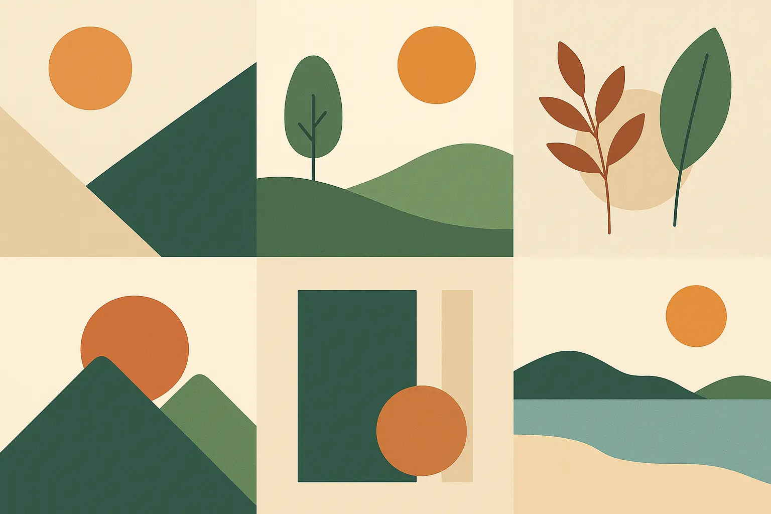
Nature-Inspired Minimalism
Nature-inspired minimalist phone wallpapers combine the psychological benefits of natural elements with clean, uncluttered design. These four options use mountain silhouettes, botanical elements, water abstractions, and desert landscapes to create calming interfaces that honestly make screen time way more relaxing while still working great for app organization and icon visibility.
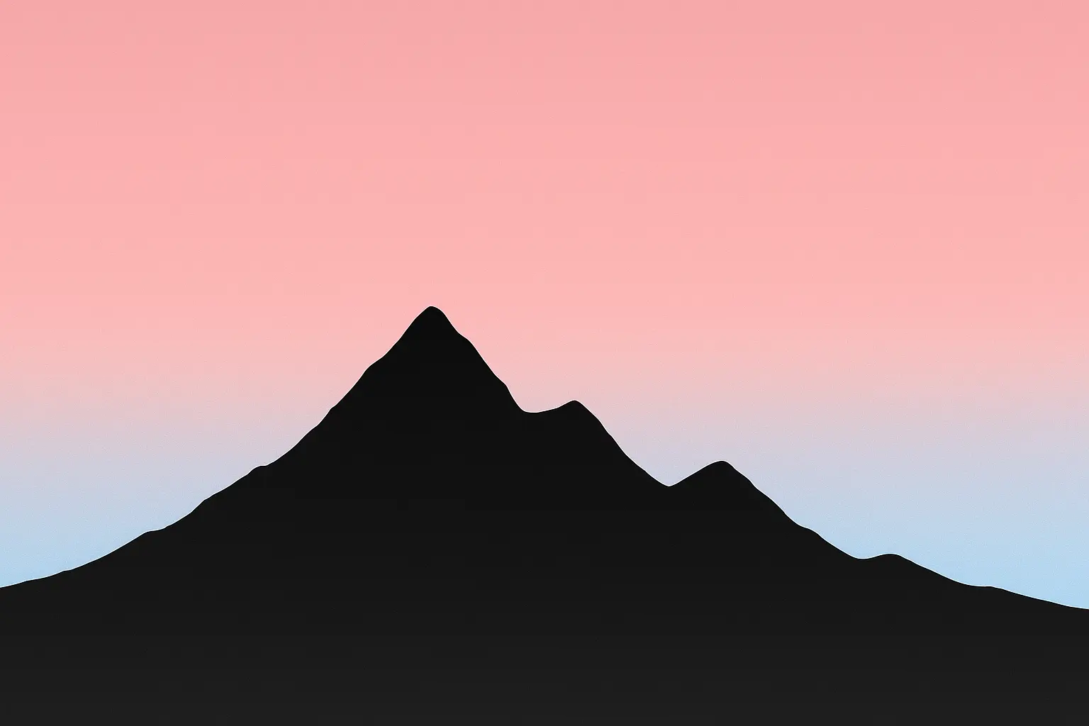
6. Mountain Silhouette Gradient
A simple mountain range silhouette in charcoal black against a gradient sky going from pale pink at the horizon to soft blue at the top.
The horizon line creates a natural division for organizing apps – frequently used ones above, utilities below. The gradient gives you subtle visual interest without competing with your icons. The nature theme helps you stay calm and reduces screen-time stress. Great contrast throughout ensures perfect visibility. The timeless mountain look ensures you'll still like it later.
7. Single Leaf Impression
A minimalist outline of a single leaf in sage green on a cream background, positioned in the lower third of the screen to leave tons of space for apps.
Smart positioning leaves maximum space for app icons while giving you a subtle focal point. The organic shape contrasts nicely with geometric app icons, creating visual balance. Neutral colors ensure great icon visibility and timeless appeal. The nature element adds warmth without complexity or distraction.
8. Water Ripple Abstraction
Concentric circles in different shades of blue and gray, suggesting water ripples, with subtle transparency effects that really show off display quality.
The concentric design creates natural zones for app organization – inner circles for essential apps, outer areas for secondary stuff. Transparency effects show off high-resolution display capabilities. Cool blue tones help you stay calm and focused throughout the day. The abstract nature interpretation feels fresh while staying timeless.
9. Desert Dune Curves
Flowing curves representing sand dunes in warm beige and soft orange tones against a pale sky background.
Organic curves give your eyes relief from rigid app grids while keeping clean aesthetics. Warm tones energize without overwhelming your visual field. The horizontal composition naturally works with dock placement at the bottom. Great contrast variations ensure icon visibility across the entire screen.
Monochromatic Studies
Monochromatic wallpapers offer maximum versatility and timeless appeal through carefully balanced grayscale palettes and high-contrast compositions. These four designs work perfectly with any app icon color scheme, provide excellent battery efficiency on OLED displays, and keep their aesthetic appeal no matter what interface theme changes or seasonal preferences you have.
For users wanting the ultimate in minimalist design, think about pairing these monochromatic wallpapers with magnetic phone cases that offer clean lines and functional mounting capabilities.
Wallpaper Type |
Battery Impact (OLED) |
Icon Visibility Score |
How Long You'll Like It |
Best For |
|---|---|---|---|---|
Grayscale Texture |
Excellent (85% power saving) |
9.5/10 |
Very High |
Professional/Business users |
Black & White Geometric |
Outstanding (90% power saving) |
10/10 |
Very High |
Productivity-focused users |
Charcoal Gradient |
Very Good (75% power saving) |
9/10 |
High |
Heavy phone users |
White Space Study |
Poor (10% power saving) |
10/10 |
Very High |
Creative professionals |
10. Grayscale Texture Field
Subtle paper-like texture in various shades of gray, creating depth without pattern distraction or visual noise.
Perfect contrast compatibility with any icon color scheme makes this incredibly versatile. The texture adds a tactile quality that makes the user experience better without overwhelming. Neutral palette ensures timeless appeal that won't feel dated. Battery-efficient on OLED displays. Works seamlessly with both light and dark interface modes.
11. Black and White Geometric Balance
Simple composition with a large black circle intersecting a white square, creating four distinct areas for strategic app placement.
High contrast areas give you excellent icon visibility options across different zones. The composition creates natural app organization areas – dark zones for light-colored icons, light zones for dark icons. Classic black and white ensures compatibility with any interface theme. Geometric precision is perfect if you like structured layouts.
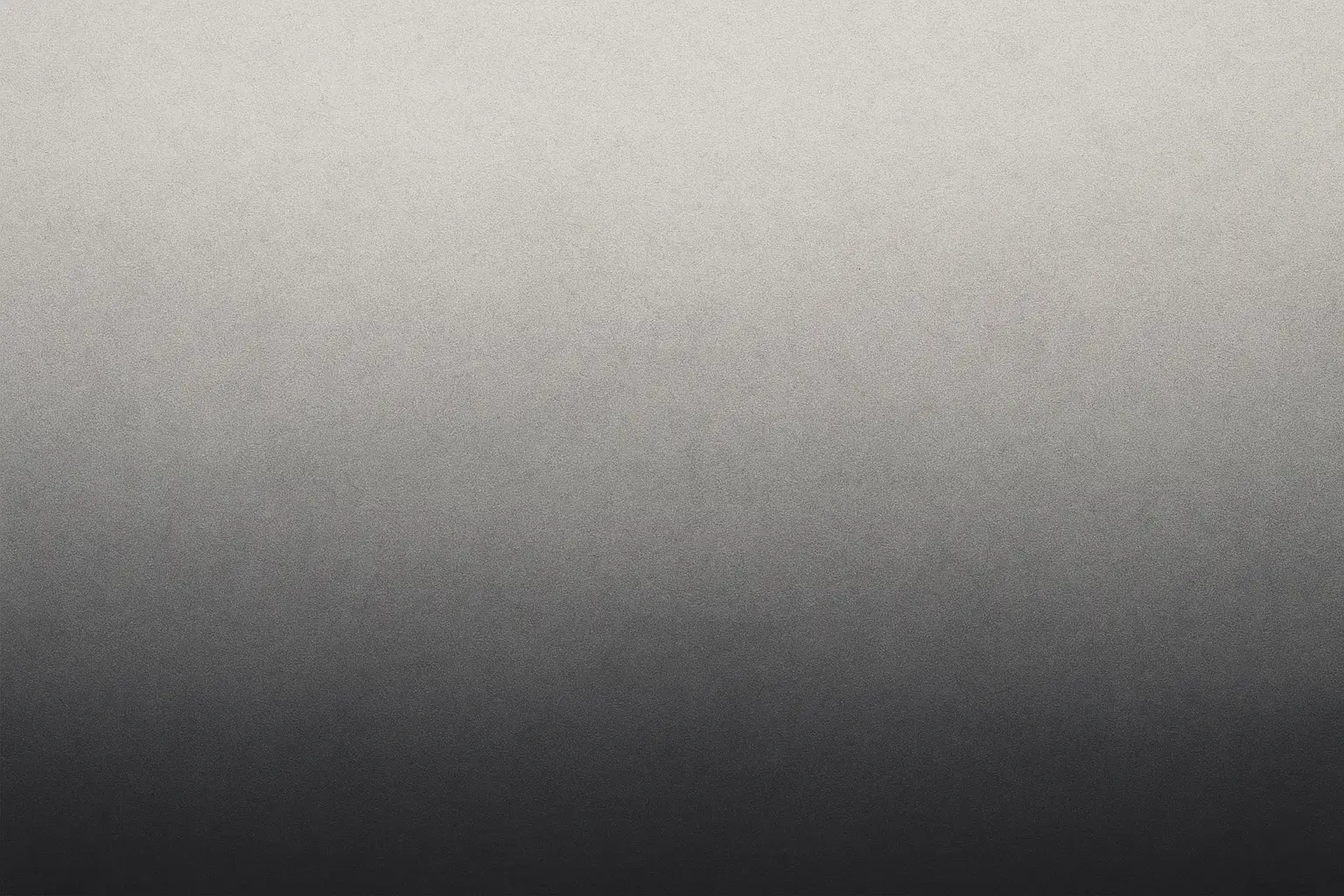
12. Charcoal Gradient Fade
Smooth transition from deep charcoal at the bottom to light gray at the top, with subtle noise texture for added depth.
Vertical gradient naturally works with bottom-heavy app layouts where you put frequently used apps. Dark bottom area saves battery on OLED displays while the lighter top gives you excellent contrast for widgets. The gradient provides visual flow without distraction. Neutral tones work with any app icon color scheme.
13. White Space Study
Mostly white background with a single small dark gray circle positioned using proportions that just naturally look balanced.
Maximum icon visibility across the entire screen makes app organization effortless. Clean aesthetic reduces visual clutter and helps you focus on your actual content. The small accent element gives you subtle visual interest without overwhelming the interface. Timeless minimalist approach that emphasizes content over decoration.
Subtle Color Palettes
Subtle color palette wallpapers add gentle warmth and personality while sticking to minimalist principles through muted tones and soft transitions. These four designs use contemporary color combinations like dusty rose and sage, ocean-inspired blues, sunset pastels, and earth tones to create emotionally engaging interfaces that stay functional and easy on your eyes during long phone sessions.
14. Dusty Rose and Sage Gradient
Gentle horizontal gradient transitioning from dusty rose to sage green, with a soft blur effect at the transition zone for seamless color flow.
Trendy yet timeless color combination that feels fresh without being overwhelming or distracting. The gradient creates natural visual flow across your screen. Soft colors are easy on your eyes during extended use sessions. Good contrast variations ensure icon visibility throughout. Perfect if you want warmth without excessive brightness.
15. Ocean Depth Layers
Three horizontal bands in different shades of blue-green, from seafoam to deep teal, with subtle transparency overlays for depth.
Cool palette helps you stay calm and reduces eye strain during long phone sessions. Horizontal bands create natural app organization zones – light apps on dark bands, dark apps on light bands. The ocean theme gives you psychological benefits of nature connection. Great for productivity-focused users. Color depth shows off high-quality display capabilities.
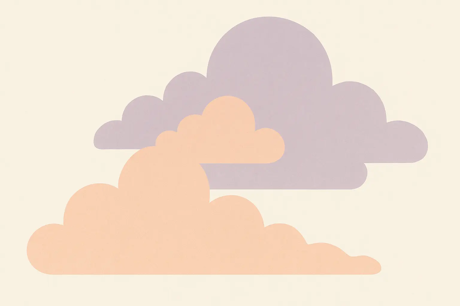
16. Sunset Minimalism
Soft peach and lavender tones in an abstract cloud-like formation against a cream background.
Warm colors energize without overwhelming your visual field or competing with app icons. Organic shapes give your eyes relief from geometric app layouts. The sunset theme brings up positive emotions and reduces stress. Soft contrast ensures comfortable viewing throughout the day. Perfect if you want gentle warmth in your interface.
17. Forest Floor Palette
Muted earth tones including moss green, mushroom brown, and stone gray in simple geometric shapes with natural spacing.
Earth tones help you feel grounded and reduce stress from screen time. Natural color palette works harmoniously with most app icon designs. The organic theme connects you with nature even during digital interactions. Great for outdoor enthusiasts and anyone wanting calm interfaces. Battery-efficient because of darker tones.
Architectural Elements
Architectural-inspired wallpapers are perfect if you appreciate structured design and industrial aesthetics through concrete textures, clean lines, shadow studies, and geometric frames. These four designs give you sophisticated visual appeal while keeping excellent functionality for app organization and icon visibility, especially suited for productivity-focused users and design enthusiasts.
18. Concrete Texture Minimalism
Subtle concrete texture in light gray with natural variations and a smooth, matte finish appearance that suggests durability.
Industrial aesthetic works great for modern design preferences and professional users. Neutral texture provides depth without distraction from your apps. Excellent icon visibility across the entire surface area. The concrete theme suggests durability and reliability. Works well with productivity and professional app collections.
19. Single Architectural Line
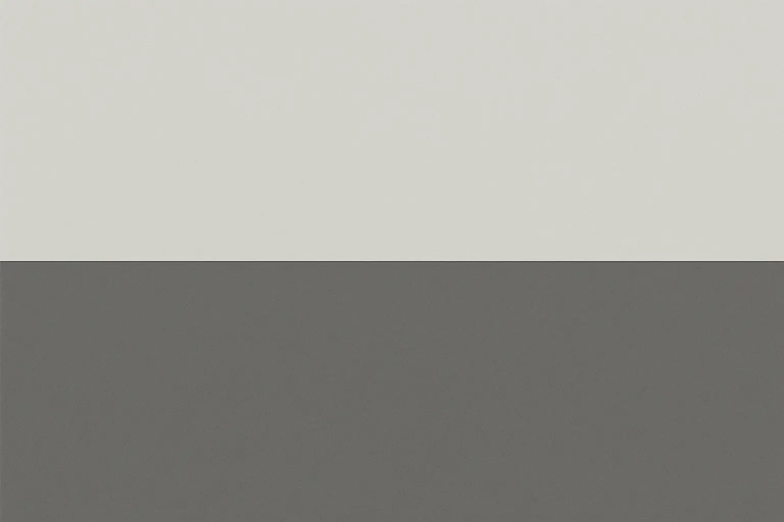
One clean, straight line in charcoal gray dividing the screen into two proportional sections with different background tones for natural organization.
Architectural precision is perfect if you're the type who likes everything organized. The division creates natural app organization zones – work apps above, personal apps below. High contrast ensures excellent icon visibility on both sides. Minimalist approach focuses attention on content rather than decoration. Timeless design principle that won't become dated.
20. Brutalist Shadow Study
Abstract shadow cast by an unseen architectural element, rendered in deep gray against a light background for dramatic contrast.
Sophisticated design is great for architecture and design enthusiasts seeking unique aesthetics. The shadow creates natural depth and visual interest without overwhelming. High contrast areas give you excellent icon placement options throughout. The abstract nature allows for personal interpretation while maintaining minimalist principles.
21. Window Frame Abstraction
Simple rectangular frame in thin black lines against a soft white background, suggesting a minimalist window view without literal representation.
Frame creates natural boundaries for app organization within the "window" area. Clean lines complement the geometric nature of app icons perfectly. High contrast ensures perfect visibility across all areas. The window metaphor psychologically opens up the interface. Perfect if you appreciate structural design elements.
Digital Minimalism
Digital minimalism wallpapers celebrate the technological nature of smartphones through pixel grids, binary code, signal waves, and QR code abstractions. These four designs are great for tech enthusiasts and early adopters while maintaining clean aesthetics and excellent functionality, reflecting the digital essence of modern devices without overwhelming the user interface.
22. Pixel Perfect Grid
Ultra-subtle grid pattern in the exact dimensions of your device's icon layout, rendered in barely visible light gray for functional guidance.
Perfect workflow integration with natural app placement guidance that doesn't interfere visually. Minimal visual impact while providing organizational benefits for systematic users. High resolution shows off display quality capabilities. Great if you want functional beauty. The digital precision reflects modern smartphone capabilities.
23. Binary Code Poetry
Single line of binary code in elegant typography, positioned strategically to leave maximum space for apps while adding subtle tech personality.
Perfect for tech enthusiasts while maintaining minimalist principles through restrained use of elements. The code element adds personality without overwhelming the interface. Strategic positioning maximizes usable space for app organization. Monochromatic approach ensures excellent icon visibility. Reflects the digital nature of the device without being overly literal.
24. Signal Wave Abstraction
Simple sine wave in thin gray line representing digital signal transmission, positioned in lower third of screen to preserve app space.
Technology theme resonates with smartphone functionality and connectivity concepts. Clean line provides subtle visual interest without distraction. Strategic positioning leaves ample app space in prime real estate areas. The wave suggests connectivity and communication. Great if you appreciate the technical aspects of your devices.
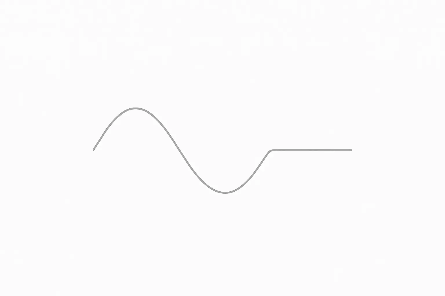
25. Minimalist QR Code
Highly simplified QR code pattern in light gray, abstract enough to be decorative rather than functional while maintaining recognizable elements.
Modern digital aesthetic that reflects contemporary technology trends. Pattern provides subtle texture without distraction from apps or widgets. Neutral colors ensure excellent icon visibility across the entire surface. The tech reference is great for early adopters and digital natives. Abstract interpretation maintains minimalist principles while adding personality.
How Rokform Enhances Your Minimalist Phone Experience
Rokform's approach to phone protection mirrors minimalist design principles by providing maximum functionality with minimal bulk through clean lines and understated aesthetics. Their rugged cases, magnetic mounting systems, and wireless charging solutions complement minimalist phone wallpapers while offering military-grade protection, seamless device integration, and clutter-free charging that aligns with the minimalist lifestyle of investing in quality pieces that serve you well over time.
While the perfect minimalist phone wallpaper sets your device's visual foundation, protecting that investment requires equally thoughtful consideration. Rokform's philosophy of functional minimalism really shines here.
Our approach to phone protection mirrors minimalist design principles: maximum functionality with minimal bulk. Rokform's rugged cases feature clean lines and understated aesthetics that complement your carefully chosen minimalist phone wallpapers rather than competing with them. The precision-engineered polycarbonate construction provides military-grade protection without visual clutter from excessive branding or unnecessary design elements.
The integration capabilities offered by our magnetic mounting systems align perfectly with the minimalist lifestyle. Whether you're using your phone for navigation, video calls, or content consumption, the ability to seamlessly mount and dismount your device reduces the need for additional accessories and cables that clutter your space. This seamless functionality allows your carefully chosen minimalist phone wallpaper to remain the focus of your device's aesthetic.
For users who appreciate the clean organization that minimalist phone wallpapers promote, Rokform's charging solutions continue this philosophy. Our magnetic wireless chargers eliminate the visual chaos of traditional charging cables while providing fast, reliable power delivery. The clean, geometric design of these chargers complements the minimalist aesthetic you've cultivated on your device's interface.
The durability aspect is particularly relevant for minimalist phone users who tend to keep their devices longer, appreciating quality over quantity. Rokform's 6-foot drop protection and military-grade construction ensure that your phone – and its perfectly curated minimalist phone wallpaper – remain pristine through daily use.
Ready to protect your minimalist setup? Explore Rokform's collection of minimalist-friendly cases and accessories that enhance rather than complicate your daily digital interactions.
Things to Think About for 2025
Successfully using minimalist phone wallpapers in 2025 requires some strategic planning for seasonal rotation, widget integration, dark mode compatibility, and cross-device consistency. Think about selecting multiple wallpapers from different categories for variety, make sure your choices work with current and future widget setups, check compatibility with both light and dark interface modes, and extend your minimalist aesthetic across your entire digital ecosystem for a cohesive experience.
What to Consider |
How to Plan It |
When to Do It |
What You'll Get |
|---|---|---|---|
Seasonal Rotation |
Pick 3-4 wallpapers from different categories |
Every few months |
Keeps things fresh without abandoning minimalism |
Widget Integration |
Test wallpaper with current and planned widgets |
Before you commit |
Makes sure everything looks good together |
Dark Mode Compatibility |
Check wallpaper works in both light/dark modes |
During selection |
Smooth day/night transitions |
Cross-Device Consistency |
Adapt wallpaper aesthetic across all devices |
Monthly check-ins |
Creates unified digital ecosystem |
Performance Monitoring |
Track battery life and app visibility |
First 30 days |
Proves the practical benefits actually work |
Seasonal Rotation Strategy
Think about selecting 3-4 minimalist phone wallpapers from different categories to rotate throughout the year. This keeps your interface feeling fresh while maintaining the minimalist aesthetic you prefer. Store your selections in a dedicated album for easy switching without hunting through your entire photo library.
Widget Integration Planning
With iOS and Android widgets getting more sophisticated, choose wallpapers that work with both your current widget setup and potential future additions. The geometric and architectural categories are especially good at providing natural widget placement zones that feel intentional rather than random.
Dark Mode Compatibility
Make sure your selected wallpapers work well with both light and dark interface modes. Many of the monochromatic studies and darker nature-inspired options transition seamlessly between modes, while lighter options may need companion dark variants for optimal functionality.
Cross-Device Consistency
If you use multiple devices (phone, tablet, laptop), think about how your chosen minimalist phone wallpaper aesthetic can extend across your entire digital ecosystem for a cohesive experience. This creates visual harmony and reinforces your minimalist approach across all touchpoints, similar to how phone accessories should complement rather than clutter your setup.
The key to successful minimalist phone wallpapers selection lies in choosing designs that serve your specific usage patterns while maintaining the clean, intentional aesthetic that defines true minimalism. Whether you prefer the structured approach of geometric abstractions or the organic calm of nature-inspired designs, the right wallpaper should enhance your daily digital interactions rather than distract from them.
Final Thoughts
Minimalist phone wallpapers represent more than just aesthetic choices – they're functional tools that can improve your daily device interaction, reduce visual stress, extend battery life, and create organized digital environments. The 25 wallpapers I've shared across six categories offer diverse options for different preferences and usage patterns, while considerations like resolution quality, color psychology, and workflow integration ensure your selection serves both form and function. Combined with thoughtful protection solutions, the right minimalist phone wallpaper creates a cohesive digital experience that embodies true minimalist principles of purposeful design and lasting quality.
Choosing the right minimalist phone wallpaper goes way beyond aesthetics – it's about creating a digital environment that supports your goals and reduces friction in your daily interactions. The 25 options I've explored offer something for every preference, from the structured precision of geometric abstractions to the calming influence of nature-inspired designs.
Remember that the best minimalist phone wallpaper is one you barely notice after a few days of use. It should fade into the background, letting your apps and content take center stage while providing just enough visual interest to prevent your screen from feeling sterile or boring.
The considerations I've discussed – visual clarity, resolution quality, color psychology, battery impact, timeless appeal, and workflow integration – aren't just technical specifications. They're practical factors that determine whether your wallpaper choice enhances or hinders your daily phone experience.
As you try these ideas, pay attention to how different minimalist phone wallpapers affect your behavior and mood throughout the day. The right choice should feel effortless, supporting your productivity and creativity without demanding attention or causing eye strain during extended use.
Whether you're looking for the best phone cases to protect your device or seeking the perfect wallpaper to complement your minimalist lifestyle, the key is finding solutions that serve multiple purposes while maintaining clean, intentional design principles.
Look, at the end of the day, the best wallpaper is whatever makes you happy when you look at your phone. These are just my favorites that happen to work really well in real-world use. Try a few and see what clicks for you.

