


Look, I get it - you want your Nothing Phone to look as unique as it actually is. When I first joined the Nothing community forums, I was blown away by how obsessed everyone is with wallpapers. Seriously, over 80% of the discussions are about customizing lockscreens and wallpapers. It makes sense though - when you've got a phone this different, you want a wallpaper that actually does it justice.
I've spent way too much time (we're talking late nights scrolling through wallpaper sites) collecting 25 wallpapers that actually work well with your Nothing Phone. Here's the thing - not every cool wallpaper plays nice with the Glyph Interface or your battery life. Trust me, I learned this the hard way.

What Actually Makes a Good Nothing Phone Wallpaper
Before we dive into the good stuff, let me save you some headaches I went through. Your Nothing Phone isn't like other phones, and picking wallpapers for it is a bit different.
First off - and I wish someone had told me this earlier - dark wallpapers will save your battery life. Like, seriously save it. OLED screens work by lighting up individual pixels, so when a pixel is black, it's actually off and using zero power. I once used this super bright neon wallpaper and my phone was dead by lunch.
Then there's the Glyph Interface thing. Those LED lights on the back are amazing, but if you've got a crazy busy wallpaper, it creates this weird visual competition when notifications light up. I had this colorful abstract thing going on, and every time I got a text, it just looked... messy. Now I stick to wallpapers that let the Glyph lights be the star of the show.
Understanding display technology is crucial for making informed choices about phone protection, which is why many users also consider protective cases that maintain screen visibility while safeguarding their investment.
Also, resolution matters more than you'd think. Your Nothing Phone's screen can show incredible detail, so why waste it on a pixelated mess? All the wallpapers I'm sharing are 4K, because once you see the difference, you can't go back.
One more thing - and this might sound obvious, but I've seen people mess this up - your wallpaper needs to actually work with your apps. The most gorgeous wallpaper becomes annoying real quick if you can't find your apps or if reading text gives you a headache.
The Official Nothing Collection (Start Here)
Okay, this might sound boring, but hear me out - the official Nothing wallpapers are actually incredible. They're designed specifically for this phone, and it shows.
Nothing Phone 2 Default Black
This might look like "just a black wallpaper" but there are these subtle geometric patterns that you don't notice at first. Once you see them though, they're everywhere, and they're honestly pretty cool. Plus your battery will thank you - this thing is basically pure efficiency.
What I love about this one is how clean your app icons look floating on it. Everything just feels... organized. Like the wallpaper is doing half the work of making your home screen look intentional.
Nothing Phone 3 Gradient Series
This is what happens when gradients are done right. It goes from deep black to charcoal gray, so you still get the battery benefits, but there's this subtle depth that makes your screen feel less flat. The transparency effects are a nice touch too - very on-brand for Nothing.
If you want something a bit more interesting than solid black but don't want to go crazy, this is your sweet spot.
Nothing Dot Matrix Classic
Remember those dot patterns from Nothing's early marketing? This is that, but as a wallpaper. It sounds simple, but the spacing is perfect - your apps sit right in the gaps, and the whole thing just works. It's like the wallpaper equivalent of a good bass line - you don't notice it doing its job, but everything sounds wrong without it.
Transparent Grid HD
If you're the type of person who organizes apps into perfect grids (no judgment, I do it too), this wallpaper is basically cheating. The grid lines help you place everything symmetrically, and the transparency effects make it feel like your apps are floating.
Nothing Brand Signature
For when you want people to know you're team Nothing. The wordmark is subtle enough that it's not screaming brand loyalty, but it's there. My coworker asked where I got this one because it looked so clean and professional.
Minimal and Abstract (For the Clean Freaks)
If you're into that clean, minimal look (and honestly, who isn't these days?), these are going to be your jam.
Geometric Void
Pure minimalism at its finest. White geometric shapes on black - sounds simple, but the shapes are positioned perfectly to frame your apps. I've noticed that my productivity apps naturally cluster around one triangle, social media around another. It's like the wallpaper is organizing my life.
A graphic designer friend of mine uses this one and swears it makes his home screen look like it was professionally designed. He's not wrong.
Gradient Sphere
One perfect sphere with some gorgeous lighting effects. That's it. That's the wallpaper. But somehow it creates this focal point that makes everything else on your screen look more intentional. The transparency effects give it that Nothing vibe without being too obvious about it.
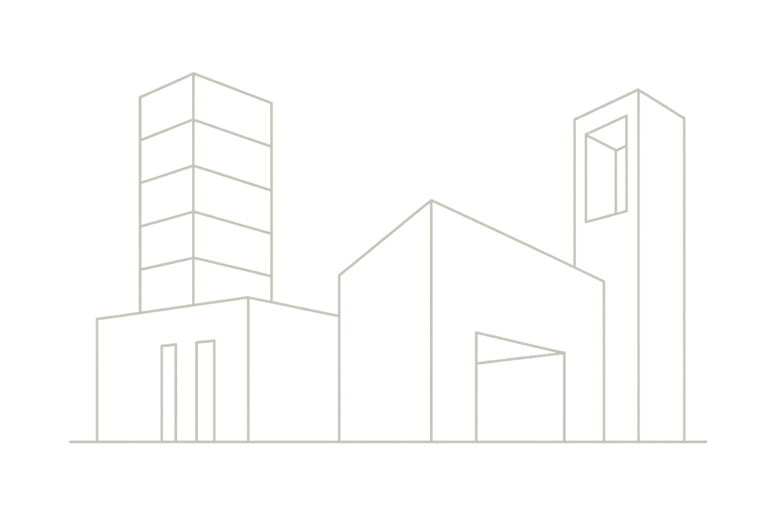
Line Art Architecture
These are basically architectural drawings - clean white lines on black showing buildings and structures. If you're into that industrial design aesthetic (which, let's be honest, if you bought a Nothing Phone, you probably are), this hits different.
Each drawing feels technical but artistic at the same time. It's the kind of wallpaper that makes people think you have good taste.
Monochrome Waves
Flowing waves in grayscale. The movement is subtle enough that it's not distracting, but when you're scrolling through your phone, everything feels more fluid. It's weird how a wallpaper can affect the feel of using your phone, but this one does.
Digital Minimalism
Clean digital patterns with tiny binary code elements. It's tech-y without being over the top. If you want your wallpaper to subtly hint that you know your way around technology, this is perfect.
Tech and Futuristic Themes (For the Nerds)
Alright, this is where we get into the fun stuff. If you're a tech enthusiast and want your phone to look like it came from the future, I've got you covered.
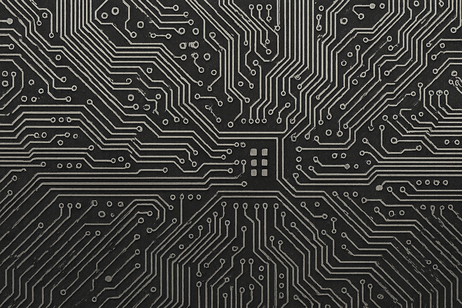
Circuit Board Aesthetic
Detailed circuit board patterns that actually show off your 4K display. These aren't just random tech-looking lines - they're carefully designed to create natural zones for your apps. It's like your home screen becomes this functional tech landscape.
Fair warning though - this one's not as battery-friendly as the minimal options, but if you're a tech person who's always near a charger anyway, it's worth it.
Holographic Interface
This looks like something out of a sci-fi movie. Holographic UI elements that complement the Glyph Interface perfectly. I use this when I want people to ask "what phone is that?" It definitely gets attention.
The transparency effects feel natural with Nothing's whole see-through thing, so it doesn't feel gimmicky.
Digital Matrix Rain
A modern take on the classic Matrix code, but done in Nothing's style. The code flows down your screen in a way that's mesmerizing but not distracting. Perfect if you want to feel like a hacker (even if you're just checking Instagram).
A software developer friend uses this and says it actually helps him feel more focused during coding sessions. Placebo effect maybe, but hey, whatever works.
Transparent Technology
Layered geometric shapes that look like phone components. It's very on-brand for Nothing's transparent design philosophy, and the way the layers create depth is pretty satisfying to look at.
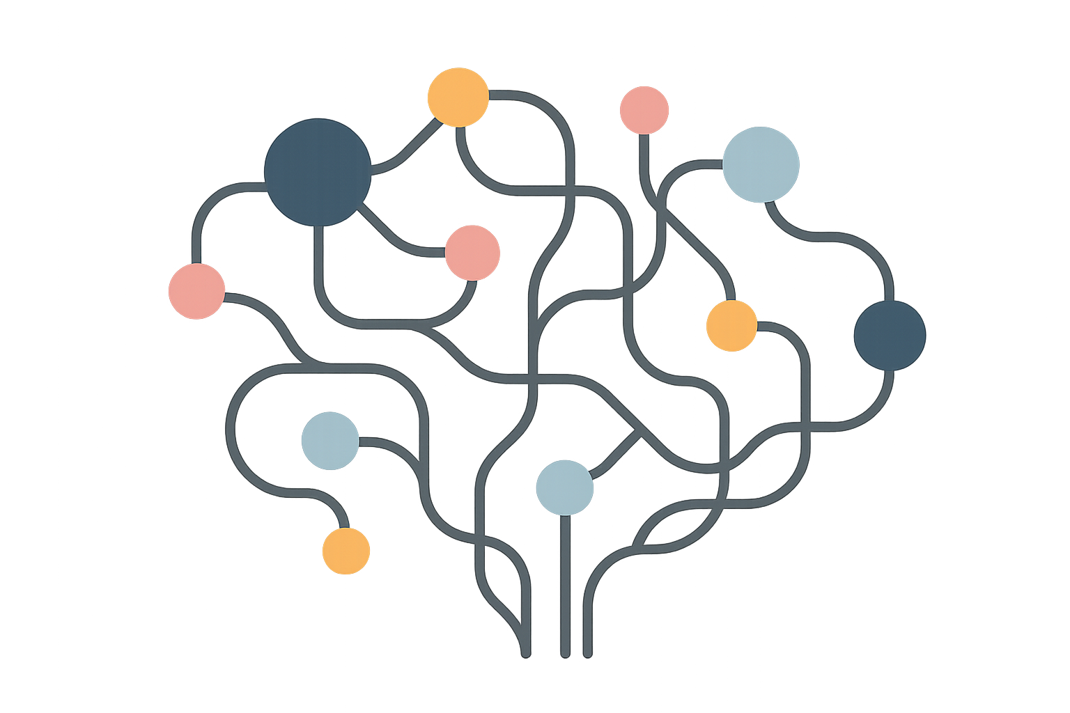
AI Neural Networks
Abstract neural network connections in minimal line art. If you work in AI or just think it's cool, this is a subtle way to show your interests. The network patterns actually help guide your eye around the screen, which makes navigation feel more intuitive.
Nature and Organic (When You Need a Break from Tech)
Sometimes you need your phone to remind you that there's a world outside of screens and circuits.
Monochrome Landscapes
Black and white landscape photography that maintains that Nothing aesthetic while bringing some natural beauty to your screen. These aren't just random nature photos - they're carefully chosen for contrast and composition that works with your UI.
I rotate through these when I'm feeling overwhelmed by technology and need something more grounding.
Abstract Flora
Plant silhouettes and organic shapes, but simplified and done in Nothing's color palette. It's nature, but make it minimal. The organic shapes provide a nice contrast to all the geometric stuff that usually dominates tech aesthetics.
Cosmic Minimalism
Deep space imagery optimized for OLED displays. Lots of black space (great for battery) with strategic star placement. It's the kind of wallpaper that makes you feel philosophical about your place in the universe, but in a good way.
This one's perfect if you want maximum battery efficiency but find solid black too boring.
Organic Geometry
Natural patterns given a geometric interpretation. It's like nature and technology having a conversation, and the result is surprisingly harmonious. These show how natural and tech aesthetics don't have to be opposites.
Artistic and Creative (For the Creative Types)
If you're in a creative field or just appreciate good art, these wallpapers will speak to you.
Digital Brushstrokes
Abstract art created specifically for Nothing Phones. Bold brushstrokes in grayscale with strategic color accents. It's not random artistic chaos - the composition actually helps with app organization while providing creative inspiration.
I use this when I'm working on creative projects. There's something about having art as your wallpaper that puts you in a more creative mindset.
Typography Art
Creative typography that incorporates Nothing's font choices. If you're a designer, this is both beautiful and educational - you can see typographic principles in action every time you look at your phone.
These appeal to the design nerd in me, and they're great conversation starters with other creative people.
Architectural Photography
High-contrast photos of modern buildings that echo Nothing's design principles. The buildings are chosen specifically for their transparency, minimalism, and technological innovation - basically the same principles that guide Nothing's products.
Perfect if you want your wallpaper to look professional in meetings but still have some visual interest.
Seasonal and Dynamic (For Year-Round Freshness)
These change things up throughout the year while staying true to Nothing's aesthetic.
2025 Seasonal Collection
Wallpapers that subtly acknowledge seasons without going full autumn leaves or Christmas trees. The seasonal elements are abstracted and minimized, so you get that temporal connection without visual clutter.
I like switching these out every few months to keep things fresh.
Dynamic Glyph Patterns
These are designed to change based on time of day or battery level. It's next-level wallpaper design - responsive and intelligent. The changes are subtle enough that they're not distracting, but they provide functional information through visual cues.
This is what the future of wallpapers looks like.
Anniversary Edition
Special edition wallpapers celebrating Nothing's milestones. These have collector appeal while showcasing how the brand has evolved. If you're a Nothing enthusiast, these are like having limited edition art on your phone.
What Actually Works Best (My Honest Opinion)
After using all of these for weeks, here's what I've learned: the official Nothing wallpapers and minimal designs just work better. They look good, they don't kill your battery, and they make the Glyph Interface shine.
The tech-themed ones are awesome if you're into that aesthetic, but they'll hit your battery harder. Nature and artistic options are gorgeous, but you need to be more careful about app visibility and practical stuff.
Here's the real talk on battery life: the darker wallpapers can save you a couple hours of usage, while the brighter ones might cost you that much. It's not huge, but it adds up, especially if you're a heavy user.
For Glyph Interface compatibility, anything with a dark background and minimal competing elements works best. The LED patterns need space to breathe and contrast to pop.
Battery optimization becomes even more crucial when using magnetic phone mounts that keep your device accessible throughout the day.
The Nothing Phone 2 wallpapers consistently perform well across everything - they look good, work well, and don't cause problems. If you want maximum visual quality, the 4K options really show off what your screen can do.
Protecting Your Setup
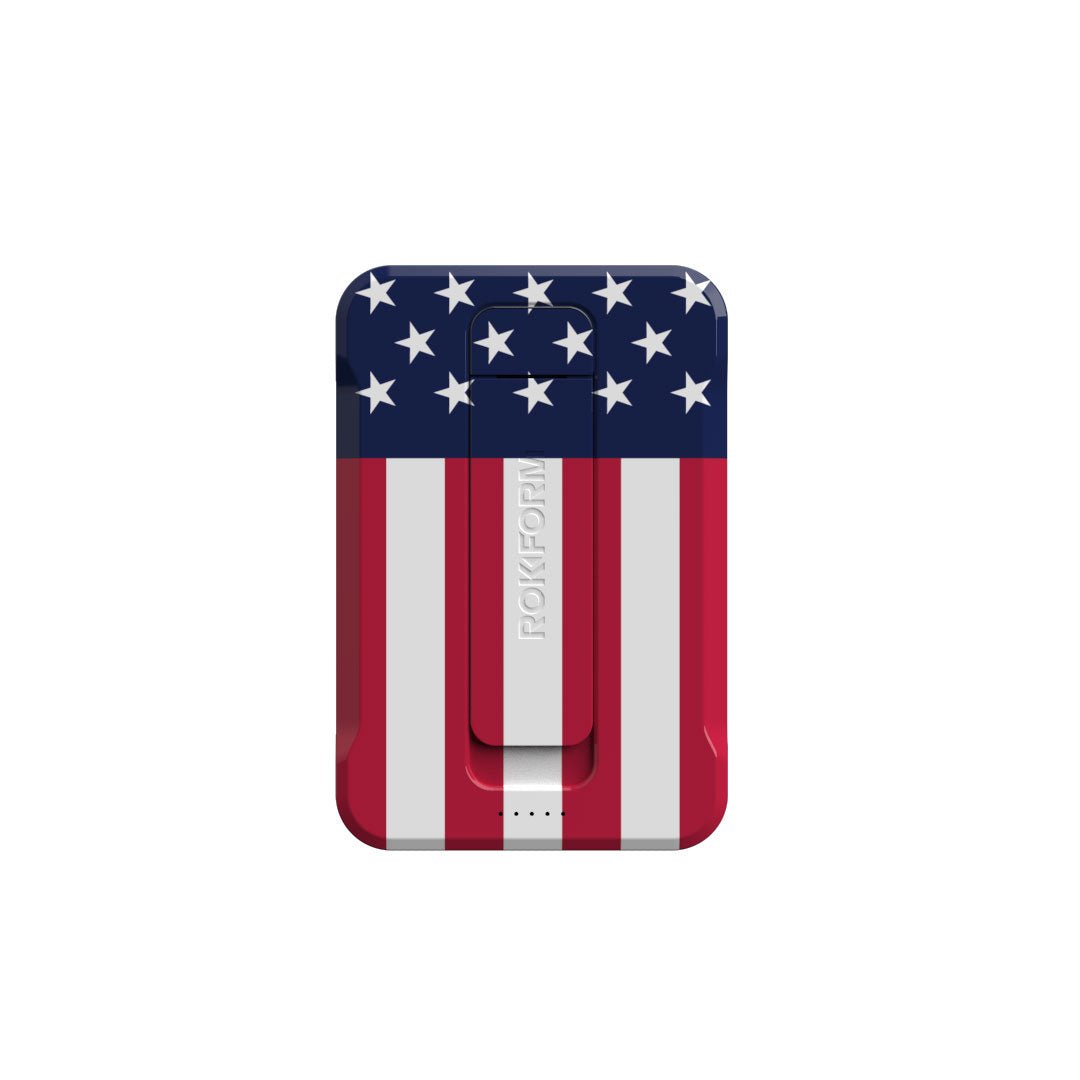
While we're talking about making your Nothing Phone look amazing, let's be real - all of this is pointless if you drop your phone and crack the screen. I've seen too many beautiful setups ruined by one bad drop.
Rokform's military-grade protection keeps your screen (and wallpaper) looking perfect while maintaining Nothing's sleek aesthetic. Their magnetic mounting systems work great with the Glyph Interface too - you can show off both your wallpaper and those LED patterns.
The cases are slim enough that they don't ruin Nothing's design, but tough enough to handle real-world use. Whether you're showcasing typography wallpapers as a creative professional or displaying circuit board aesthetics as a tech enthusiast, protection that doesn't interfere with functionality is key.
First responders who rely on Nothing's unique notification system particularly benefit from rugged phone cases that don't mess with Glyph functionality.
Ready to protect your Nothing Phone investment? Check out Rokform's phone cases and keep your wallpaper collection looking perfect.
My Final Take
Look, at the end of the day, pick whatever makes you happy when you look at your phone. But if you want my honest opinion? Start with the stock Nothing wallpapers - they just work. They're designed for this phone specifically, they won't cause battery or visibility issues, and they look professional.
Once you've lived with those for a while, then get weird with it. Try the tech themes, experiment with the artistic ones, see what fits your style. But having a solid foundation of wallpapers that you know work well gives you something to fall back on.
Your Nothing Phone is already unique - the wallpaper should enhance that, not fight against it. Whether you go minimal, techy, artistic, or seasonal, make sure it feels like an extension of what makes your phone special in the first place.
The 25 wallpapers I've shared here are all solid choices that respect what makes Nothing Phones different while giving you room to express your personal style. Your mileage may vary, obviously, but these have all worked well for me and the Nothing users I know.
Now stop reading about wallpapers and go make your phone look awesome.

