


I once spent three hours staring at a grid of generic "download" symbols, totally paralyzed by the sheer volume of choices. It sounds ridiculous until you hop on Flaticon and realize that even copying a simple asset counts as a download. The demand for visual clarity is massive. We are drowning in options, but finding the right visual language for 2026 requires a sharp eye. This guide cuts through the noise to identify the specific symbols that actually define modern user experiences. We’re exploring the exact design cues users expect right now and how to implement icons for apps without cluttering your screen.

Table of Contents
We’re going to look at the essential criteria for picking iconography that actually scales and adapts to modern interfaces. Then, I'll break down the top 25 symbols you need across navigation, commerce, communication, health, and future tech. We’ll wrap up by looking at how digital utility relies on physical hardware durability to actually function in the real world.
TL;DR
You don't have time to waste, and neither do your users. Here are the critical takeaways on interface design and hardware protection:
Clarity Over Art: Users need to know what a button does instantly. If they have to guess, you've lost them.
Vector Scalability: SVGs are mandatory. You need lines to stay crisp on everything from a massive monitor to a tiny watch face.
Spatial Minimalism: The trend has shifted from completely flat design to icons that have a little depth but remain simple.
Physical Security: A great app is useless if the phone falls off a mount; mechanical locking systems are essential for active users.
Unified Style: Mixing filled and outlined shapes looks messy. Stick to one stroke width and corner radius.
Design Criteria |
Old Standard (2015-2020) |
New Standard (2026) |
|---|---|---|
Visual Style |
Completely Flat Design |
Spatial Minimalism (Subtle Depth) |
File Format |
PNG / Raster |
SVG / Lottie Animation |
Line Weight |
Ultra-thin Hairlines |
Medium, Accessible Strokes |
Corner Radius |
Sharp 90-degree angles |
"Squircle" or Soft Rounded |
Interaction |
Static Images |
Micro-interactions (Haptic feedback) |
The Method Behind the Madness: How to Pick Winners
Selecting icons for apps isn't about what looks cool; it's about instant communication. I look for clarity above all else because users in 2026 have zero patience for guessing games. A search tool needs to look like a search tool. We also prioritize scalability. You need vectors—preferably SVGs found on platforms like The Noun Project—that stay crisp whether they are on a desktop or a smartwatch.
Stylistic consistency is non-negotiable. Mixing filled shapes with outlined ones looks amateur. We also consider cultural universality (does this make sense globally?) and accessibility to aid users with visual impairments. Finally, keep an eye out for "Spatial Minimalism," which blends depth with simplicity.
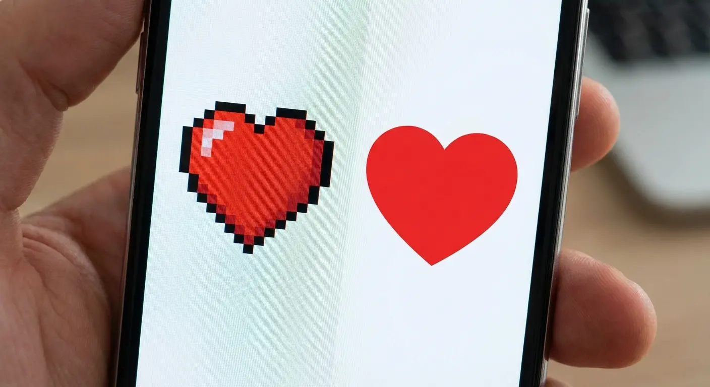
Consider the floppy disk. For Gen Z users, this shape is abstract nonsense. A modern "Save" icon has to pass the clarity test. Instead of a floppy disk, successful 2026 interfaces use a "Bookmark" ribbon or a "Cloud with Checkmark" symbol. If you have to explain what the icon is in a tooltip, it’s already failed.
25 Essential Icons for Apps You Need Right Now
I’ve curated the definitive list of symbols that are dominating user interfaces this year. These are categorized by function to help you find exactly what your project needs.
Core Navigation & Interface
These workhorses handle daily interactions. They need to be invisible in their utility but beautiful in their execution.
1. The "Soft" Hamburger Menu
We’re seeing a shift away from sharp corners. This icon features three horizontal lines with rounded edges, sometimes with a shorter top line. It instantly screams "Menu" but feels friendlier and softer on the eyes.
2. The Home "Portal"
Forget the detailed chimney. The modern home icon is a simplified silhouette—just the roof and base outline with a door opening. It scales beautifully from 16px to 64px and matches the linear style of current OS updates.
3. The Intelligent Search
Search has evolved into AI-assisted discovery. This icon combines the classic magnifying glass with a "sparkle" on the upper right rim. It tells the user they aren't just finding things; they are finding them with help.

4. The User "Pill"
Circles are out. We are seeing a head/shoulders avatar enclosed in a pill or oval shape. This offers a larger touch target and moves the aesthetic toward a button-like feel rather than a generic profile picture.
5. The Haptic Settings Gear
Complex gears turn into blobs on small screens. The new standard is a cogwheel with fewer, thicker teeth—usually six. It maintains its shape on wearables and communicates "Settings" without the visual noise.
Commerce & Transaction
Digital wallets are the new standard. These symbols focus entirely on speed, trust, and the blend of physical and digital shopping.
6. The Minimalist Tote
Industrial shopping carts feel cold. Fashion and lifestyle apps are adopting the simple tote bag outline. It feels personal and styles easily with the varying line weights you find on Noun Project.
7. The Contactless Wave
This is the global standard for paying. Four curved lines radiating sideways signify NFC or Tap-to-Pay. It is universally understood and essential for any transaction-based interface.
Imagine a user standing in a busy line. They don't have time to dig through menus. When they see the "Contactless Wave" icon on their lock screen widget, they instinctively know that tapping it will activate the NFC chip for payment. This instant recognition reduces friction and speeds up the transaction by seconds—which matters when people are waiting behind you.
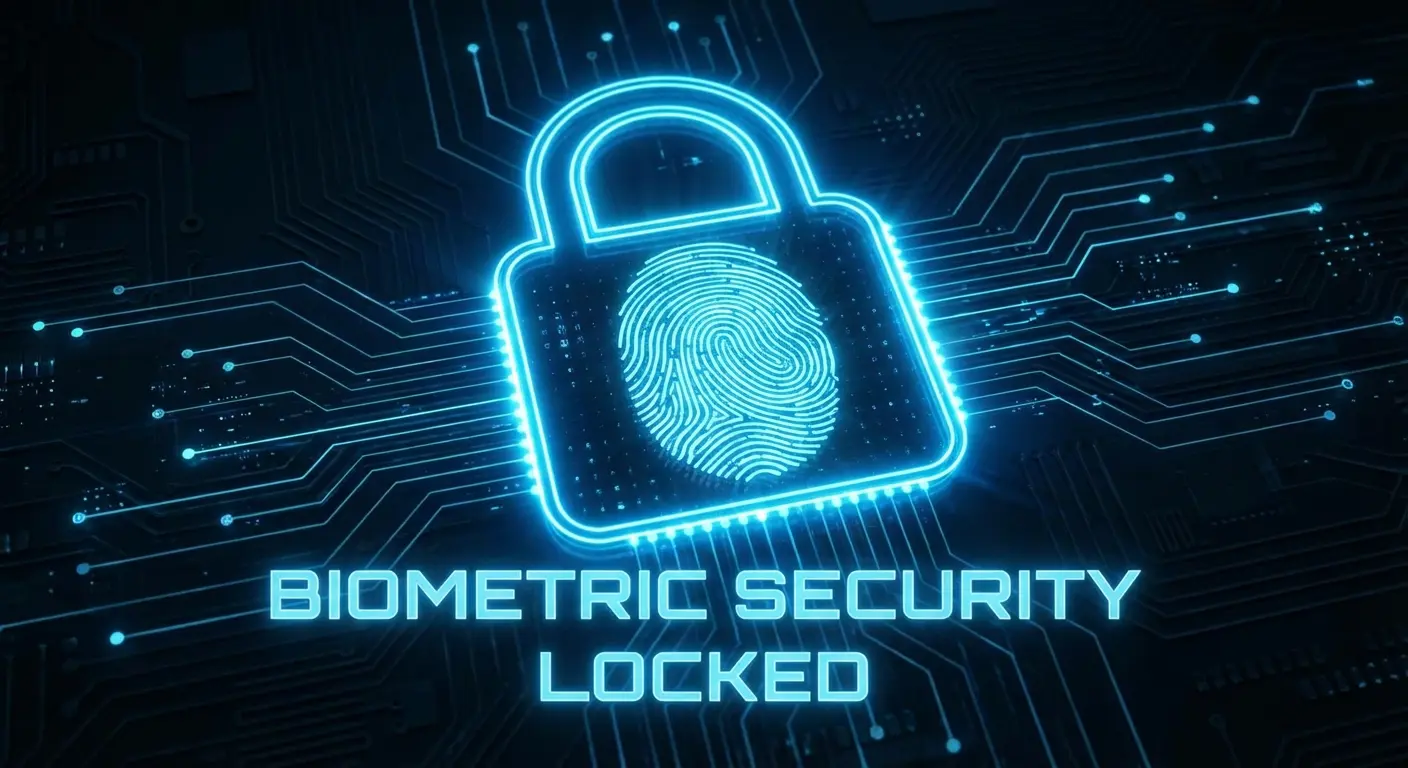
8. The Biometric Lock
Security needs to feel modern. This icon places a fingerprint swirl inside a padlock body. It visually confirms that the security is biological and unique to you, combining identity and safety in one mark.
9. The QR Frame
We need to scan things constantly. This symbol uses four corner brackets with a horizontal line through the center. It implies the action of scanning without needing to render complex pixel details.
10. The Stacked Wallet
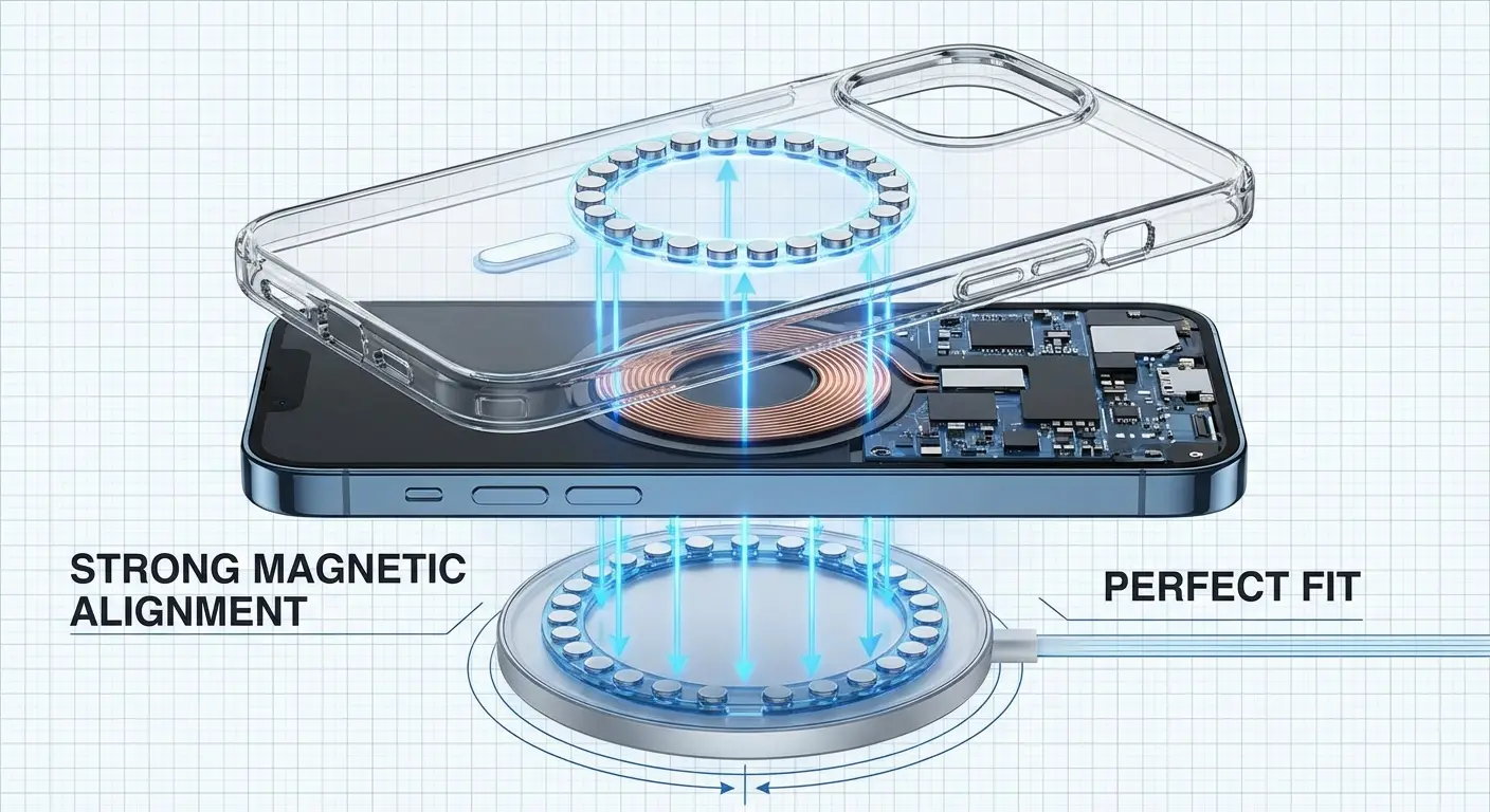
A single card doesn't represent modern finance. We use a rectangle with a second one peeking out from behind. It clearly represents a digital wallet with multiple payment options, matching OS-level designs. Having a clear wallet icon is crucial, just as understanding the reasons why you need a MagSafe magnetic wallet in 2023 ensures your physical cards are as accessible as your digital ones.
Communication & Social
Social interaction happens in real-time now. These icons prioritize community presence and instant connection over static archives.
Function |
The Old Icon |
The Modern Replacement |
|---|---|---|
Messaging |
Rectangular Envelope |
The "Squircle" Bubble |
Notifications |
Bell with Motion Lines |
Bell with Notification Dot |
Sharing |
Three Connected Dots |
Tray with Upward Arrow |
Live Status |
"REC" Text |
Radiating Pulse Circles |
11. The Squircle Chat
Hardware design influences software. The speech bubble has morphed into a "squircle" to mirror device shapes. It clearly denotes messaging while feeling thoroughly modern.
12. The Active Bell
Stop making bells shake; it's annoying. The standard now is a bell with a solid dot in the top right corner. That small dot is a high-contrast indicator of new status that works even in tiny status bars.
13. The Universal Share
We are bridging the gap between iOS and Android. This icon blends the tray and the dots into a "tray with an arrow" hybrid. It clearly communicates "sending this out" regardless of the user's device.
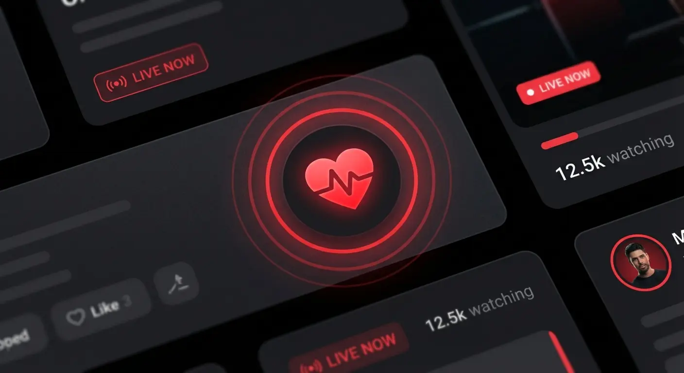
14. The Live Pulse
Static play buttons are for archives. A solid circle with two concentric rings radiating outward indicates live streaming or stories. It creates a sense of urgency and real-time broadcasting.
15. The Community Cluster
Globes are too vague for groups. We use three distinct user avatars grouped closely together. It represents "Community" clearly and maintains consistency with the single user icon style.
Health & Wearables
Data needs to be precise but not scary. These symbols balance clinical accuracy with an approachable, wellness-focused aesthetic.
16. The ECG Line
A heart icon usually means "Like." To show health data, we use a heart shape that breaks into a jagged pulse line. We source simplified versions to ensure that line remains sharp even at small sizes.
17. The Hydration Drop
Color alone shouldn't convey meaning. This water droplet features a vertical "fill" level line inside. It allows color-blind users to gauge fullness instantly without relying on blue hues.
18. The Mindfulness Lotus
We need symbols for mental breaks. A simplified three-petal flower is the universal sign for meditation or yoga. Its soft curves align perfectly with the "calm" aesthetic of health apps.
19. The Sleep Moon
Don't confuse sleep tracking with dark mode. We use a crescent moon with two "Z" letters floating near it. It differentiates the function and is understood across all languages.
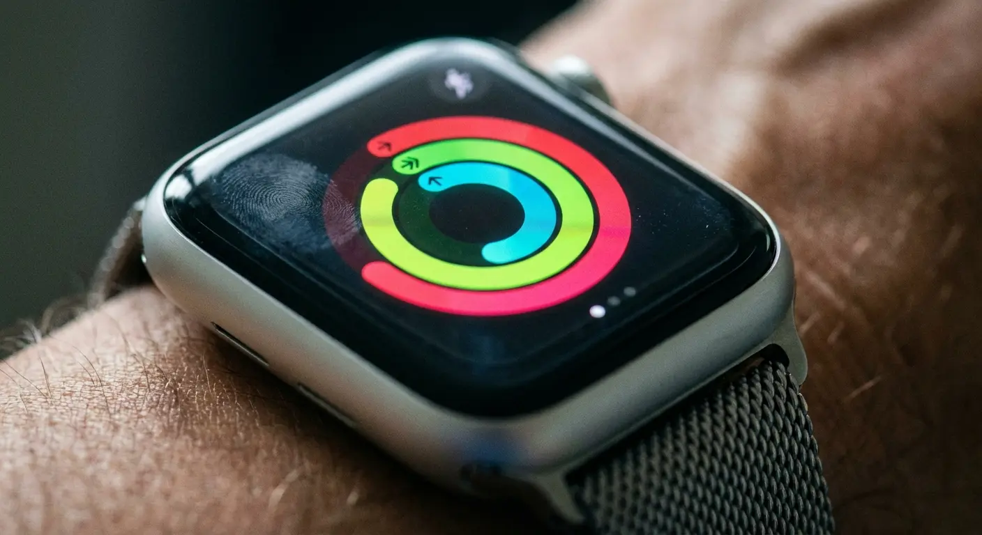
20. The Activity Ring
Closing rings is a daily goal. Three concentric, incomplete circles represent activity progress. This format works exceptionally well as a complication on watch faces. If you are tracking performance on the go, using one of the best apps for cyclists pairs perfectly with this visual style.
Future Tech (AI & Spatial)
This is where the cutting edge lives. These icons for apps represent the technologies that are defining the latter half of the decade.
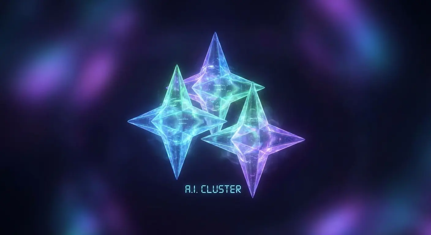
21. The AI Sparkles
You see this everywhere for a reason. A cluster of three four-pointed stars is the universal shorthand for "Generate with AI." It is the most used icon of the mid-2020s.
22. The AR Cube
Spatial computing needs a signifier. A 3D isometric cube with dashed lines on the back faces indicates an AR view. The isometric lines keep it sharp in vector format.
In an interior design app, a user sees a 2D photo of a couch. Next to it is the "AR Cube" icon. Tapping this launches the camera, allowing the user to place the couch in their actual living room. The icon bridges the gap between a static catalog and an immersive spatial experience.
23. The Voice Waveform
Microphones feel old school. We use five vertical bars of varying heights to mimic a sound wave. It implies the device is actively listening and processing voice commands.
24. The Smart Lens
Cameras aren't just for photos; they are for searching. A camera shutter aperture with an eye symbol in the center represents visual search and object recognition. This functionality is often enhanced when you follow top 6 smartphone video tips to ensure your lens captures clear data.
25. The Privacy Shield
Data concerns are real. A shield shape containing a checkmark is prominent in settings menus. It reassures the user that they are protected.
Don't Let Gravity Ruin Your UI
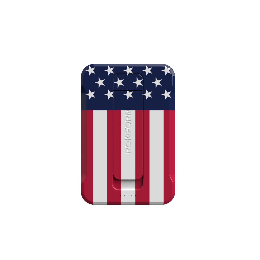
We spend so much time obsessing over the perfect pixel placement for a navigation bar, but none of that matters if your device shatters on the pavement. You can have the most intuitive "Contactless Wave" icon in the world, but it fails if your phone slides off the dashboard before you can pay. This is where the digital world crashes into physical reality. We bridge that gap.

Think about the "Biometric Lock" we discussed earlier. That represents digital safety. Rokform provides the physical equivalent with the RokLock™ twist lock system. It mechanically fastens your device to your motorcycle, bike, or car mount, offering protection that outperforms competitors. When you use the "QR Frame" or "Contactless Wave," you need precise alignment. Our MagSafe® compatible cases use industrial-grade MAGMAX™ magnets to ensure an instant, unbreakable connection to magnetic surfaces. And for those tracking health with the "Activity Ring," our most protective phone cases use military-grade materials to protect the device tracking your life.
Digital Icon Utility |
Physical Hardware Requirement |
Rokform Solution |
|---|---|---|
Contactless Wave (Payments) |
Precise Magnetic Alignment |
MagSafe® Compatible with MAGMAX™ |
Activity Ring (Fitness) |
Impact Protection for Active Use |
Rugged Military-Grade Cases |
Maps/Navigation (Travel) |
Secure Mounting on Vehicles |
RokLock™ Twist Lock System |
Do you want to ensure your apps are always accessible, regardless of the terrain? Equip your device with the hardware that matches your software's ambition. Whether you are driving or off-roading, having the best car phone mounts ensures your navigation icons remain visible and your device stays secure.
Final Thoughts
The best mobile experience in 2026 relies on a partnership between intuitive design and rugged hardware. While you scour libraries like Noun Project for the perfect "Spatial Minimalist" vector, remember to protect the glass that displays it. A shattered screen makes even the best icons illegible. You need the right assets from Noun Project and the right protection from us to keep your interface functional. and nothing else

