


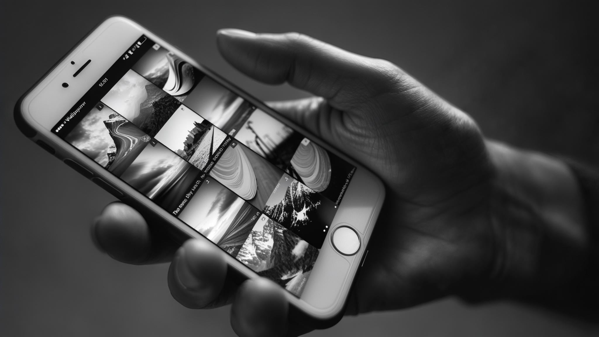
We spend over 7 hours a day staring at our phones, yet most of us settle for whatever wallpaper came pre-installed. I'll admit it – I was stuck with that boring default mountain scene for three years until my teenage niece roasted me about it during Thanksgiving dinner. She literally grabbed my phone and said "Uncle, this is embarrassing." That moment sparked my deep dive into the world of phone customization, and I've never looked back.
Your wallpaper isn't just decoration; it's the foundation of your daily digital experience. The right choice can boost your mood, improve functionality, and even help your battery last longer. I've been obsessing over wallpapers for months now, trying out everything from weird geometric patterns to photos of my dog, and I've learned what truly makes a wallpaper exceptional.
Table of Contents
What Makes a Phone Wallpaper Actually Worth Using
The Nerdy Stuff That Actually Makes a Difference (Trust Me on This)
Functional Design Elements You Can't Ignore
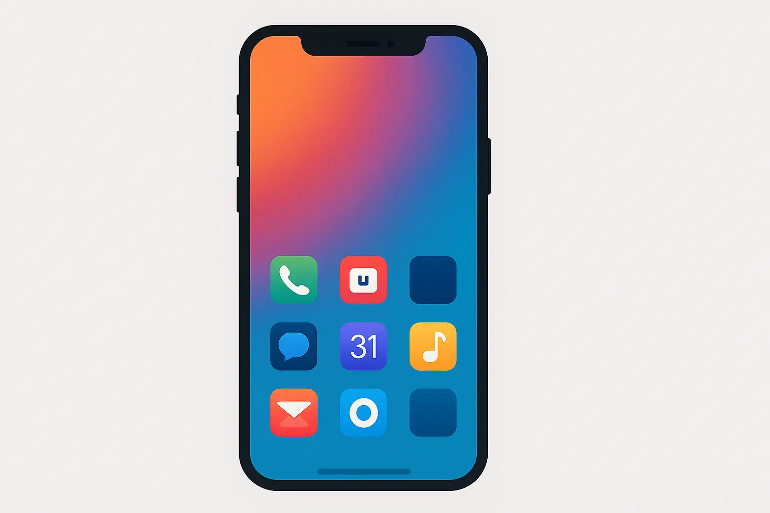
1. Sunset Gradient Perfection
2. Geometric Circle Symphony
3. Pure Black Minimalism
4. Mountain Line Art Magic
5. Architectural Shadow Play
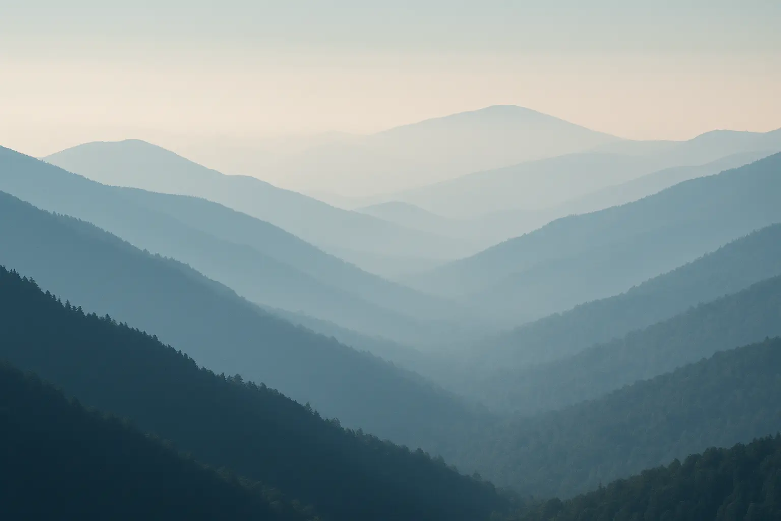
6. Alpine Peak Drama
7. Ocean Wave Energy
8. Forest Canopy Serenity
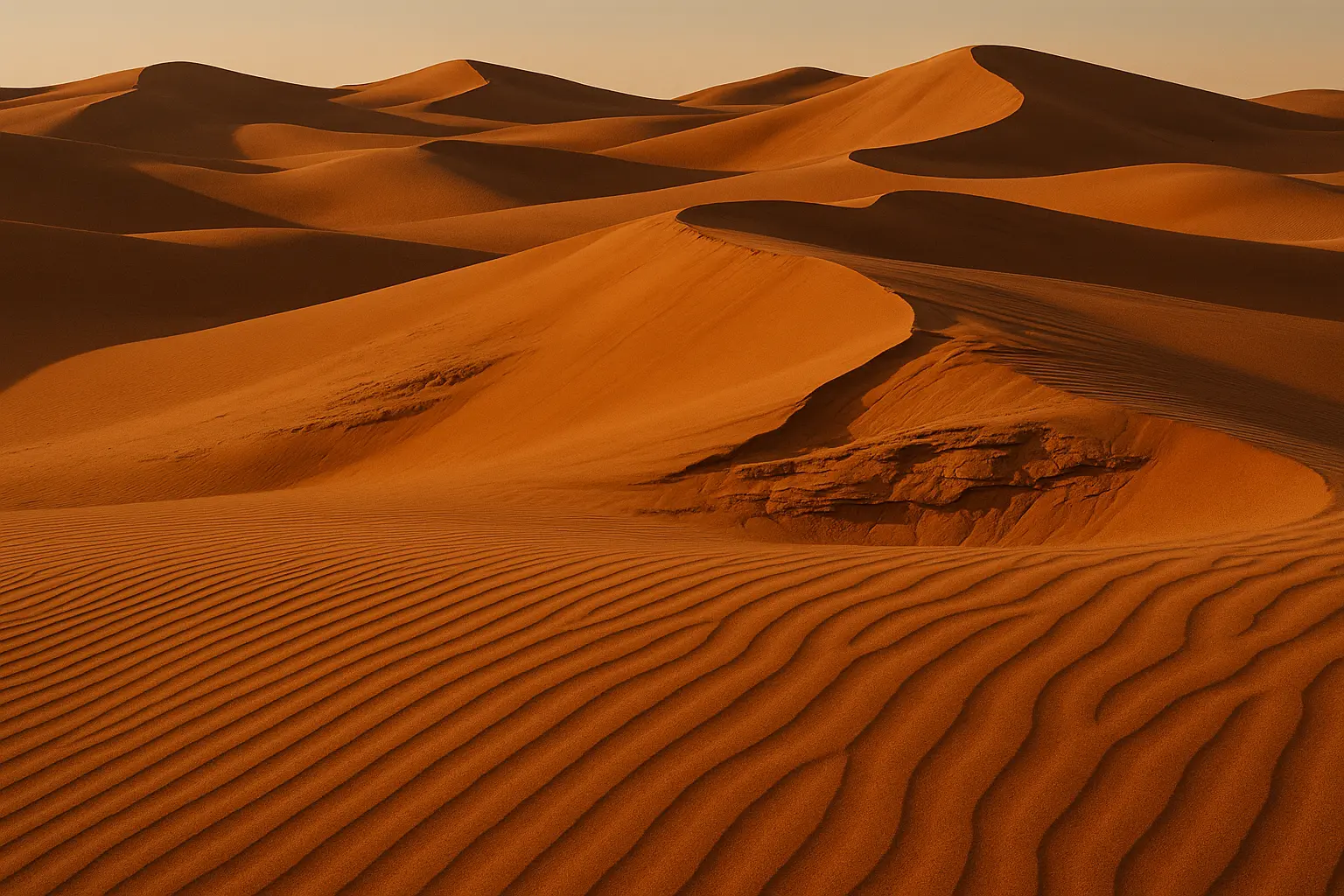
9. Desert Formation Beauty
10. Macro Water Droplet Wonder
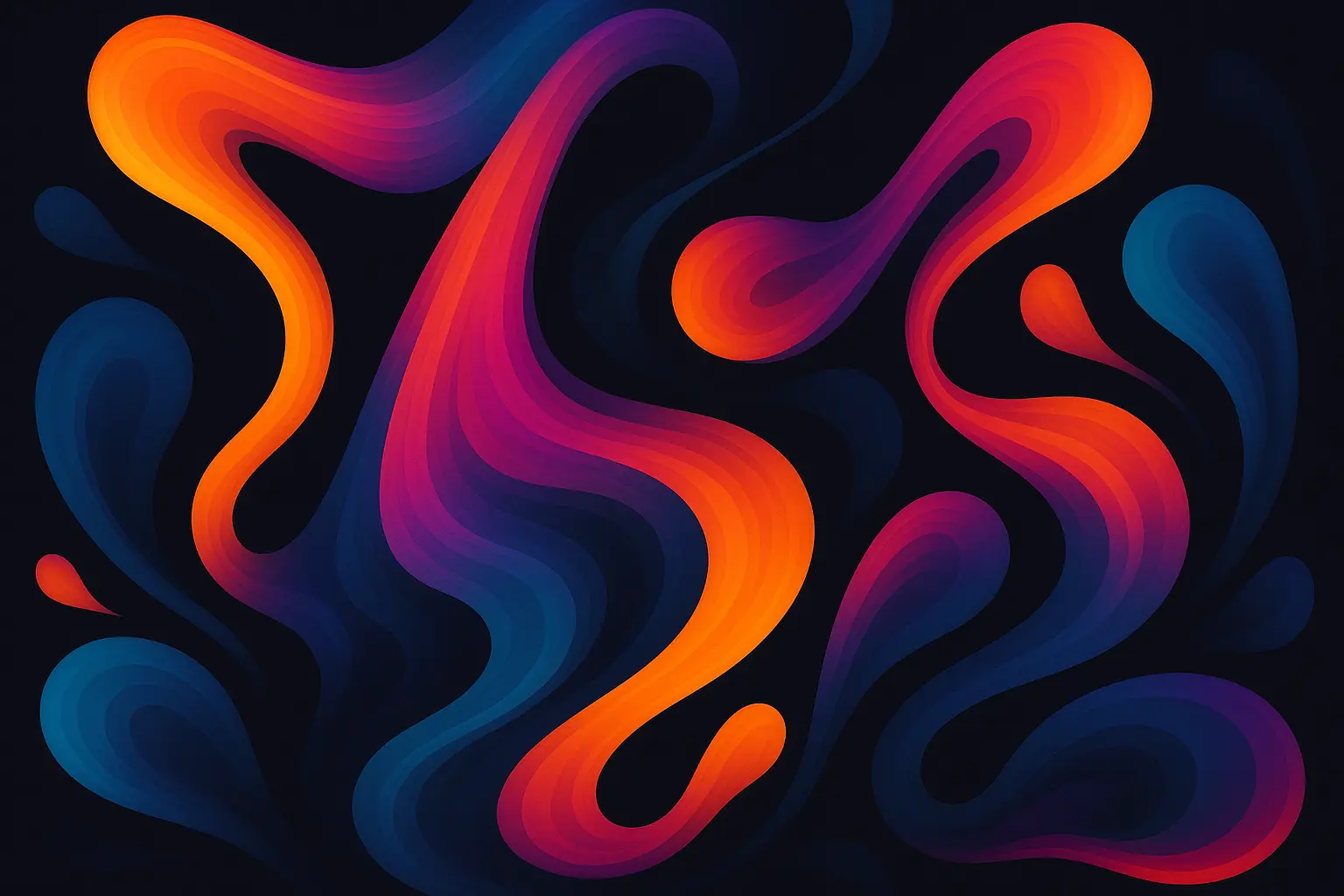
11. Digital Fluid Art Flow
12. Controlled Glitch Aesthetics
13. Watercolor Dream Blend
14. 3D Abstract Precision
15. Circuit Board Sophistication
16. Neon Grid Nostalgia
17. Cosmic Deep Space
18. Holographic Rainbow Shift
19. Typography Motivation Boost
20. Wanderlust Travel Inspiration
21. Personal Hobby Expression
22. Pet Portrait Perfection
23. Seasonal Rotation System
24. Time-Adaptive Themes
25. Interactive Live Elements
How Rokform Protects Your Perfect Wallpaper Choice
Final Thoughts
TL;DR
Resolution matching prevents pixelation – always check your phone's exact specs before downloading
Dark wallpapers extend OLED battery life by up to 15% compared to bright alternatives
Icon visibility trumps beauty – avoid busy patterns in app placement areas
Minimalist gradients and geometric patterns offer the best functionality-to-aesthetics ratio
Nature photography provides emotional benefits while maintaining professional appearance
Seasonal rotation prevents wallpaper fatigue and keeps your device feeling fresh
File size matters – balance quality with storage space (aim for 2-4MB for optimal performance)
What Makes a Phone Wallpaper Actually Worth Using
Your wallpaper choice impacts everything from battery life to daily productivity. I've learned this through months of testing different styles and watching how they affect my phone usage patterns. The phone wallpapers that lasted longest in my rotation weren't necessarily the prettiest – they were the ones that made my phone more enjoyable to use.
Quality phone wallpapers share several key characteristics. They display crisp details without pixelation, maintain excellent contrast for UI elements, and provide visual interest without overwhelming your apps. Most importantly, they feel right for your lifestyle and usage patterns.
The Nerdy Stuff That Actually Makes a Difference (Trust Me on This)
Look, I learned this the hard way – if you don't match your phone's resolution, your gorgeous wallpaper will look like it was stretched through a potato. Your iPhone 15 Pro needs 2556×1179 pixels, while Samsung Galaxy S24 requires 2340×1080. My friend Jake has an iPhone 15 Pro, and when he used my Samsung wallpaper on it, everything looked weirdly stretched. Turns out his phone needs different pixel dimensions than mine. Who knew numbers could matter so much for something as simple as a background picture?
File size creates a constant balancing act. High-resolution images can consume 5-8MB of storage, which adds up quickly if you're like me and enjoy variety. I've found the sweet spot sits around 2-4MB for most wallpapers, providing excellent quality without hogging precious storage space.
Color depth becomes crucial on modern displays. OLED screens showcase deep blacks and vibrant colors beautifully, while LCD displays handle bright, colorful images differently. Understanding your screen technology helps you choose wallpapers that truly shine on your specific device.
Device Model |
Resolution |
Aspect Ratio |
Recommended File Size |
|---|---|---|---|
iPhone 15 Pro |
2556×1179 |
19.5:9 |
2-4MB |
Samsung Galaxy S24 |
2340×1080 |
19.5:9 |
2-4MB |
Google Pixel 8 |
2400×1080 |
20:9 |
2-3MB |
OnePlus 12 |
2400×1080 |
20:9 |
2-3MB |
iPhone 14 |
2532×1170 |
19.5:9 |
2-4MB |
Samsung Galaxy S23 |
2340×1080 |
19.5:9 |
2-4MB |
Functional Design Elements You Can't Ignore
Icon visibility determines whether your wallpaper for phone enhances or hinders daily phone use. I once spent 20 minutes looking for my messaging app because I picked this super busy floral pattern that basically camouflaged everything. My mom was texting me about dinner plans while I'm squinting at my screen like an old person trying to read a menu.
Text legibility affects everything from notifications to time display. White text needs sufficient contrast to remain readable, while dark text requires lighter background areas. Pro tip I learned after making this mistake: don't pick a wallpaper with white text if you use light mode. I couldn't read my clock for a week and kept showing up late to everything.
Battery impact varies dramatically between wallpaper types. Dark wallpapers can extend OLED battery life by 10-15%, while bright, colorful images drain power faster. This difference becomes significant for heavy phone users who need every minute of battery life.
Sarah, a marketing executive, switched from a bright floral wallpaper to a dark gradient design and noticed her iPhone 14 Pro's battery lasting 3-4 hours longer during busy conference days. The dark background reduced OLED pixel power consumption while maintaining the professional aesthetic she needed for client meetings.
1. Sunset Gradient Perfection
Okay, so gradient wallpapers are basically my gateway drug into the whole wallpaper obsession. I started with one of those sunset gradients – you know, the ones that go from deep blue at the top to pink at the bottom – and suddenly I understood why people care about this stuff.
Here's the thing about gradients: they're like the perfect roommate. They look good, they don't get in your way, and they make everything else around them look better. Your app icons just pop against those smooth color transitions, and you never have to squint to read your notifications.
I've tried probably fifty different gradient combinations (yes, I counted), and the ones that stick around in my rotation are always the subtle ones. Those harsh, rainbow-explosion gradients might look cool in screenshots, but try living with one for a week – it's like having a neon sign as your bedroom wall.
The best part? They work on literally any phone. My old iPhone 8 made them look decent, and now on my newer phone, they're absolutely gorgeous. It's like they scale with whatever screen you throw at them.

2. Geometric Circle Symphony
I never thought I'd be the type of person to get excited about circles, but here we are. There's something weirdly satisfying about geometric patterns – maybe it's my brain's love of order, or maybe I just like things that look intentional.
The overlapping circle thing works because it creates these natural pockets where your apps can sit. It's like the wallpaper is designed around how you actually use your phone, instead of fighting against it. I stumbled onto this realization when I noticed my most-used apps always ended up in the same spots, right where the circles intersected.
My coworker Sarah saw my geometric wallpaper during a meeting and asked if I was "going through a minimalist phase." I guess compared to her photo of her three cats wearing tiny hats, yeah, I probably am. But it works – I can find my apps instantly, and it still looks intentional rather than boring.
3. Pure Black Minimalism
This is going to sound dramatic, but switching to a pure black wallpaper changed my relationship with my phone. I know, I know – it's just a black screen. But hear me out.
First off, my battery life went from "constantly hunting for chargers" to "oh right, I should probably plug this in tonight." The difference is real, especially if you've got an OLED screen like I do. Those pixels literally turn off when they're displaying black, so your phone sips power instead of chugging it.
But the bigger thing? It's like decluttering your digital space. Everything else – your apps, your widgets, your notifications – they all stand out perfectly. It's the phone equivalent of wearing all black: simple, elegant, and it makes everything else look more intentional.
The only downside is that some people think you're being boring. My sister keeps trying to send me "fun" wallpapers with sparkles and motivational quotes. I appreciate the thought, but I've found my zen place in the void.
Wallpaper Type |
OLED Battery Savings |
Icon Visibility Score |
Professional Rating |
|---|---|---|---|
Pure Black |
15% |
10/10 |
9/10 |
Dark Navy |
12% |
9/10 |
9/10 |
Charcoal Gray |
10% |
9/10 |
8/10 |
Dark Gradient |
8% |
8/10 |
8/10 |
Bright Colors |
0% |
6/10 |
6/10 |
Busy Patterns |
-2% |
4/10 |
4/10 |
4. Mountain Line Art Magic
Line art wallpapers are for people who want to feel artistic without actually being artistic. That's me, by the way. I can barely draw a stick figure, but put a single-line mountain range on my phone and suddenly I feel like I have taste.
The continuous line thing is mesmerizing – your eye follows it around the screen, and somehow it never feels busy or distracting. I picked one that looks like it was drawn in one fluid motion, even though I'm sure it took the artist forever to get right.
Best part? People always ask about it. "Oh, is that a drawing?" It's become my accidental conversation starter. I've had more random chats about art and hiking because of this wallpaper than from anything else on my phone. Who knew a simple line drawing could be such a social lubricant?

5. Architectural Shadow Play
I discovered shadow wallpapers by accident when I was looking for something "sophisticated" for a job interview. Ended up with this image of building shadows creating these dramatic geometric patterns, and it stuck around way longer than I expected.
The genius is in the negative space – all those empty areas where shadows aren't falling? Perfect spots for apps. It's like the wallpaper is working with your phone's layout instead of against it. My productivity apps sit in the light areas, my entertainment stuff hangs out in the shadows. Totally unintentional, but it feels right.
Plus, architectural shadows photograph beautifully, so even your lockscreen looks like you have your life together. My mom saw it and asked if I'd "gotten into photography." I didn't have the heart to tell her I just downloaded it from the internet.
6. Alpine Peak Drama
Mountain wallpapers are basically cheating – they make every phone look like it belongs in an REI catalog. I went through a phase where I changed my mountain wallpaper every week, trying to find the perfect balance of "I'm outdoorsy" and "but also I work in an office."
The layered ridge thing works so well because it gives your screen depth without being distracting. Those mountains fading into the background create natural zones for different types of apps. My work stuff lives in the foreground (urgent, immediate), while my games and social apps hang out in the misty background peaks.
Fair warning though: mountain wallpapers will make you want to go hiking. I've booked three camping trips since switching to alpine themes. My bank account is not thrilled, but my mental health definitely approves.
7. Ocean Wave Energy
Water wallpapers are my go-to when work stress gets overwhelming. There's actual science behind this – looking at water images can lower your stress response. I'm not making this up; I looked it up after noticing I felt calmer every time I unlocked my phone.
The wave patterns create these flowing lines that guide your eye around the screen without creating visual chaos. It's like having a tiny meditation break every time you check your messages. My therapist would probably approve, if she knew I was getting mindfulness practice from my wallpaper.
The color psychology is real too. Those deep ocean blues just hit different than bright, aggressive colors. I switched from a red abstract pattern to ocean waves and immediately noticed I felt less frantic when using my phone. Could be placebo effect, but I'll take it.
Michael, a financial analyst, replaced his busy city skyline wallpaper with an aerial ocean wave photograph and found his stress levels decreased during market volatility. The calming blue tones and organic patterns helped him maintain focus during 12-hour trading days while still providing visual interest.
8. Forest Canopy Serenity
Forest wallpapers are like having a tiny nature preserve in your pocket. I started using them during a particularly brutal work period when I couldn't get outside for weeks. Looking up through tree branches became my substitute for actual forest time.
The green tones really do help with eye strain – I read about it online and decided to test it during a weekend coding marathon. By Sunday evening, my eyes felt noticeably less fried than usual. Could be coincidence, but the science checks out, and the wallpaper looks great, so why not?
The upward perspective creates interesting visual dynamics too. Instead of looking down at your apps, you're looking up through branches at them. It's a subtle psychological shift, but it makes checking your phone feel less like diving into digital chaos and more like... I don't know, discovering things in a forest canopy?
9. Desert Formation Beauty
Desert wallpapers are underrated. Everyone goes for beaches or mountains, but there's something sophisticated about desert landscapes that works in professional settings without screaming "I'd rather be anywhere else."
The warm, earthy tones complement most app icon color schemes naturally. Those sunset desert shots with the layered rock formations? They create natural shelves and zones for organizing apps. My finance apps sit on the rock ledges, my creative stuff floats in the sky areas.
Plus, they're great conversation starters that don't reveal too much personal information. Mountain wallpapers make people ask about hiking, beach photos get comments about vacations, but desert shots? People just say "that's beautiful" and move on. Perfect for maintaining professional mystery.
10. Macro Water Droplet Wonder
Macro photography wallpapers are for people who like to show off their phone's screen quality. I'll admit it – I picked my first macro wallpaper specifically because it made my display look expensive. Those tiny water droplets with perfect reflections? They're basically screen resolution flex material.
But they grew on me for different reasons. There's something meditative about seeing the intricate details of things we usually ignore. Every time I unlock my phone, I get this tiny reminder that there's incredible complexity and beauty in everyday stuff we walk past without noticing.
The key is finding macro shots that aren't too busy. I made the mistake of using a super detailed flower petal image once – couldn't find any of my apps because everything blended into the texture. Now I stick to simpler macro subjects with clean backgrounds.
11. Digital Fluid Art Flow
Fluid art wallpapers are what happens when you want something that looks expensive and modern but don't want to commit to actual abstract art on your walls. These digital paint pours and liquid simulations scratch that aesthetic itch without any permanent decorating decisions.
The organic flowing shapes work surprisingly well with app layouts. Unlike rigid geometric patterns that can clash with circular icons, fluid art just flows around everything. Your apps become part of the composition instead of fighting against it.
My OLED screen makes these look incredible – those deep blacks and vibrant flowing colors create this almost holographic effect. I've caught myself just staring at my lock screen, watching how the colors seem to move even though it's a static image. Probably not great for productivity, but definitely good for my mood.
12. Controlled Glitch Aesthetics
Glitch wallpapers are my guilty pleasure. They're definitely not for everyone – my dad took one look and asked if my phone was broken. But there's something appealing about embracing digital chaos as an aesthetic choice.
The randomness actually works functionally because there's no predictable pattern to interfere with app placement. Unlike geometric designs that can create visual conflicts in specific areas, glitch patterns are chaotic enough that they don't consistently clash with anything.
They make a statement though. Using glitch art basically announces that you're comfortable with technology, maybe even that you find beauty in digital imperfection. It's not subtle, but sometimes you want your phone to reflect your personality loudly.
13. Watercolor Dream Blend
Watercolor wallpapers are the perfect compromise between artistic and professional. They're sophisticated enough for work environments but personal enough to feel like they reflect your taste. I switched to watercolor during a period where I needed my phone to look more "grown-up" but didn't want to go full corporate minimalist.
The soft, bleeding edges create these gentle backgrounds that don't compete with your apps or notifications. It's like having original artwork as your wallpaper, but artwork that knows its place and doesn't demand all the attention.
Different color palettes can match your mood or even your outfit coordination. I have a soft blue watercolor for professional days, warm earth tones for casual weekends, and a subtle purple blend for when I want to feel creative. It's probably overthinking it, but it works for me.
Emma, a graphic designer, uses watercolor wallpapers that match her current project's color palette. She switches between soft blues for corporate clients and warm earth tones for organic brands, helping her stay mentally aligned with each project's aesthetic while maintaining professional device appearance during client presentations.
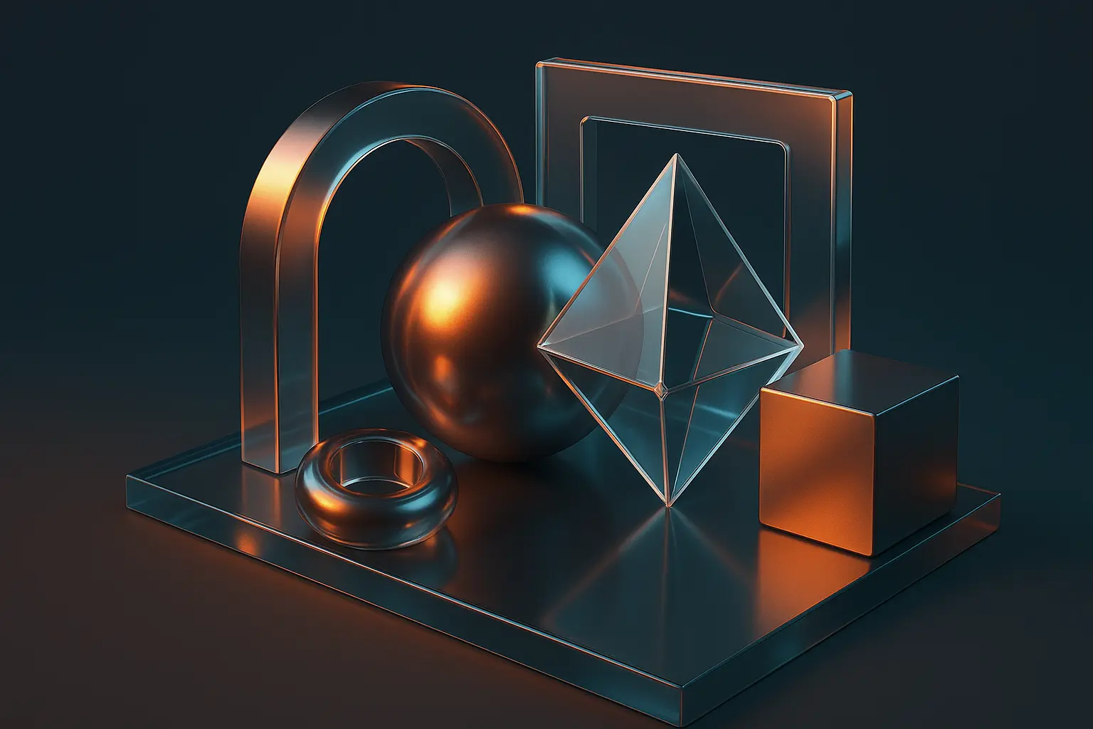
14. 3D Abstract Precision
3D rendered wallpapers are for people who want their phone to look like it belongs in a sci-fi movie. The complex lighting effects and realistic materials showcase what modern screens can do – it's basically showing off, but in a sophisticated way.
These wallpapers tend to be conversation starters in tech circles. Other people who care about display quality notice the difference immediately. It's like wearing a really good watch – most people won't notice, but the ones who do will appreciate the attention to detail.
The file sizes are bigger, usually 4-8MB, which adds up if you like to switch frequently. But the visual impact often justifies the storage cost. When someone hands me their phone with a basic wallpaper after seeing mine, the difference is pretty stark.
15. Circuit Board Sophistication
Circuit board wallpapers speak directly to my inner tech nerd. There's something satisfying about having the guts of electronics as your background – it's like celebrating the engineering that makes your device possible.
The linear patterns work great for organization too. Those circuit pathways naturally create zones and flow lines that complement folder arrangements. My work apps follow the main circuit traces, while my personal stuff sits in the component areas. Totally nerdy, but it makes navigational sense.
In professional tech environments, these wallpapers are subtle signals that you understand and appreciate the hardware side of things. It's not flashy, but it shows you're thinking about more than just the surface level of technology.
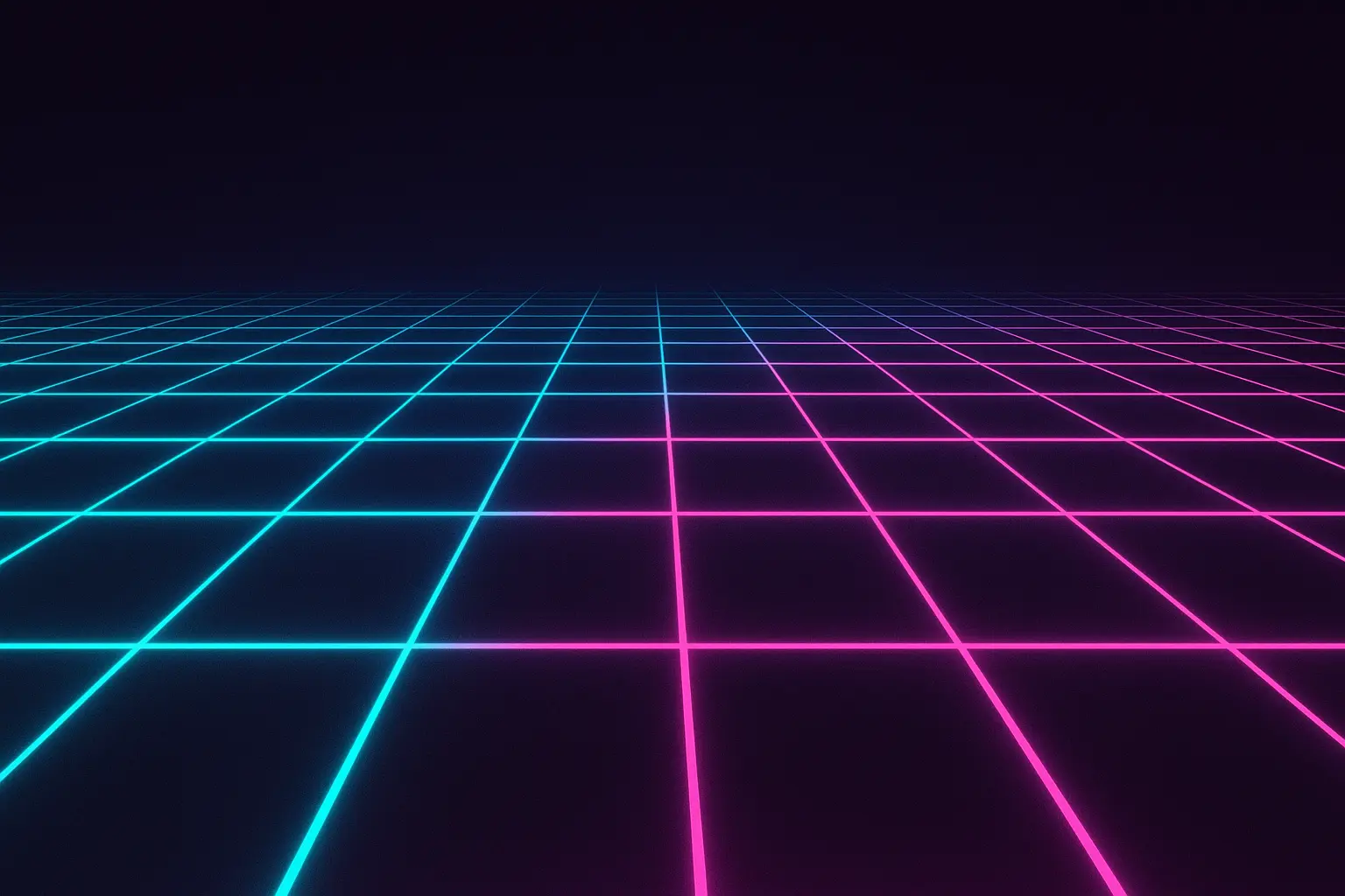
16. Neon Grid Nostalgia
Neon grid wallpapers tap into that retro-futuristic aesthetic that somehow never goes out of style. There's something about those glowing cyan and magenta lines that makes your phone feel like a prop from an 80s sci-fi movie, but in a good way.
The bright accent colors on dark backgrounds work perfectly for battery life while still providing visual punch. You get the energy of bright colors without the power drain, plus white text and icons pop beautifully against the dark areas.
These definitely make a statement. You're either into the retro-tech aesthetic or you're not. I love them, but I've gotten comments ranging from "that's so cool" to "are you going through a midlife crisis?" Fair points all around.
17. Cosmic Deep Space
Space wallpapers are basically universally appealing – I've never met anyone who looked at a good nebula photo and said "meh." There's something about cosmic imagery that works for everyone from kids to grandparents to serious business professionals.
The natural dark backgrounds are perfect for OLED battery conservation, while the bright stars and colorful cosmic clouds provide beautiful contrast for interface elements. It's functional and gorgeous, which is the sweet spot for wallpaper design.
Plus, they're great conversation starters that don't reveal much personal information. Mountain photos make people ask about hiking, pet photos get you into lengthy stories, but space images? People just say "wow, that's beautiful" and maybe make a comment about the universe. Perfect for maintaining friendly but professional boundaries.
18. Holographic Rainbow Shift
Holographic wallpapers are the "look at me" option of the wallpaper world. They're designed to show off your screen's capabilities and create that premium, expensive-device feeling. The color-shifting effects work particularly well on high-end OLED displays.
They can be distracting though. If you're someone who needs to focus intensively on your phone for work, the shifting patterns and colors might pull your attention away from what you're trying to accomplish. They're beautiful, but they're not subtle.
I use holographic wallpapers when I want my phone to feel special – before big presentations, during social events, or when I'm just in the mood for something that makes every unlock feel a little magical. They're not everyday wallpapers for me, but they're fun for special occasions.
Wallpaper Category |
Best Use Cases |
Potential Drawbacks |
Recommended Users |
|---|---|---|---|
Minimalist/Solid |
Heavy phone users, professionals |
Can appear boring |
Business users, productivity-focused |
Nature Photography |
All-purpose, emotional benefits |
File size, seasonal relevance |
General users, outdoor enthusiasts |
Abstract/Geometric |
Tech professionals, modern aesthetic |
May lack personality |
Designers, tech workers |
Typography/Motivational |
Personal inspiration, goal-oriented |
Text placement limitations |
Self-improvement focused, entrepreneurs |
Space/Cosmic |
Universal appeal, conversation starter |
Very dark, may hide details |
Science enthusiasts, dreamers |
Artistic/Creative |
Personal expression, unique style |
Professional appropriateness |
Artists, creative professionals |
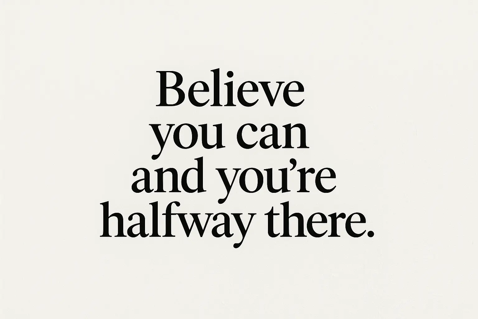
19. Typography Motivation Boost
Motivational quote wallpapers are hit or miss – they either genuinely inspire you or they start feeling cheesy after a week. I've been through both phases. The key is finding quotes that resonate with your actual goals rather than generic "live laugh love" type stuff.
Text placement is crucial for these to work functionally. I learned this the hard way with a wallpaper that put the quote right where my most-used apps needed to go. Now I look for designs that position text in the upper or lower areas, leaving the middle clear for app icons.
The psychological impact can be real though. Having a relevant, personal mantra visible every time you unlock your phone creates these tiny moments of refocusing throughout the day. It's like having a personal coach who whispers encouragement every time you check your messages.
20. Wanderlust Travel Inspiration
Travel photography wallpapers serve double duty – they look sophisticated in professional settings while providing daily inspiration for future adventures. I rotate through photos from places I want to visit, which keeps the wanderlust alive even during busy work periods.
The diverse compositions and color palettes mean you can find options that work with any icon arrangement or UI theme. Architectural shots provide clean lines and organized layouts, while landscape photos offer more organic, flowing compositions.
These wallpapers work especially well if you're in travel-related industries or international business. They project worldliness and cultural appreciation while maintaining appropriate workplace aesthetics. Plus, they're great for starting conversations with colleagues about travel experiences and recommendations.
21. Personal Hobby Expression
Hobby-themed wallpapers require the most careful selection because they need to balance personal expression with professional appropriateness. I've learned to go with subtle references rather than obvious displays – sound wave visualizations instead of concert photos, abstract patterns inspired by sports rather than team logos.
The personal connection makes these wallpapers particularly satisfying for long-term use. When your wallpaper reflects genuine, long-term passions, it creates daily moments of joy and identity reinforcement. It's like carrying a small piece of what makes you happy everywhere you go.
Creative approaches often work better than literal representations. My musician friend uses sound wave patterns instead of instrument photos, my rock-climbing buddy has abstract patterns inspired by route maps, and my cooking-obsessed sister uses artistic food photography that looks sophisticated rather than obvious.
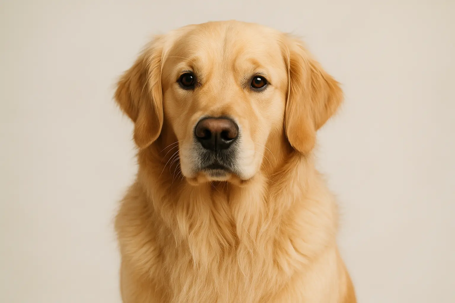
22. Pet Portrait Perfection
Pet photos are the ultimate personal wallpaper choice – they create immediate emotional connections and provide daily joy every time you unlock your phone. The trick is using professional-quality images that work well even in business settings.
The emotional benefits are real and measurable. Seeing beloved pets throughout the day reduces stress and provides moments of happiness during challenging periods. It's like carrying a pocket-sized mood booster that activates every time you check your phone.
Quality matters enormously for pet wallpapers. Blurry phone snapshots might be emotionally meaningful, but they don't work well as wallpapers. Professional lighting, sharp focus, and good composition transform simple pet photos into sophisticated images that look great anywhere.
23. Seasonal Rotation System
Seasonal rotation provides the highest long-term satisfaction by preventing wallpaper fatigue while creating natural connections to environmental changes. I switch mine four times a year – spring flowers, summer beaches, autumn leaves, and winter scenes – and it keeps my phone feeling fresh and current.
The key is selecting images that represent seasons without being overly obvious or cliché. Instead of literal pumpkin spice imagery for fall
The key is selecting images that represent seasons without being overly obvious or cliché. Instead of literal pumpkin spice imagery for fall, I go for subtle warm color palettes or abstract interpretations of autumn tones. It's more sophisticated and ages better.
Setting up rotation takes more effort than picking one wallpaper and forgetting about it, but the payoff is huge. There's something satisfying about updating your wallpaper when the seasons change – it's like giving your phone a mini makeover that matches what's happening outside your window.
24. Time-Adaptive Themes
Time-based wallpapers are for people who really want to optimize their phone experience. I started doing this when I realized my bright, energizing wallpaper was probably not helping my sleep hygiene when I checked my phone before bed.
Now I manually switch to darker, calmer themes in the evening and brighter, more motivating ones in the morning. It's become part of my daily routine – like changing into pajamas for my phone. Sounds ridiculous when I say it out loud, but it genuinely helps signal to my brain that it's wind-down time.
The psychological impact is subtle but real. Calming evening wallpapers support better sleep habits, while energizing morning options provide motivation for starting the day productively. It's like having environmental design that follows you everywhere.
25. Interactive Live Elements
Live wallpapers are cool in theory but tricky in practice. I've tried several – moving clouds, gentle particle effects, parallax scrolling – and the key is finding ones that enhance rather than distract from actual phone use.
The most effective versions use minimal processing power while providing maximum visual impact. Simple animations that loop seamlessly work much better than complex effects that drain battery and pull attention away from what you're trying to accomplish.
Battery life is the real consideration here. Live wallpapers that look amazing but kill your phone by 2 PM aren't worth it unless you're always near a charger. I save them for days when I know I'll be plugged in frequently, or when I want my phone to feel extra special for some reason.
How Rokform Protects Your Perfect Wallpaper Choice
After spending all this time finding the perfect wallpaper, the last thing you want is a cracked screen ruining the whole experience. Rokform's magnetic mounting system lets you position your phone at optimal viewing angles – whether you're showing off that motivational typography during presentations or enjoying nature landscapes during breaks.
The N52 Neodymium magnets are seriously strong (2-3x stronger than standard magnetic cases), which means secure mounting in cars, at desks, or anywhere else you want to display your carefully chosen wallpaper. No more propping your phone against random objects and hoping it doesn't slide.
For people who rotate seasonal wallpapers or use time-based themes, having reliable protection supports the dynamic lifestyle that makes these choices meaningful. Professional settings, outdoor adventures, daily commutes – you can enjoy your wallpaper choices without constantly worrying about drops or damage.
Final Thoughts
Look, I know I've probably overthought this whole wallpaper thing. My friends regularly make fun of how much time I spend considering background images for a device I'm supposed to be using productively. But here's the thing – we interact with our phones hundreds of times per day, so why not make those interactions a little more enjoyable?
The best wallpaper isn't necessarily the most beautiful one or the trendiest one. It's the one that enhances your daily phone experience instead of fighting against it. Whether that's clean minimalism that keeps you focused, inspiring nature photography that improves your mood, or quirky personal expression that makes you smile – the right choice is whatever works for your specific situation.
Don't feel pressured to stick with one style forever either. I've been through minimalist phases, nature photography obsessions, and abstract art periods. Your wallpaper preferences will probably evolve as your life changes, and that's totally fine. The goal isn't to find the perfect wallpaper and never change it – it's to be intentional about this small detail that affects your daily experience more than you might realize.
Take some time to actually consider what you want from your wallpaper. Do you need it to be professional? Calming? Energizing? Conversation-starting? Once you know what you're optimizing for, the choice becomes much clearer. And if you end up changing your mind in a few months, well, that's what makes this whole thing fun.

