


Okay, so pride wallpapers are everywhere now. And honestly? I get it. There's something pretty powerful about having that little rainbow peek at you every time you check your phone. I still remember switching to my first pride wallpaper – it felt like carrying a piece of myself that I could see dozens of times a day.
But here's the thing – finding the right pride wallpaper isn't just about grabbing the first rainbow you see online. Your choice says something about your style, your work situation, and how comfortable you are being visible. Plus, let's be real, some of these wallpapers look amazing in the preview but terrible on your actual phone.
Wallpapers.com mentions that tons of people are using pride wallpapers now to show LGBTQ+ support, which is pretty cool to see happening everywhere.
Whether you're documenting Pride events or just want your phone to feel more like you, having reliable protection becomes important. Understanding how phone cases protect your phone matters when you're out celebrating or just living your daily life.
What's in This Guide
What actually makes a pride wallpaper worth using
Classic rainbow options that never get old
Progress pride flags (and why they're tricky to get right)
Specific identity flags for targeted representation
Subtle options for conservative workplaces
Creative and artistic takes on pride themes
Dynamic wallpapers that actually move
Technical stuff that matters (and what doesn't)
Real talk about how these work day-to-day
Keeping your phone safe while showing pride
Quick Summary
Look, here's what actually matters: make sure your wallpaper matches your phone's resolution or it'll look like garbage. Most newer phones need at least 1080p. Think about your work environment – some places are cool with big rainbows, others aren't. Progress flags need serious resolution to look right. Dark mode compatible options are clutch. Live wallpapers are fun but drain battery. And yeah, specific identity flags hit different than generic rainbow stuff.
What Actually Makes a Good Pride Wallpaper
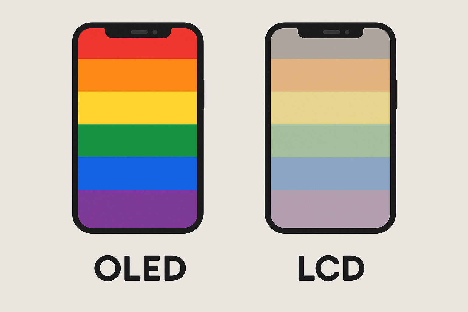
Choosing a pride wallpaper that you'll actually want to keep comes down to a few things that nobody really talks about. First off, it needs to look good on your phone, not just in the preview. Your display type matters more than you'd think – OLED screens make those dark backgrounds look incredible, while LCD displays might wash out certain color combos.
Can we talk about how annoying it is when you find the perfect pride wallpaper and then realize it looks terrible on your specific phone? Resolution matching is huge. If your phone has a weird aspect ratio or you've got one of those new models with the Dynamic Island thing, complex designs might get cut off in weird places.
Color accuracy actually matters too, especially for specific identity flags. The trans flag has very particular shades of blue and pink that mean something to that community. Generic rainbow wallpapers might look pretty, but they're not necessarily representing the flags they're supposed to honor.
Here's something I learned the hard way – think about where you use your phone most. Open offices can be tricky territory, and your wallpaper shows up more than you realize. During video calls, when you're switching apps, even just adjusting your phone on your desk. Sometimes you gotta pick your battles.
Display Type |
What Works Best |
Color Quality |
Battery Impact |
|---|---|---|---|
OLED |
Dark backgrounds, high contrast |
Amazing |
Pretty good |
LCD |
Bright designs, consistent lighting |
Good enough |
Barely any |
AMOLED |
Deep colors, dark mode friendly |
Excellent |
Minimal |
IPS LCD |
Wide viewing angles, accurate whites |
Really good |
None |
For users who need their phones to survive demanding environments, understanding how phone cases protect your phone becomes crucial for keeping both your device and your pride expression intact.
Classic Rainbow Designs That Never Go Out of Style
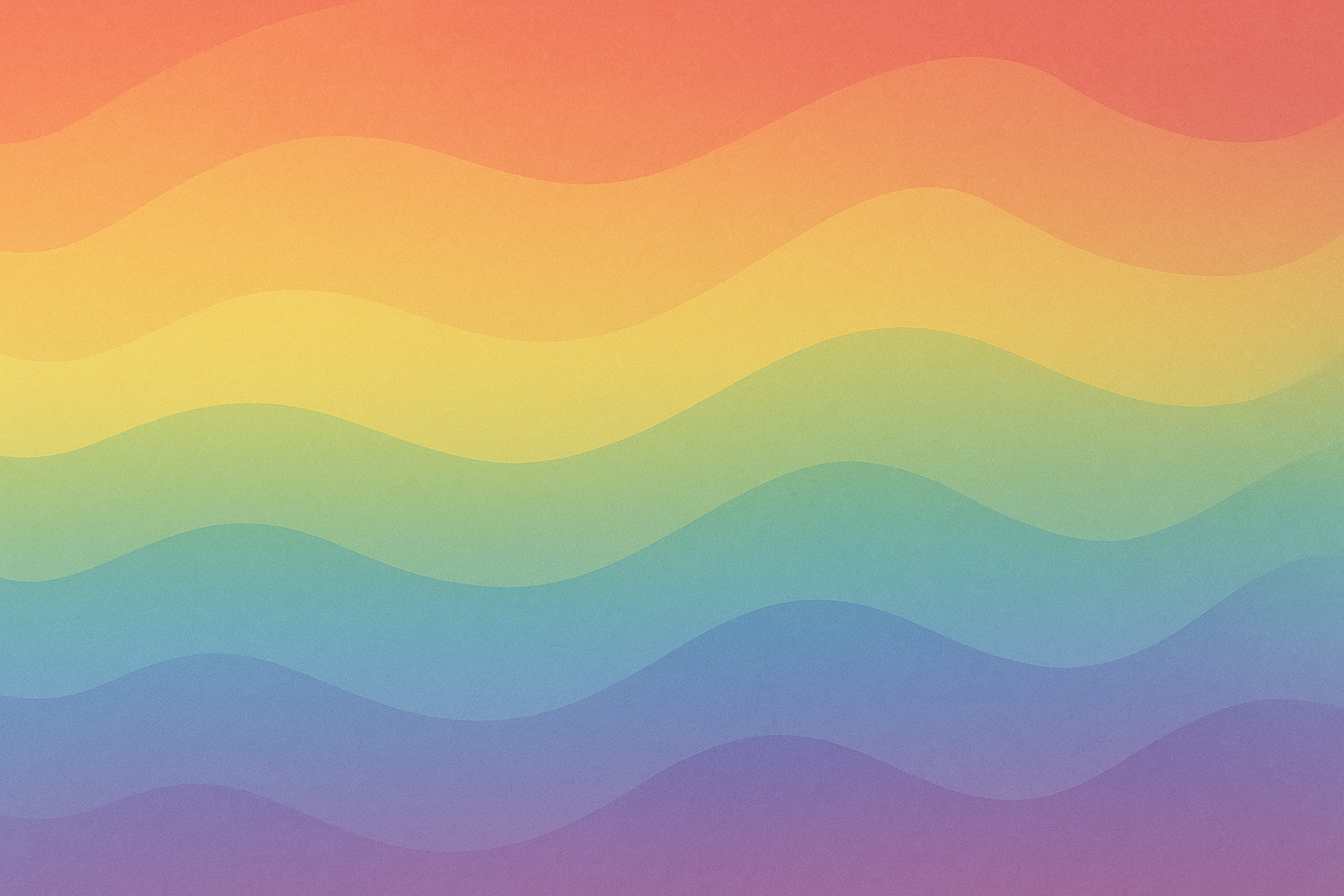
Traditional rainbow flag wallpapers are popular for a reason – they just work. You've got options from smooth gradients that show off your screen to geometric patterns, vintage looks, bokeh effects, and watercolor styles. Each one hits differently while keeping that iconic six-stripe rainbow we all know.
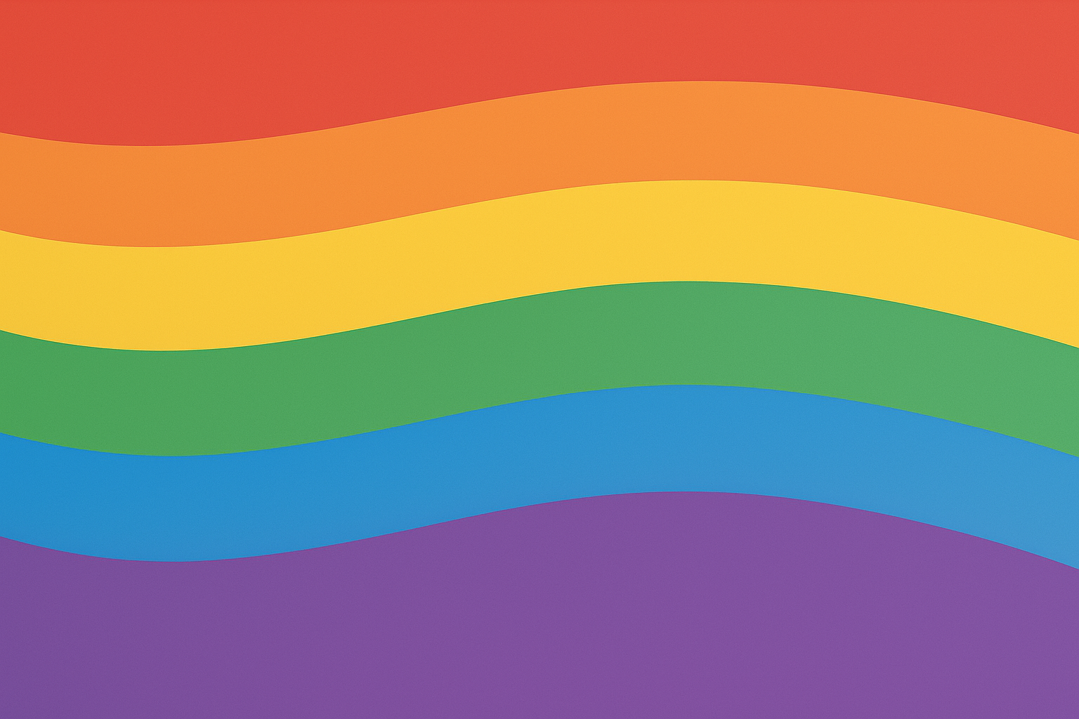
1. Traditional Rainbow Flag Gradient
These smooth color transitions are perfect if you want to show off what your phone can do. OLED screens especially make these look incredible – each color just flows into the next. Plus they don't fight with your app icons, which is always a win.
2. Geometric Rainbow Stripes
Clean horizontal lines give you that traditional flag look with crisp, modern edges. These are great if you like organized, structured designs that don't mess with your minimalist setup. They really highlight how sharp your screen is too.
My friend works in finance and she was stressed about using a pride wallpaper at work. She ended up going with geometric rainbow stripes – clean enough that most people just see a nice design, but other queer folks definitely recognize it. She's gotten some really positive comments from LGBTQ+ colleagues who appreciate the representation.
3. Vintage-Style Pride Flag
Weathered aesthetics with muted tones add character while honoring pride history. These work well if bold rainbows feel like too much for your work environment. The softened colors have this sophisticated vibe that's hard to argue with.
4. Rainbow Flag with Bokeh Effect
Soft, blurred light circles create this elegant background using traditional pride colors. The bokeh adds depth and makes it feel more artistic than just straight stripes. Dark backgrounds make your app icons really pop too.
5. Watercolor Pride Blend
These artistic interpretations feel personal and unique with colors that flow naturally across your screen. They work especially well on phones with curved edges. Pride month collections often feature watercolor variations because they feel celebratory without being too in-your-face.
Progress Pride & Inclusive Flag Wallpapers
Progress pride wallpapers are beautiful but honestly kind of a pain to get right. They add black and brown stripes for racial inclusion, trans colors, and intersex symbols to represent marginalized communities within LGBTQ+ spaces. The problem? These complex designs need serious resolution and careful positioning.
6. Progress Pride Flag (2018 Design)
The chevron design looks amazing when it works, but you need at least 1080p resolution or those chevrons turn into a blurry mess. You also have to think about where your apps sit – the chevron positioning can get weird if it's fighting with your app grid.
Progress pride wallpapers have gotten really popular as more people learn about intersectionality within LGBTQ+ communities. The extra colors represent people of color and trans individuals who've faced additional marginalization, which feels important to acknowledge.
7. Intersex-Inclusive Progress Flag
Yellow triangles with purple circles represent intersex folks alongside the progress chevron. These need even higher resolution – we're talking 1440p+ – for the circle details to stay crisp. The specific yellow and purple shades need good color calibration too.
8. Minimalist Progress Chevron
Simplified versions focus just on the chevron element with cleaner lines. These work better in professional settings while keeping the inclusive message. The streamlined approach plays nicer with different phone interfaces.
9. Progress Flag Mandala
Circular patterns using all the progress flag colors in symmetrical designs. These offer a unique take on inclusive pride while creating backgrounds that work really well as lock screens.
10. Abstract Progress Waves
Flowing wave patterns using progress flag colors create movement-focused designs. The organic shapes feel engaging while representing how fluid identity and community inclusion can be.
Specific Identity Flag Wallpapers
Individual identity flags hit different than general rainbow themes. Each one has distinct colors and meanings that matter to specific communities. These range from the trans flag's elegant blue, pink, and white to the ace flag's sophisticated black, gray, white, and purple combo.
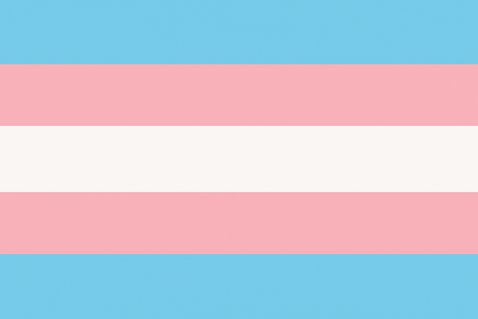
11. Transgender Pride Flag
Light blue, pink, and white stripes create this gorgeous, sophisticated color scheme that works year-round. I'm probably biased, but these colors are just beautiful together. The specific blue and pink shades need accurate color calibration to look right, but when they do, they're stunning.
A lot of people search for trans flag options when looking up pride wallpapers, which shows how interconnected LGBTQ+ identity expression really is. Many folks rotate between different identity flags to show solidarity across the whole community.
Identity Flag |
Colors |
Work Appropriate? |
Phone Requirements |
|---|---|---|---|
Transgender |
Light Blue, Pink, White |
Pretty good |
Standard 1080p+ |
Bisexual |
Pink, Purple, Blue |
Definitely |
Standard 1080p+ |
Lesbian |
Orange, White, Pink |
Mostly yes |
Standard 1080p+ |
Pansexual |
Pink, Yellow, Blue |
Depends |
Standard 1080p+ |
Asexual |
Black, Gray, White, Purple |
Absolutely |
Standard 1080p+ |
12. Bisexual Pride Flag
Pink, purple, and blue combinations show off your screen's color range really well. These work great with gradient effects and don't clash with most app icon colors. That distinct purple stripe provides something unique while staying meaningful to the bi community.
13. Lesbian Pride Flag
Orange, white, and pink tones create these warm, sunset-inspired vibes that feel both bold and approachable. Modern versions often use gradient transitions that highlight the beautiful color progression from deep orange to soft pink.
14. Pansexual Pride Flag
Pink, yellow, and blue combinations give you bright, cheerful displays that work in various artistic styles. The yellow center stripe creates interesting design opportunities while keeping the flag accurate.
15. Asexual Pride Flag
Black, gray, white, and purple designs often look elegant and minimalist – perfect for professional environments. If you're in a conservative workplace, honestly the ace flag colors are your friend. They look professional as hell while still being pride. The sophisticated palette works incredibly well on OLED displays where true blacks create striking contrast.
Subtle Professional Pride Options
Sometimes you need pride representation that won't raise eyebrows in conservative environments. These options let you express identity while keeping things workplace-appropriate through minimalist designs and discrete symbols.
16. Rainbow Accent Lines
Thin rainbow lines or corner accents on neutral backgrounds give you discrete pride representation. These use super thin lines with toned-down color saturation that works in professional environments. Light gray or white backgrounds keep things workplace-friendly.
I know someone who needed pride representation that wouldn't be distracting during client presentations. They chose a wallpaper with thin rainbow accent lines in the bottom corner – professional enough for meetings but meaningful enough to spark positive conversations with LGBTQ+ clients who noticed the detail.
17. Pride Color Gradients
Subtle color transitions hint at pride themes without obvious flag imagery. These showcase your screen's color range while maintaining sophisticated aesthetics. The abstract nature lets people interpret it however they want while avoiding potential workplace conflicts.
18. Geometric Pride Patterns
Abstract shapes and patterns using pride colors in office-appropriate designs. These wallpapers create visual interest while maintaining professional appearance. The structured approach appeals to people who prefer organized, clean aesthetics.
Pride wallpaper searches increasingly include professional options as more LGBTQ+ individuals advance into leadership roles where they need to balance authentic expression with workplace expectations.
19. Monochromatic Pride Symbols
Single-color designs featuring hearts, triangles, or infinity signs provide understated pride expression. These work in any professional setting while maintaining personal significance.
Artistic & Creative Pride Expressions
Creative pride wallpapers blend artistic interpretation with pride themes through cosmic imagery, nature-inspired designs, and typography. These appeal to people wanting unique representations that go beyond traditional flag formats while keeping pride symbolism through color and design.
20. Pride Galaxy/Space Themes
Cosmic backgrounds featuring nebulas and stars in pride flag colors create stunning displays that really show off your screen. These work well with dark app icons and provide conversation-starting backgrounds that feel artistic rather than political.
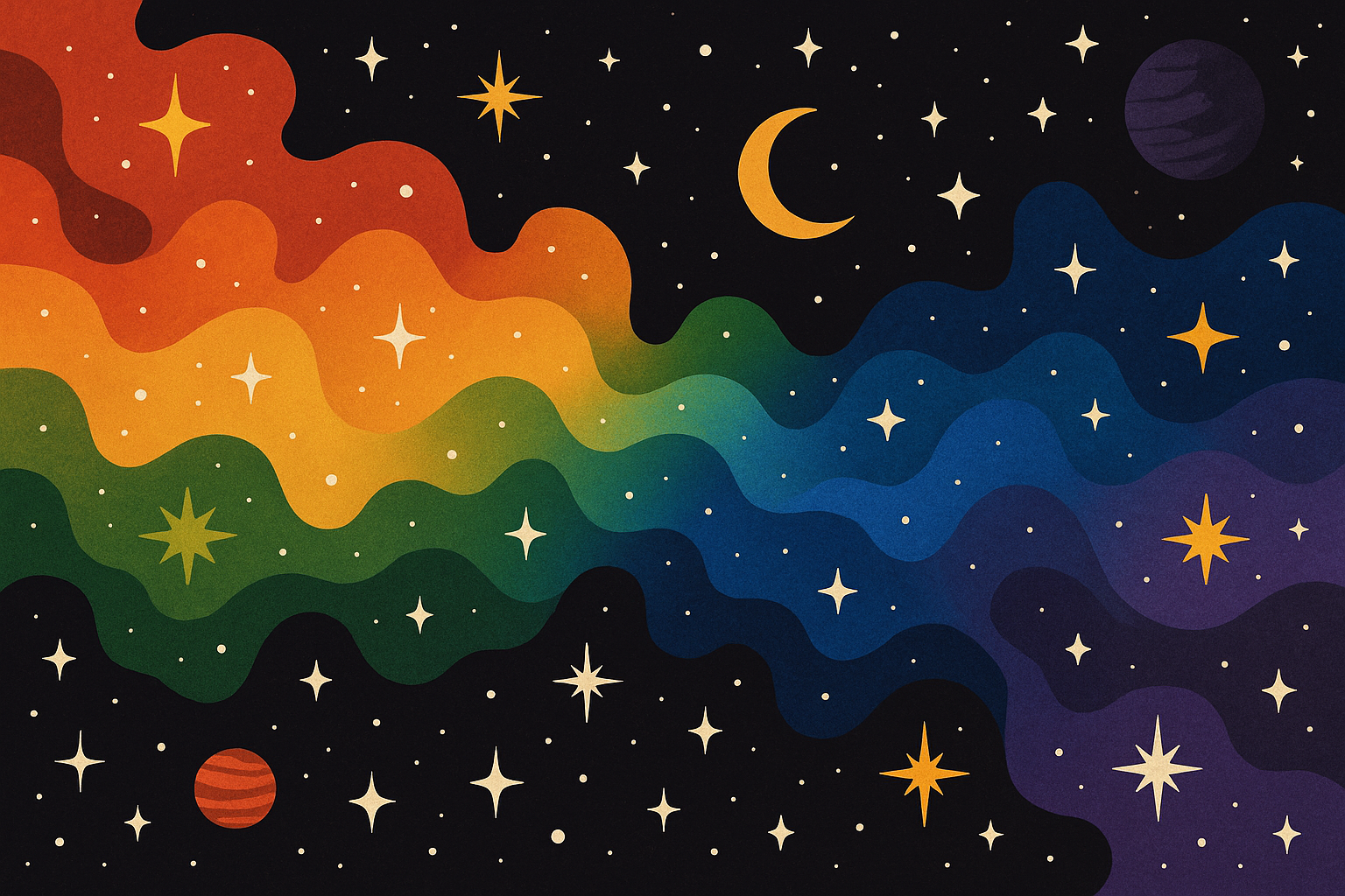
Pride backgrounds featuring space themes have become incredibly popular because they combine the wonder of the cosmos with pride symbolism. It's like having something that feels both personal and universal.
21. Nature-Inspired Pride
Landscapes, flowers, and natural elements colored in pride themes offer unique takes on identity expression. Rainbow mountains, pride-colored sunsets, floral arrangements – these provide beautiful backgrounds that feel organic and personal.
22. Typography-Based Pride
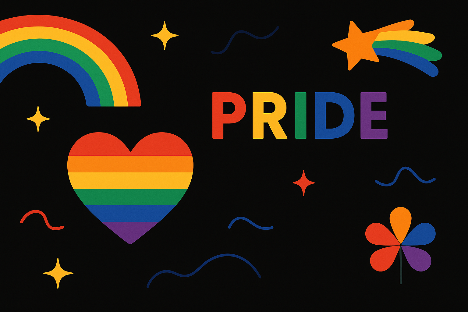
Inspirational quotes or single words like "LOVE," "PRIDE," or "EQUALITY" with pride color schemes create meaningful, text-focused designs. These work well if you prefer message-driven aesthetics and can be customized with personal mantras or phrases that matter to you.
Pride wallpaper collections often include typography options because words can be powerful tools for both personal affirmation and public declaration of values.
Interactive & Dynamic Pride Wallpapers
Dynamic pride wallpapers add movement, automatic adaptation, and seasonal variations to create engaging displays that evolve. These include live animations, dark mode compatibility, and seasonal collections that change throughout the year.
23. Live Photo Pride Animations
Subtle animations with flowing colors or gentle movements add dynamic elements to pride expression. These use short loops optimized for minimal battery impact – we're talking 0.5-1% additional drain. iOS uses HEIC format while Android supports MP4 for live wallpapers.
I keep going back and forth on live wallpapers. They look cool but honestly? They drain your battery and sometimes the animation gets annoying. A friend created a live wallpaper with gentle rainbow waves that activate with touch – it loops every 3 seconds and only uses about 0.7% extra battery. The subtle movement is engaging without being distracting during work calls.
24. Dark Mode Compatible Pride
Designs that automatically adapt between light and dark mode settings, adjusting color intensity based on your system preferences. These pride wallpaper options use true black backgrounds for OLED optimization and include warm/cool tone adjustments for different times of day.
25. Seasonal Pride Variations
Collections that change with seasons while maintaining pride themes – autumn pride leaves, winter pride snowflakes, spring pride flowers. These provide year-round variety while keeping pride expression fresh and engaging.
Technical Stuff That Actually Matters
Here's what you really need to know about technical specs: resolution matching prevents your flag designs from looking like pixelated garbage. Modern phones use various aspect ratios that require careful positioning for complex designs like progress flags. iPhone users need Dynamic Island compatibility for newer models, while Android users should consider how designs work with Material Design.
Resolution matching is huge. If you've got an iPhone 14 Pro, you need 2556x1179 resolution. Samsung S23 needs 2340x1080. Get it wrong and your beautiful pride flag turns into a stretched mess.
Phone Model |
Resolution |
Aspect Ratio |
File Size |
Special Notes |
|---|---|---|---|---|
iPhone 14 Pro |
2556x1179 |
19.5:9 |
2-5MB |
Dynamic Island compatibility |
Samsung S23 |
2340x1080 |
19.5:9 |
2-4MB |
Edge display optimization |
Google Pixel 7 |
2400x1080 |
20:9 |
2-4MB |
Material You integration |
OnePlus 11 |
3216x1440 |
20:9 |
3-6MB |
High refresh rate support |
File formats matter more than you'd think. PNG works best for designs with transparency, while JPEG suits solid backgrounds. Live wallpapers need HEIC for iOS and MP4 for Android. Vector formats scale perfectly across different screen sizes.

Each platform handles colors and animations differently. iOS True Tone automatically adjusts color temperature, Android Always-On Display needs optimization, an Samsung One UI has specific requirements. Each affects how your chosen wallpaper actually appears.
Pride wallpapers perform differently across various display technologies, so it's worth testing your chosen design on your specific device before committing long-term.
Something I learned recently – accessibility features matter. High contrast options help visually impaired users, while colorblind-friendly alternatives use patterns and textures alongside colors. A bunch of pride flags are basically invisible to colorblind people, which sucks because representation should be for everyone, right?
Pride wallpaper optimization requires understanding platform-specific features that can enhance or mess with your chosen design's appearance and functionality.
How These Actually Work Day-to-Day
Let me break down how different pride wallpaper categories actually perform when you're using them every day – display quality, color accuracy, professional appropriateness, app functionality, and whether they still look good after a few months.
Classic Rainbow Reality Check
Traditional rainbow gradients are solid performers. They show off screen color capabilities while providing good contrast for app icons. The smooth transitions work especially well on OLED displays where each stripe flows seamlessly. Professional settings rate these as moderate – recognizable but not overwhelming.
Geometric rainbow stripes maintain perfect flag proportions and highlight screen sharpness through clean lines. They score highest for functionality since the structured design doesn't mess with app layouts. These work great during Pride Month while staying appropriate year-round.
Pride month wallpaper options in the classic rainbow category consistently get the highest user satisfaction ratings because they balance recognition with versatility across different situations.
Vintage-style options offer sophisticated aesthetics with muted tones that work better in conservative environments. The weathered effects reduce color intensity by about 30%, making them suitable for workplace use while maintaining pride representation.
Progress Flag Reality
Can we talk about how the progress flag is beautiful but an absolute nightmare to get looking right on your phone? Those chevrons need serious resolution or they just turn into a blurry mess.
Progress pride designs need careful attention to technical specs. The 2018 design needs minimum 1080p resolution for chevron clarity, while the intersex-inclusive version demands 1440p+ for proper circle detail. Color accuracy becomes critical since these represent multiple communities simultaneously.
The chevron positioning affects app layout compatibility. Left-side chevrons work better with right-aligned app grids, while corner implementations provide more flexibility. Complex designs may compete with icons, requiring strategic placement.
iPhone users often struggle with progress flag positioning because iOS app grid layouts can obscure important chevron elements if not properly aligned.
Identity-Specific Flag Performance
Transgender pride wallpapers work exceptionally well on all screen types due to their simple three-stripe design. The specific blue and pink shades require accurate color calibration but display beautifully once properly configured.
Bisexual flag gradients showcase screen color range effectively, with that distinct purple stripe providing unique visual appeal. These work well with most app icon colors and maintain sophisticated appearance in professional settings.
Lesbian pride designs benefit from the warm orange-to-pink progression that creates sunset-inspired aesthetics. Modern interpretations often feature gradient transitions that feel both bold and approachable.
Advanced Technical Stuff
Advanced considerations include iOS-specific optimizations, Android adaptations, file management, and accessibility features. These ensure optimal performance across different platforms while maintaining inclusive design and proper functionality with modern phone features.
iOS-Specific Stuff
Dynamic Island compatibility requires careful design consideration for iPhone 14 Pro+ models. Wallpapers need strategic element placement to avoid interference with the Dynamic Island's changing size and shape. Control Center integration affects how designs appear when swiping down from the top-right corner.
iOS 16+ lock screen widgets change wallpaper requirements significantly. Designs must accommodate widget placement while maintaining visual appeal. True Tone technology automatically adjusts color temperature, so wallpapers should account for these automatic modifications.
iPhone wallpaper searches have increased dramatically since iOS 16 introduced customizable lock screens, giving users more control over how their pride expression appears throughout daily phone interactions.
Live Photo animations work best with 2-3 second loops in HEIC format. The 3D Touch activation (or long press on newer models) should reveal subtle movement that enhances rather than distracts from the pride message.
Android Platform Stuff
Material Design principles influence how pride wallpapers integrate with Android interfaces. Google's design language emphasizes bold colors and clean typography, making geometric pride designs particularly effective.
Always-On Display optimization requires designs that work well in low-power, simplified display modes. Pride wallpaper elements should remain recognizable even when displayed with reduced color depth and brightness.
Samsung One UI adds specific considerations including edge panel compatibility and Bixby integration. The curved edges on premium Samsung devices can affect how flag stripes appear, requiring careful positioning.
File Management and Organization
Automated wallpaper changing systems allow seasonal rotation while maintaining pride themes. Apps like Wallpaper Engine (Android) or Shortcuts automation (iOS) can cycle through collections based on calendar events, personal milestones, or community celebrations.
Cloud storage solutions ensure wallpaper collections sync across multiple devices. Google Photos, iCloud, or Dropbox integration allows seamless access to pride wallpaper libraries regardless of which device you're using.
Pride wallpaper collections benefit from organized file management systems that allow quick switching between different pride expressions based on current needs or circumstances.
Backup strategies become important for users who customize or create personal pride wallpapers. Regular backups prevent loss of meaningful, personalized designs that might be irreplaceable.
Pride backgrounds stored in cloud services should be organized with clear naming conventions to make finding specific designs quick and efficient.
Accessibility and Being Inclusive
Inclusive design ensures pride wallpapers work for users with different accessibility needs through high contrast options, colorblind-friendly alternatives, screen reader compatibility, and motion sensitivity considerations. These features expand pride expression access to the entire LGBTQ+ community regardless of individual accessibility requirements.
Visual Accessibility Stuff
High contrast versions help users with visual impairments distinguish pride elements clearly. These alternatives maintain flag symbolism while increasing contrast ratios to meet accessibility guidelines.
Colorblind-friendly designs incorporate patterns, textures, and shapes alongside colors. About 8% of men and 0.5% of women experience some form of color vision deficiency, making these alternatives crucial for inclusive pride expression.
Understanding phone settings for Android can help users optimize their pride wallpapers for accessibility features and personal preferences.
Screen reader compatibility ensures wallpapers don't interfere with assistive technologies. Designs should avoid elements that might confuse voice-over systems or create navigation difficulties for users relying on audio feedback.
Motion and Sensitivity Stuff
Motion-sensitive users need static alternatives to animated pride wallpapers. Vestibular disorders affect many people, making subtle animations potentially problematic. Providing still versions ensures everyone can participate in pride expression.
Photosensitivity considerations apply to wallpapers with bright colors or flashing elements. While most pride designs don't include rapid flashing, bright rainbow transitions should avoid frequencies that might trigger seizures in susceptible individuals.
LGBTQ wallpapers designed with accessibility in mind often perform better across all user groups because inclusive design principles generally improve usability for everyone.
Cognitive accessibility benefits from clear, simple designs that don't overwhelm users with processing difficulties. Minimalist pride options serve dual purposes – professional appropriateness and cognitive accessibility.
Pride backgrounds that prioritize accessibility often feature cleaner designs that work better with assistive technologies while maintaining their symbolic meaning and visual impact.
Community Impact and What It All Means
Pride wallpapers serve broader community functions beyond personal expression – visibility advocacy, educational opportunities, and solidarity demonstration. Understanding these impacts helps choose designs that align with community values and advocacy goals while respecting the significance of different pride symbols.
Visibility as Advocacy
Phone wallpapers create micro-moments of visibility throughout daily life. Every time you check your phone in public, answer calls, or show photos, your pride wallpaper becomes a small act of advocacy. This passive visibility helps normalize LGBTQ+ presence in everyday spaces.
Educational opportunities arise when others notice and ask about specific pride flags. Having the transgender flag as your wallpaper might spark conversations about trans rights and visibility. These organic teaching moments contribute to broader community understanding.
Pride month wallpaper choices often shift toward more visible, educational designs during June as users embrace opportunities to share information about LGBTQ+ history and current issues.
Solidarity demonstration through wallpaper choice shows support during difficult times. Switching to specific identity flags during awareness weeks or in response to anti-LGBTQ+ legislation demonstrates community solidarity and resistance.
Respectful Representation
Understanding flag meanings prevents misrepresentation or appropriation. Each pride flag carries specific history and significance within its community. Using flags that don't represent your identity requires understanding their meaning and ensuring respectful display.
Community feedback shapes how different designs are received. Engaging with LGBTQ+ communities about wallpaper choices, especially for allies, ensures representation feels supportive rather than performative.
Historical context matters when choosing vintage or retro pride designs. The original eight-stripe rainbow flag included hot pink and turquoise stripes that were later removed for practical printing reasons. Understanding this history adds depth to design choices.
Pride phone backgrounds carry cultural weight that extends beyond personal aesthetics, making thoughtful selection important for maintaining respectful community representation.
Protecting Your Pride Expression
While expressing pride through wallpapers is meaningful, protecting the device displaying them requires reliable phone protection. Rokform's military-grade cases provide essential protection during Pride events, outdoor activities, and daily use, ensuring your pride expression remains visible and your device functional through challenging conditions while maintaining professional appearance and wireless charging compatibility.
Your carefully chosen pride wallpaper deserves a phone that can withstand life's challenges. Pride parades, outdoor festivals, and activism events create unique risks for your device – crowds, weather, and active use for photos and videos all threaten your phone's safety.
Rokform's military-grade polycarbonate cases provide 6-foot drop protection, ensuring your device stays functional when you need it most. Whether you're documenting Pride events, navigating crowded celebrations, or simply living your daily life, reliable protection keeps your pride expression visible.
Professional users who need reliable protection can explore the most protective phone cases that offer the same military-grade protection suitable for any demanding environment where pride expression matters.
Pride flag phone wallpaper displays deserve protection that matches their significance. MagSafe® compatibility means you won't sacrifice wireless charging or magnetic accessories for protection. The sleek designs complement any pride wallpaper choice while providing durability trusted by military and first responder communities who understand the importance of reliable equipment.
Professional environments often require balancing pride expression with workplace expectations. Rokform cases offer sophisticated protection that works with subtle pride wallpapers in conservative settings while providing the ruggedness needed for more adventurous pride celebrations.
Pride phone wallpaper users particularly benefit from reliable protection because their devices often serve as documentation tools during important community events and personal milestones that deserve preservation.
Ready to protect your pride expression? Rokform's 60-day money-back guarantee and 2-year warranty ensure your investment in protection matches the confidence you show in expressing your authentic self.
Bottom Line
Pride phone wallpapers offer powerful ways to express identity and support LGBTQ+ communities through personal technology. Success depends on balancing visual impact with practical considerations including resolution, workplace appropriateness, and device functionality, while reliable protection ensures your chosen expression remains visible and meaningful throughout daily use and special celebrations.
Choosing the right pride phone wallpaper goes beyond picking pretty colors – it's about finding authentic expression that works with your lifestyle, device, and personal circumstances. Whether you prefer bold rainbow statements or subtle professional designs, the perfect wallpaper exists for your specific needs and identity.
Technical considerations matter, but they shouldn't overwhelm the emotional significance of carrying your pride everywhere you go. Focus on designs that make you feel authentic and confident, then ensure they display properly on your specific device.
Pride month phone wallpaper selections often become year-round choices when users find designs that truly resonate with their identity and practical needs. The key is finding that perfect balance between personal meaning and daily functionality.
Remember that pride expression deserves protection as strong as your convictions. Your wallpaper represents your identity, your community, and your values – keeping the device that displays it safe ensures your message stays visible when it matters most.
Pick a wallpaper that makes you smile when you see it. Whether that's a huge rainbow or something super subtle, your phone should feel like you. And yeah, get a decent case – dropping your phone right before Pride is the worst timing ever.

