


I've noticed everyone (including myself) goes a little wallpaper-crazy right when September hits. There's something about that first crisp morning that makes you want to ditch your summer beach photo for something more... autumn-y.
Last year, I found myself at 11 PM on August 31st frantically scrolling through Pinterest for the perfect fall wallpaper. Never mind that it was still 85 degrees and humid as a sauna outside—my phone needed to match the cozy autumn vibes I was desperately craving. Anyone else do this, or is it just me? That late-night wallpaper hunt taught me something valuable: the right september phone wallpaper doesn't just change your screen—it shifts your entire seasonal mindset.
Your phone's wallpaper sets the tone for hundreds of daily interactions. Whether you're checking morning notifications or scrolling through apps during your commute, that background image influences your mood more than you might realize. September wallpapers carry extra weight because they bridge the gap between summer's brightness and autumn's warmth, creating a visual transition that helps you embrace the season's unique energy.
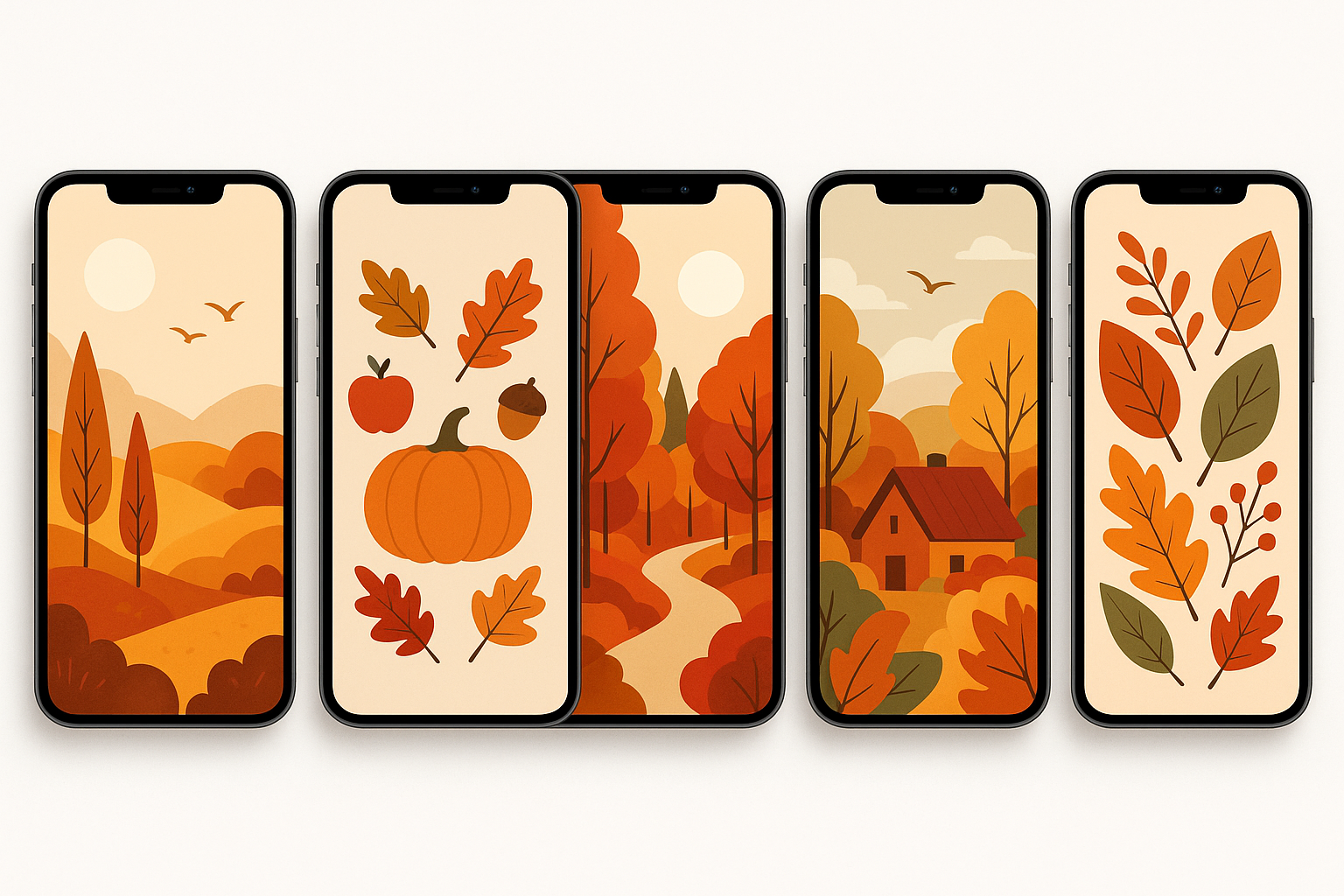
We've curated 25 stunning september phone wallpaper options across six distinct categories, each designed to capture different aspects of the month's character. From golden forest paths that make you want to plan weekend hikes to minimalist designs that complement any app layout, these options cater to every aesthetic preference and functional need.
Table of Contents
What Makes September Wallpapers Special
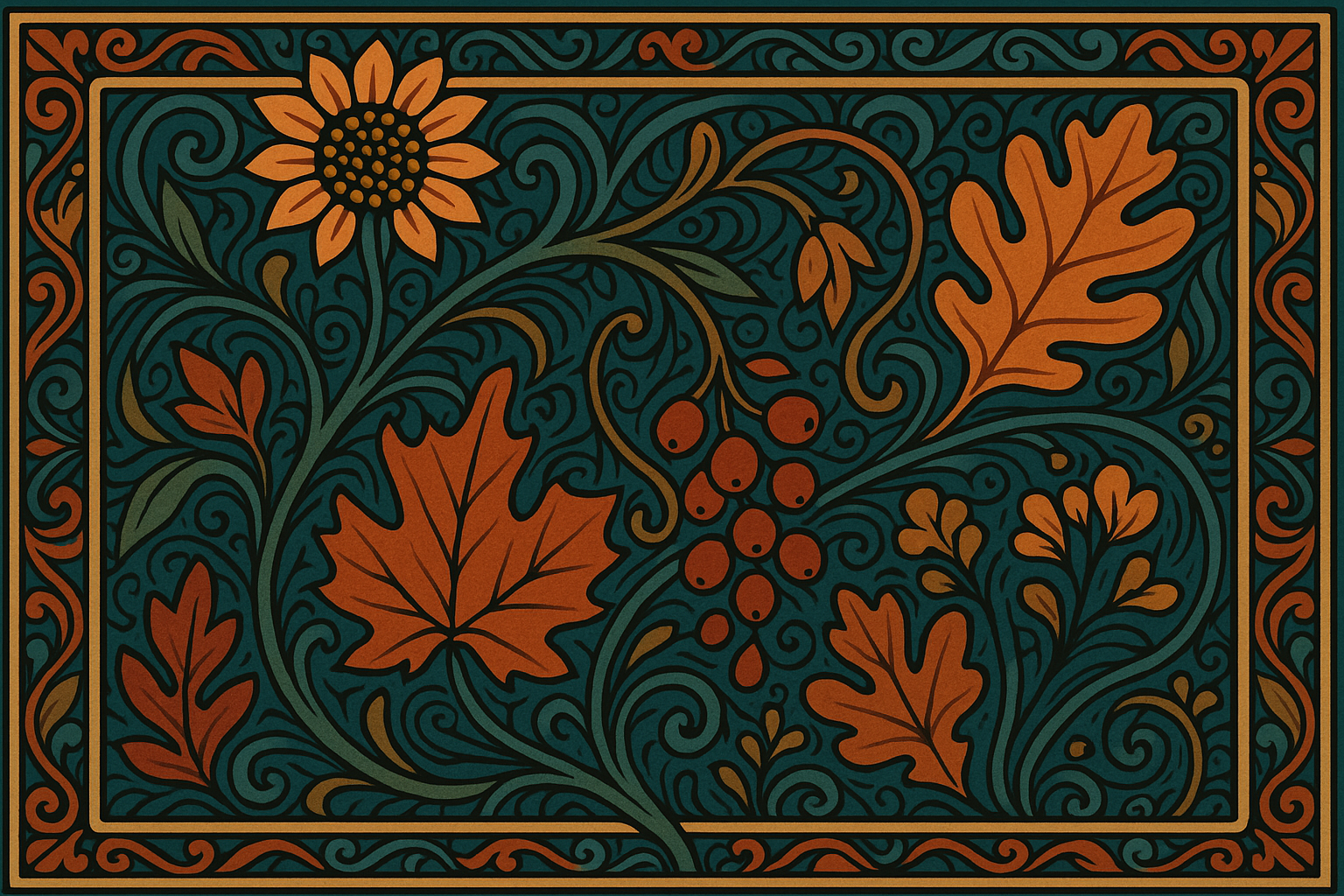
Autumn Nature & Landscapes Collection
Minimalist & Abstract September Themes
September 2024 Calendar Wallpapers
Aesthetic & Artistic September Designs
Photography & Realistic September Scenes
Seasonal Lifestyle & Activities
Technical Performance Analysis
Protecting Your Phone During Autumn Adventures
Final Thoughts
TL;DR
September wallpapers should balance seasonal aesthetics with functional readability and battery optimization
Resolution compatibility matters—ensure your chosen wallpaper matches your device's native resolution to avoid pixelation
Dark wallpapers conserve battery life on OLED displays, while gradient designs offer the best balance of style and efficiency
Calendar wallpapers serve dual purposes, providing both visual appeal and practical monthly planning functionality
Nature photography and minimalist designs offer the broadest appeal across different personal styles and interface preferences
Strategic negative space placement ensures app icons and text remain clearly readable against your chosen background
What Makes September Wallpapers Special
Look, I get it—picking a wallpaper seems like it should be simple. But here's the thing: your wallpaper is literally the first thing you see every time you pick up your phone (which, let's be honest, is probably way more than you'd like to admit). So it better be good.
September wallpapers hit different because they're doing this whole balancing act between summer's last hurrah and autumn's cozy embrace. You want something that says "yes, I'm ready for sweater weather" without completely abandoning the warmth we're still clinging to.
When selecting seasonal wallpapers, understanding 4K phone wallpaper quality helps ensure your chosen design maintains crisp detail across all device types and screen sizes.
Wallpaper Criteria |
Importance Level |
Key Considerations |
|---|---|---|
Resolution Compatibility |
Critical |
Match device native resolution (1080x1920, 1440x2560, or 4K) |
Aesthetic Harmony |
High |
Balance with app icons and interface elements |
Seasonal Relevance |
High |
Incorporate autumn themes, warm tones, transitional elements |
Functional Readability |
Critical |
Ensure text visibility and app icon clarity |
Personal Style Alignment |
Medium |
Match individual preferences and lifestyle |
Battery Impact |
Medium |
Consider OLED optimization and power consumption |
The real deal on what actually matters:
Your wallpaper needs to play nice with your apps. I learned this the hard way when I fell in love with this gorgeous, super detailed leaf pattern only to realize I couldn't read a single app name against it. Epic fail.
Resolution is boring but important—basically, just make sure whatever you pick matches your phone's screen size. Nothing kills the vibe like a pixelated mess that looked amazing on Pinterest but terrible on your actual device. Most modern smartphones require wallpapers in 1080x1920 or higher resolutions, with flagship devices often demanding 1440x2560 or even 4K resolution.
Consider Sarah, a graphic designer who downloaded a beautiful autumn forest wallpaper at 720x1280 resolution for her iPhone 14 Pro. Despite the gorgeous imagery, the wallpaper appeared blurry and pixelated on her 1179x2556 display. After switching to a properly sized version at 1179x2556, the same image looked crisp and professional, perfectly complementing her design apps and maintaining visual quality throughout daily use.
And here's something most people don't think about: darker wallpapers save battery life if you've got one of those fancy OLED screens. It's not going to change your life, but every little bit helps when you're trying to make it through the day without hunting for a charger.
September's seasonal relevance sets these wallpapers apart from generic options. The month represents transition—summer's end, autumn's beginning, back-to-school energy, and harvest time. Effective September wallpapers incorporate warm autumn tones, educational themes, or harvest motifs that reflect this unique temporal position.
Your wallpaper shouldn't interfere with text visibility on your home screen. Overly busy patterns behind app names create visual chaos and reduce usability. The best wallpapers provide clear areas for text while maintaining visual interest.
Autumn Nature & Landscapes Collection
Alright, nature lovers, this section's for you. These are the wallpapers that make you want to plan a weekend road trip to see some actual fall foliage (even if you'll probably just end up at Target buying pumpkin spice everything instead).
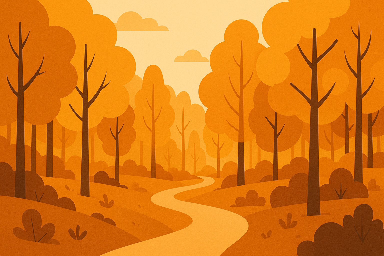
1. Golden Hour Forest Path
This one's pure magic. You know that perfect lighting that happens right before sunset? That's what we're talking about here. The kind of photo that makes you feel like you should be hiking instead of scrolling through your phone.
Winding trails through deciduous trees create natural leading lines that draw your eye through the composition. The golden and amber foliage, captured during magic hour, provides warm 2700K color temperature lighting with high contrast between illuminated and shadowed areas.
The golden trees create this natural tunnel effect that somehow makes your apps look more organized. It's weird but it works. Plus, the shadowy areas give you perfect spots to put your most-used apps without them getting lost in all that gorgeous foliage. Strategic shadow areas provide natural negative space for app placement without disrupting the image's flow.
2. Misty Mountain Valley
If you're into that mysterious, early-morning vibe, this is your jam. There's something about fog rolling through mountains that just screams "I have my life together and drink coffee from actual mugs, not paper cups."
Early morning fog rolling through valleys creates layers of atmospheric depth that work beautifully on high-resolution displays. The mixed autumn colors—deep reds, burnt oranges, and golden yellows—create natural color gradients that complement most interface themes.
The soft, blurred areas are perfect for widgets, and the color transition from cool blues to warm oranges somehow makes everything on your screen look more sophisticated. It's like Instagram filter magic for your home screen. The soft focus areas in this wallpaper provide excellent negative space for widget placement.
3. Maple Leaf Close-up
For when you want autumn vibes but don't want your wallpaper to be too busy. This macro shot shows off all those tiny details you never notice in real life—the veins, the water droplets, the way the colors blend together.

Macro photography reveals intricate leaf vein patterns and water droplets against a softly blurred autumn background. This wallpaper requires phones with good detail rendering capabilities to showcase the fine textures and subtle color variations effectively.
The blurred background means your apps won't compete for attention, and there's something oddly satisfying about having nature's artwork as your backdrop. Very zen, very fall. The shallow depth of field creates natural bokeh that won't interfere with icon readability.
4. Harvest Moon Landscape
Okay, this one's dramatic. Big orange moon, dark landscape, total autumn movie poster vibes. If you've got an OLED screen, those dark areas will help your battery last longer too—bonus points for being practical while looking amazing.
A large orange harvest moon rising over agricultural fields creates dramatic silhouette contrast perfect for OLED displays. The gradient sky transitions from deep blue to warm amber, providing smooth color changes that look stunning on modern screens.
The horizontal layout works great if you're one of those people who organizes apps in neat little rows. The moon gives you a natural focal point, and everything else just falls into place around it. The moon serves as a natural focal point while the horizontal composition works well with landscape-oriented widgets.
5. Autumn Lake Reflection
Sometimes you just want something peaceful, you know? This perfectly still lake reflecting all the fall colors is like visual meditation. It's symmetrical, calming, and makes you feel like you've got your zen master certification even when you're stress-scrolling through emails.
Perfect mirror reflections create symmetrical compositions that provide visual balance and tranquility. The pristine lake surface reflects surrounding trees in full fall color, with scattered floating leaves adding subtle movement to the scene.
The mirror effect creates natural sections for organizing your apps, and the calm water surface is basically the visual equivalent of a deep breath. Perfect for when life gets a little too chaotic. This wallpaper's horizontal orientation accommodates landscape-oriented app arrangements effectively.
Minimalist & Abstract September Themes
For those of you who think "less is more" and actually mean it. These are clean, sophisticated, and won't give you visual overload every time you check your phone.
6. Gradient Autumn Palette
This is just pure color therapy. Smooth transitions from deep burgundy to golden yellow—like a sunset you can carry in your pocket. No fuss, no complicated imagery, just beautiful color that happens to save your battery life too.

Smooth color transitions from deep burgundy to golden yellow mimic September sunset colors while optimizing battery life on OLED displays. Pure color gradients eliminate visual complexity, creating sophisticated backgrounds that complement any app icon style.
It's the kind of wallpaper that works with literally any app setup and never gets old. Sometimes the simplest things are the most perfect. The gradient's smooth transitions prevent visual fatigue during extended phone use.
7. Geometric Fall Leaves
Think autumn leaves, but make them modern. These stylized, low-poly leaf designs are for people who love fall but also love clean lines and contemporary design. It's seasonal without being cutesy.
Stylized low-poly representations of maple and oak leaves arrange in clean, modern patterns that complement contemporary flat design principles. Vector-based construction ensures perfect scaling across all screen resolutions without quality loss.
The geometric style plays really well with today's flat app icons, and the structured spacing gives you plenty of flexibility for organizing your home screen however makes sense to you. The geometric style aligns with modern interface design languages used in current operating systems.
8. September Typography
Just the word "September" in beautiful typography against a warm, textured background. It's simple, it's elegant, and it literally tells you what month it is (helpful for those of us who lose track of time).
Clean serif typography spelling "September" creates elegant focal points against textured backgrounds in warm earth tones. The text placement leaves strategic areas clear for app placement while maintaining typographic hierarchy.
Real talk: My friend James uses this one because it matches his company's branding, but also because seeing "September" every day helps him remember monthly deadlines. Sometimes functional can be beautiful too. Marketing professional James chose the September Typography wallpaper for his work phone because the clean serif font matched his company's brand guidelines. The warm earth-tone background complemented his productivity apps while the prominent "September" text helped him stay aware of monthly deadlines and campaign schedules.
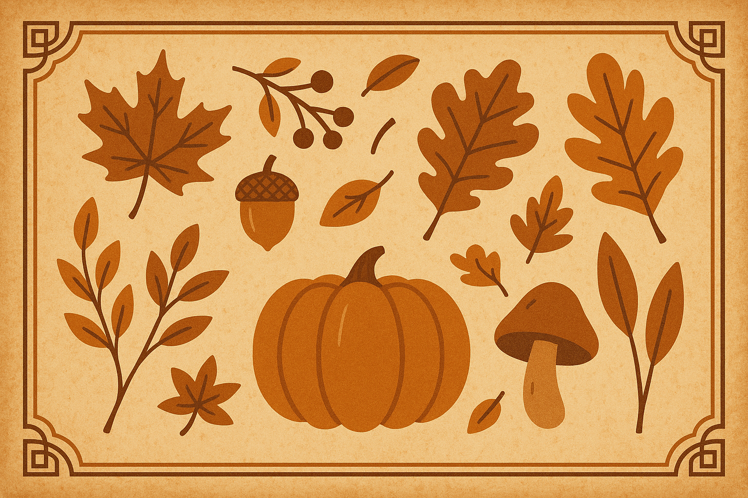
9. Minimalist Harvest Elements
Simple line drawings of wheat, pumpkins, and acorns scattered on a clean background. It's autumn-themed without being overwhelming, and the sparse design means you can organize your apps however you want without visual chaos.
Simple line drawings of wheat stalks, pumpkins, and acorns arrange asymmetrically on neutral backgrounds with subtle autumn color accents. The sparse composition maximizes flexibility for home screen customization.
Perfect for people who want seasonal vibes but don't want their wallpaper to be the star of the show. Line art style reduces visual complexity while maintaining thematic relevance.
10. Abstract Autumn Swirls
Flowing, organic shapes in warm fall colors that suggest movement without being literal about anything. It's sophisticated, it's modern, and it gives you that autumn feeling without hitting you over the head with pumpkins and leaves.
Flowing organic shapes in warm autumn colors create abstract compositions with generous negative space. Rust, amber, and deep red tones flow together in patterns that suggest natural movement without literal representation.
The flowing design adds just enough visual interest to keep things from being boring, while the generous negative space keeps everything functional. The organic shapes add visual energy while maintaining sophisticated color harmony.
For users seeking september phone wallpaper aesthetic options that maintain visual simplicity, exploring minimalist phone wallpaper designs provides additional inspiration for clean, functional backgrounds.
September 2024 Calendar Wallpapers
For the planners, the organizers, the people who color-code their schedules and actually use their phone's calendar app. These wallpapers are functional AND pretty—the holy grail of productivity aesthetics.
Calendar Type
Calendar Type |
Best For |
Key Features |
Compatibility |
|---|---|---|---|
Full Grid Layout |
Monthly planners |
Complete 30-day view, holiday highlighting |
All devices, landscape orientation |
Weekly View |
Detailed scheduling |
7-day focus, note space, autumn borders |
Portrait orientation preferred |
Minimalist Date |
Current day focus |
Large date display, gradient background |
High-resolution displays |
Widget Coordinated |
Integration users |
Negative space zones, widget compatibility |
iOS/Android widgets |
11. Full September 2024 Calendar Grid
The whole month laid out in front of you, with autumn colors that don't hurt your eyes. It's like having a desk calendar that you can't lose, forget at home, or accidentally spill coffee on.
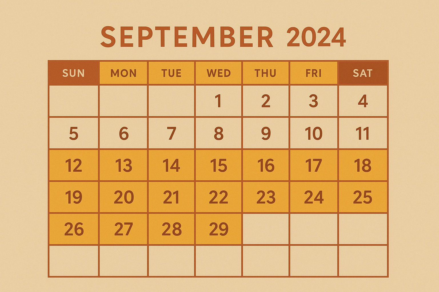
Complete 30-day layouts feature proper week alignment in Sunday-Saturday format with autumn-themed color schemes. Important date highlighting systems use seasonal colors to mark holidays and significant events throughout the month.
The grid naturally creates spots for your apps, so your home screen ends up looking super organized even if the rest of your life isn't quite there yet. The grid layout aligns naturally with app icon placement, creating seamless integration between functional and decorative elements.
12. Weekly View September Calendar
This one focuses on just one week at a time, with extra space for notes or reminders. Perfect for people who like to plan in smaller chunks or who find full monthly views overwhelming.
Vertical weekly planner formats show detailed first-week layouts with dedicated space for notes and subtle autumn leaf borders. This format provides more detailed planning capability while maintaining visual appeal.
The weekly format gives you more detail while still keeping that autumn aesthetic. Plus, there's actual room to write things down if you're still old-school like that. The weekly structure accommodates users who prefer detailed scheduling over monthly overviews.
13. Minimalist Date Display
Just a big, bold date with "September 2024" underneath, set against a gorgeous autumn gradient. It's for people who mainly just need to know what day it is (honestly, same).
Large bold numbers showcase current dates with "September 2024" in complementary smaller text, set against gradient autumn backgrounds. The design emphasizes temporal awareness while maintaining visual simplicity.
The large numbers make it super easy to see at a glance, and the minimalist design works with pretty much any app setup you've got going on. Dynamic relevance updates throughout the month as date emphasis changes.
14. Interactive Calendar Widget Style
This one's designed specifically to work with your phone's calendar widgets. The background fades in all the right places so your widgets stay readable while everything looks coordinated and intentional.
Specifically designed to complement iOS and Android calendar widgets through strategic negative space zones and autumn color coordination. Background elements fade to lower opacity in widget areas to maintain readability.
It's like having a personal assistant who also happens to be really good at interior design. The september 2024 calendar phone wallpaper design coordinates with common widget placements—top thirds for weather widgets, bottom thirds for calendar widgets, and side margins for app dock areas.
Aesthetic & Artistic September Designs
For the creative souls, the vintage lovers, the people who have strong opinions about fonts and color palettes. These wallpapers are basically art you can carry around.
15. Vintage September Postcard
"Greetings from September" in that classic postcard style that makes everything feel nostalgic and charming. It's like finding a cool vintage postcard at an antique shop, except it lives on your phone.
Retro-style designs mimic vintage postcards with "Greetings from September" text, autumn illustrations, and aged paper textures. The nostalgic aesthetic appeals to users who appreciate historical design elements and vintage charm.
The aged texture and retro typography give it character without being too busy. Perfect for people who think everything looked better in the old days (at least aesthetically speaking). Aged texture overlays add character while maintaining modern usability standards.
16. Watercolor Autumn Bouquet
Hand-painted watercolor flowers and leaves with those soft, blended edges that only happen with real paint. It's organic, artistic, and has that handmade quality that feels special in our digital world.
Hand-painted watercolor illustrations feature fall flowers, berries, and foliage in soft, blended autumn tones with artistic paint splatter effects. The organic medium provides natural texture variation and color bleeding that creates visual interest.
The soft edges are easy on the eyes, and the artistic medium gives it a unique texture that's way more interesting than your average digital design. Soft edges generate gentle contrast that's comfortable for extended viewing.
17. Cottagecore September Scene
Cozy cottage, apple trees, pumpkin patch, warm lighting—basically everything you need for that "simple life in the countryside" fantasy we all have sometimes. It's the visual equivalent of baking bread from scratch.
Cozy illustrations featuring rustic cottages, apple trees, pumpkin patches, and warm lighting capture the cottagecore aesthetic that's gained popularity among lifestyle-conscious users. The scene evokes feelings of simplicity and seasonal comfort.
This trend speaks to people who want to slow down and connect with seasonal traditions, even if their actual life involves more takeout than home-cooked meals. The trend-conscious design appeals to users who embrace slow living and seasonal mindfulness.
18. Art Nouveau September
Elegant flowing lines and rich colors in that classic 1890s Art Nouveau style. It's sophisticated, it's historical, and it makes your phone look like a piece of art.
Elegant designs incorporate flowing lines, stylized autumn motifs, and rich jewel tones characteristic of the 1890s Art Nouveau movement. Intricate patterns require high-resolution rendering to maintain line work clarity and detail integrity.
The intricate patterns require a good screen to really shine, but when they do, they're absolutely gorgeous. This is for people who appreciate detailed craftsmanship and timeless design. The sophisticated artistic style provides elegant backdrops for modern interface elements.
19. Boho Autumn Mandala
Intricate circular patterns incorporating autumn elements in that bohemian style that's been having a moment. The symmetry is satisfying, and the detailed center gives you something interesting to discover every time you look at it.
Intricate mandala designs incorporate autumn elements like leaves, acorns, and harvest symbols in warm earth tones with bohemian flair. The circular symmetry creates natural focal points while detailed patterns reward close examination.
Pro tip: Keep that detailed center area clear of apps so you can actually appreciate all the intricate work that went into it. Eight-fold symmetry works exceptionally well with rounded app icons and creates natural groupings for app organization.
Photography & Realistic September Scenes
For people who want their wallpaper to feel like a window into an actual autumn day. These are real photos of real places doing real September things.
20. Pumpkin Patch Panorama
Sprawling pumpkin fields under a partly cloudy sky—basically the Instagram photo you wish you took at that pumpkin patch you visited last year. It's wide, it's expansive, and it captures that classic autumn activity we all pretend we're going to do more of.
High-resolution photography captures sprawling pumpkin patches with various sized pumpkins, hay bales, and autumn decorations under partly cloudy skies. The wide composition provides multiple focal points and excellent depth of field variation.
The panoramic format works great with different screen orientations, and the natural lighting makes everything look warm and inviting. Advanced lighting utilizes natural overcast conditions to create even illumination without harsh shadows.
21. Urban Autumn Street
Tree-lined city streets covered in fallen leaves, with that perfect streetlight glow that makes everything look like a movie scene. It's autumn for people who live in actual cities but still want those cozy fall vibes.
Tree-lined city streets with autumn leaves covering sidewalks combine seasonal elements with urban lifestyle relevance. Warm streetlight illumination creates cozy feelings while the street perspective provides natural leading lines and depth.
The perspective draws your eye down the street, creating depth and making your screen feel bigger than it actually is. Plus, it's relatable for anyone who's ever walked down a leaf-covered sidewalk and felt like they were in a romantic comedy. One-point perspective positions the vanishing point in the upper third, following rule of thirds principles for visual balance.
22. Cozy Coffee Shop Window
The view from inside a café looking out at autumn trees, with a steaming coffee cup in the foreground. It's that perfect cozy moment we all crave—warm inside, beautiful outside, caffeine within reach.
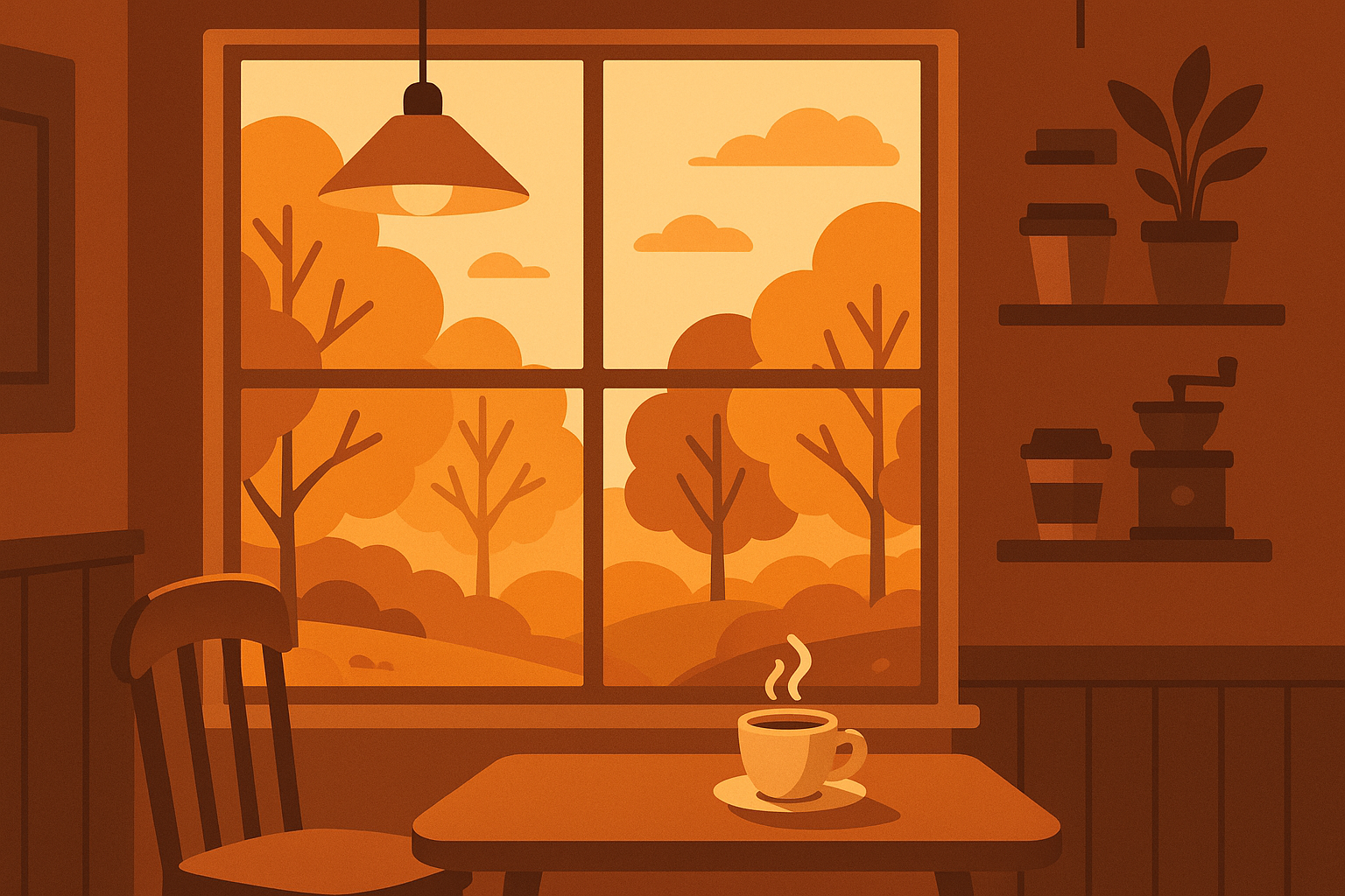
Interior perspectives looking out café windows at autumn trees create intimate, relatable scenes with steaming coffee cups in the foreground and warm, inviting lighting. The composition employs 3000K interior lighting contrasted with 5500K natural window light.
The interior viewpoint creates comfortable, familiar feelings while seasonal outdoor views maintain autumn relevance. Warm lighting and cozy elements evoke comfort and routine, making daily phone interactions feel more pleasant.
Seasonal Lifestyle & Activities
These wallpapers connect to actual things you might do in September (or at least things you tell yourself you're going to do).
23. Back-to-School Flat Lay
Perfectly arranged school supplies, books, and autumn leaves photographed from above. It's organized, it's aesthetic, and it makes you feel like you have your life together even when you definitely don't.
Stylishly arranged school supplies, books, autumn leaves, and warm beverages photographed from overhead create pleasing compositions that appeal to students and professionals. The organized layout promotes feelings of preparedness and control.
The overhead view creates clean sections that work perfectly with organized app layouts. It's like visual motivation to get your act together, one perfectly arranged notebook at a time. The overhead perspective provides clean, structured visual organization that complements organized app layouts.
College student Emma selected the Back-to-School Flat Lay wallpaper at the start of her junior year. The organized arrangement of notebooks, pens, and autumn leaves reminded her of her academic goals every time she checked her phone. The overhead composition perfectly framed her study apps—Notion, Anki, and Google Calendar—while the warm autumn elements kept her motivated during late-night study sessions in the library.
24. Apple Picking Adventure
Baskets full of fresh apples with the orchard in the background. It captures that quintessential September activity that everyone posts about on social media but only some people actually do.
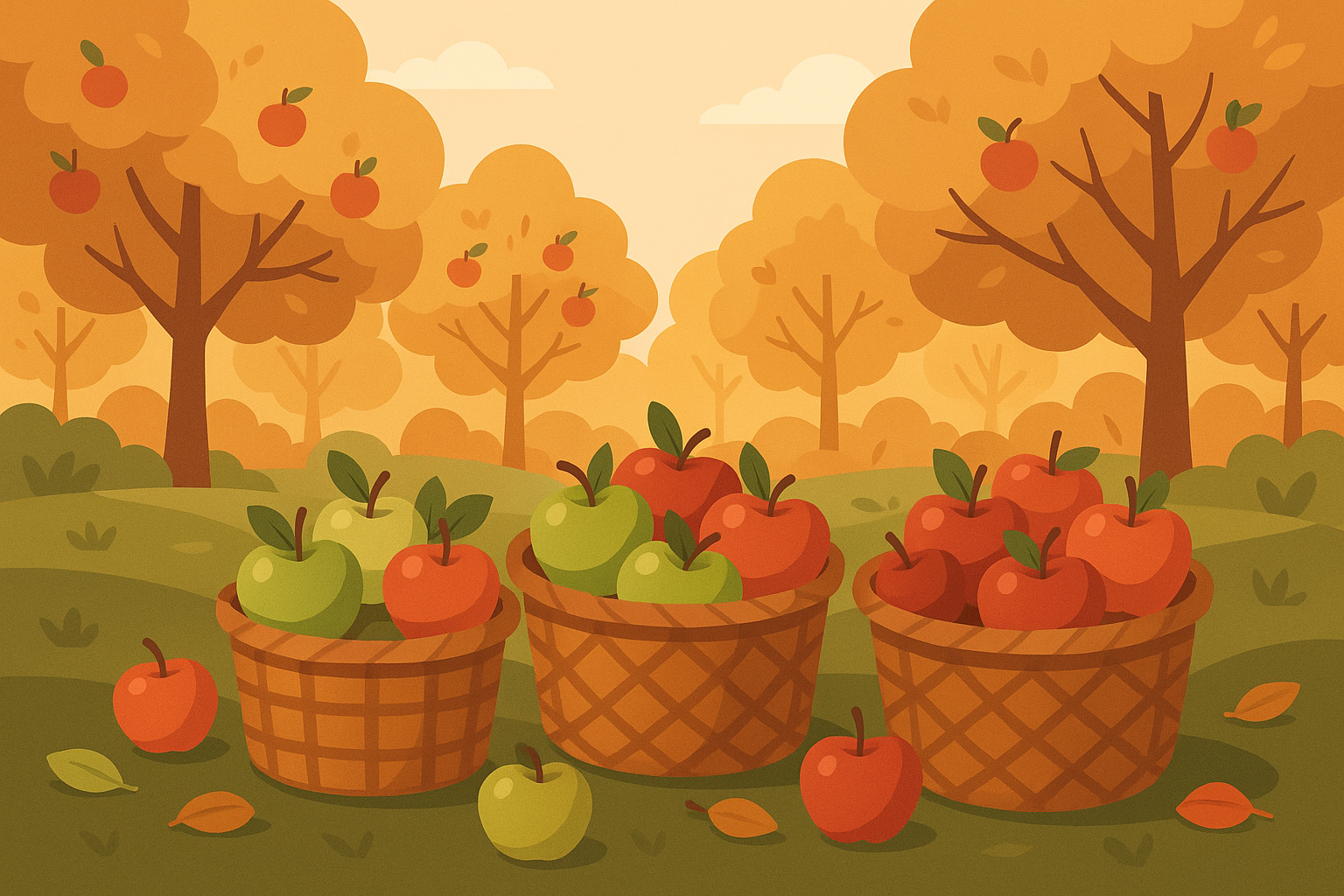
Baskets full of freshly picked apples with orchard backgrounds capture quintessential September activities in warm, natural lighting. The activity-focused imagery connects to seasonal experiences and encourages outdoor engagement.
The warm, natural lighting makes everything look inviting and might even inspire you to actually go apple picking instead of just buying pre-picked apples at the grocery store. Natural lighting and authentic textures provide genuine autumn feelings while the activity connection may increase user engagement with outdoor and seasonal apps.
25. Cozy Sweater Weather
Stacks of chunky knit sweaters in all those perfect autumn colors. It's textile porn for people who get excited about breaking out their fall wardrobe, even if "sweater weather" is still weeks away.
Stacks of chunky knit sweaters in autumn colors—cream, rust, mustard, deep green—with seasonal accessories create textile-focused compositions that emphasize comfort and warmth. The layered arrangement provides visual depth while maintaining cozy aesthetics.
The layered arrangement provides visual depth while making you feel cozy just looking at it. Perfect for when you want to feel autumn vibes even when it's still too hot for actual sweaters. The textile focus appeals to users anticipating cooler weather and seasonal wardrobe changes.
Technical Performance Analysis
Okay, let's get a little nerdy for a second. Not all wallpapers are created equal when it comes to actually working well with your phone.
Performance Category |
Top Performers |
Good Performers |
Challenging Options |
|---|---|---|---|
Resolution Compatibility |
Golden Hour Forest Path, Pumpkin Patch Panorama |
Watercolor Autumn Bouquet, Art Nouveau September |
Calendar wallpapers, Typography designs |
Battery Optimization |
Gradient Autumn Palette, Minimalist designs |
Balanced exposure photography |
Harvest Moon Landscape, High-contrast designs |
Readability |
Minimalist compositions, Strategic negative space |
Nature photography with depth of field |
Boho Autumn Mandala, Busy patterns |
Aesthetic Integration |
Abstract designs, Gradient palettes |
Geometric patterns, Modern designs |
Vintage postcards, Highly detailed artwork |
Resolution and Screen Compatibility Performance
The high-resolution nature photos like Golden Hour Forest Path and Pumpkin Patch Panorama are going to look amazing on any device. They scale well, maintain their quality, and generally just work without any fuss. These wallpapers maintain detail integrity from compact phones to large flagship displays without quality degradation.
Good performers encompass Watercolor Autumn Bouquet, Art Nouveau September, and Boho Autumn Mandala, providing vector-based or high-resolution artistic designs that adapt well to different screen sizes while preserving visual appeal and design integrity.
Calendar wallpapers and typography designs can be trickier because text needs to stay readable across different screen sizes. They might need device-specific versions to really shine. Moderate performers include september 2024 calendar phone wallpaper options and typography-based designs that may require resolution-specific versions to maintain text readability across different screen densities and pixel arrangements.
Aesthetic Harmony Assessment
The minimalist designs like Gradient Autumn Palette are basically foolproof—they look good everywhere, save battery life, and never interfere with your apps. They're the reliable friend of the wallpaper world. Outstanding integration comes from Gradient Autumn Palette, Minimalist Harvest Elements, and Abstract Autumn Swirls, which provide neutral backgrounds that complement any app icon style or color scheme while maintaining clear seasonal relevance.
Strong integration characterizes Geometric Fall Leaves and September Typography, which offer modern design elements that align with contemporary flat design principles used in most current app interfaces and operating systems.
The super detailed designs like the Boho Mandala or Art Nouveau patterns are gorgeous, but they need high-resolution screens to really show off properly. On older or lower-resolution devices, all that beautiful detail might just look muddy. Situational integration applies to highly detailed wallpapers such as Boho Autumn Mandala or Vintage September Postcard, which work best with organized app layouts and may clash with cluttered home screens or busy interface arrangements.
Seasonal Relevance Scoring
Peak relevance belongs to Harvest Moon Landscape, Apple Picking Adventure, and Maple Leaf Close-up, which capture quintessential September imagery that immediately evokes the season's unique character and transitional energy.
Strong relevance encompasses autumn nature landscapes, cozy lifestyle images, and harvest-themed designs that maintain clear seasonal connections while offering visual variety and broad appeal across different user preferences.
Subtle relevance describes minimalist and abstract designs that incorporate autumn colors and themes in sophisticated ways, feeling seasonal without being overtly thematic or limiting long-term usability.
Functional Readability Analysis
Excellent readability comes from gradient designs, minimalist compositions, and carefully planned negative space wallpapers that ensure app names and interface elements remain clearly visible without visual interference.
Good readability characterizes nature photography with natural depth of field that creates distinct areas of focus and blur, accommodating app placement with proper organization and strategic positioning.
We've all been there—you find the perfect wallpaper only to realize your app icons completely disappear against it. Rookie mistake. Challenging readability affects highly detailed patterns, busy photographic compositions, or high-contrast designs that may require careful app placement or interface customization to maintain usability.
Personal Style Alignment
Broad appeal encompasses nature landscapes, minimalist designs, and seasonal photography that attract wide ranges of personal preferences while maintaining sophisticated aesthetics and universal visual appeal.
Niche appeal targets Cottagecore, Art Nouveau, and Boho designs that serve specific aesthetic preferences but provide strong appeal within those particular style categories and communities.
Functional appeal prioritizes september 2024 calendar phone wallpaper designs that emphasize utility alongside aesthetics, appealing to users who value practical functionality integrated with visual design.
Battery Impact Evaluation
Battery life reality check: Dark wallpapers really do help with OLED screens. It's not going to double your battery life or anything dramatic, but every little bit helps when you're trying to make it through a full day.
Battery-friendly options include Gradient Autumn Palette, minimalist designs, and darker nature photography that optimize power consumption on OLED displays through strategic use of darker pixels and reduced illumination requirements.
Neutral impact describes most photographic wallpapers with balanced exposure that provide standard battery performance without significant drain or optimization benefits.
Higher consumption affects very bright wallpapers such as Harvest Moon Landscape or high-contrast designs that may increase battery usage on OLED displays through increased pixel illumination requirements.
Protecting Your Phone During Autumn Adventures
Here's something nobody talks about: if you're going to have a gorgeous wallpaper, you probably want to protect the phone it's living on.
Autumn is prime time for outdoor activities—hiking to see fall foliage, apple picking, pumpkin patch visits, football games, back-to-school campus running around. All of these are excellent opportunities to drop your phone and crack your screen, which really puts a damper on enjoying your beautiful new wallpaper.
Your carefully chosen September wallpaper deserves protection that matches your active autumn lifestyle. Whether you're hiking through golden forests that inspired your wallpaper choice or capturing pumpkin patch photos, your phone needs security that preserves both function and beauty with the most protective phone cases available.
A good protective case isn't just about preventing damage—it's about being able to actually use your phone for all those autumn photo opportunities without constantly worrying about it. You want to be able to pull out your phone to capture that perfect sunset that matches your Golden Hour Forest Path wallpaper, not leave it buried in your bag because you're scared of dropping it.
Rokform's military-grade phone cases ensure your September aesthetic remains intact during the season's most adventurous moments. Their rugged polycarbonate construction provides 6-foot drop protection—perfect for scenic autumn hike photography or apple orchard adventures that connect to your wallpaper themes.
Look for cases that offer real protection (6-foot drop protection is a good benchmark) but don't make your phone so bulky that you hate carrying it around. The integrated magnetic mounting system displays your beautiful September wallpaper securely while using your phone hands-free during activities. Following hiking trails, capturing time-lapse videos of changing leaves, or navigating to perfect apple orchards becomes easier with reliable mounting solutions.
MagSafe compatibility keeps wireless charging working, which is clutch when you're out all day taking photos and your battery starts dying. Nothing's worse than missing that perfect autumn sunset shot because your phone died. MagSafe® compatibility ensures wireless charging continues working seamlessly, keeping your phone powered for autumn photo opportunities. You won't miss capturing that perfect sunset that matches your Golden Hour Forest Path wallpaper because of a dead battery with the best wireless charging solutions.
The wallet-style cases are perfect for back-to-school season—keep your student ID, transit cards, and cash all in one place while still showing off your carefully chosen wallpaper. For September's back-to-school energy, Rokform's wallet cases combine protection with functionality. Keep your student ID, transit cards, and cash secure while showcasing your chosen seasonal wallpaper. Belt clip accessories make phone access easy during busy campus days or outdoor autumn activities.
Just as you carefully selected a September wallpaper reflecting your style and seasonal appreciation, choosing Rokform protection means investing in gear that performs when it matters most—whether capturing perfect autumn sunsets or surviving another busy September day with the best phone cases for your lifestyle.
Final Thoughts
Look, at the end of the day, the perfect September wallpaper is whatever makes you smile when you unlock your phone. Maybe it's that dramatic harvest moon that makes you feel like a nature photographer. Maybe it's the clean minimalist gradient that just makes everything feel more organized. Maybe it's the calendar wallpaper that actually helps you stay on top of your life.
The perfect September wallpaper balances seasonal aesthetics with practical functionality, requiring consideration of technical specifications, personal preferences, and device capabilities to create an optimal mobile experience that enhances rather than hinders daily phone interactions.
September has this unique energy—it's new beginnings (thanks, school conditioning), harvest time, the start of cozy season, and that perfect balance between summer's last gasps and autumn's full embrace. Your wallpaper should capture whatever part of that resonates with you.
Selecting the ideal september phone wallpaper involves more than aesthetic preference—it requires understanding how different designs interact with your device's capabilities and your personal usage patterns. The 25 options we've explored span diverse categories, ensuring every user can find something that resonates with their style while meeting their functional needs.
Don't overthink it too much. Yes, technical stuff matters (nobody wants a pixelated mess), but mostly you just want something that feels right. Something that makes those hundreds of daily phone checks a tiny bit more pleasant.
Technical considerations matter as much as visual appeal. Resolution compatibility prevents pixelation issues, while battery optimization extends your device's daily performance. The wallpapers that perform best combine beautiful seasonal imagery with practical design elements that enhance rather than hinder your phone's usability.
Whether you go for the functional calendar, the artistic mandala, or the cozy coffee shop scene, pick something that feels authentically you. September's transitional energy makes this month special for wallpaper selection. These designs capture the unique character of early autumn—the excitement of new beginnings, the warmth of harvest season, and the anticipation of cozy months ahead. Your wallpaper choice becomes a daily reminder of seasonal beauty and possibility.
Whether you choose functional september 2024 calendar phone wallpaper options for productivity, september phone wallpaper aesthetic designs for visual appeal, or september 2024 calendar phone wallpaper layouts for organization, your selection should feel authentically you while celebrating September's distinctive charm.
And hey, if you change your mind halfway through the month, that's what makes it fun. It's just a wallpaper—experiment, have fun with it, and find what makes your phone feel like home.
Remember that the best wallpaper is one you'll enjoy seeing hundreds of times throughout the month. Whether you choose dramatic nature photography, subtle minimalist designs, or functional calendar layouts, your selection should feel authentically you while celebrating September's distinctive charm alongside other fall phone wallpaper options for the season ahead.

